Cancellation Email Examples I Love (For Your Inspiration)
The best-case scenario is that a cancellation email turns a churned subscriber into a retained customer.
But that’s not all the cancellation email can do.
Recently, I canceled a subscription. The truth was, I wasn’t entirely satisfied with the company, and someone else could do the same thing for the same money. I left.
Within hours, I received a very polite email from customer service, which made me feel valued. They offered a discount, and I felt they were very understanding. I admit it wasn’t enough to encourage me to sign up again, but it did allow the subscriber/software “relationship” to end well. The cancellation email was enough to curb my dissatisfaction, and now my narrative about the company is positive; I’d even recommend them to a friend!
While this cancellation email hadn’t quite wooed me back, it certainly left the door wide open for the future. It made me appreciate the power of a good email when the chips are down.
In this article, we’ll explore the components of well-done cancellation emails — plus share a template for you to create one of your own.
Table of Contents
The Best Cancellation Emails
I’ve dug through my emails and spoken to expert email marketers to find fifteen of the best cancellation emails. I’ve included why they’re effective, with the stats to prove it.
By learning from these cancellation email examples, you’ll be able to create your own version that will bring your customers back — or at least allow you to part ways in the best way possible.
1. Zero Bounce
Zero Bounce has a staged process when it comes to cancellation emails. Zach Nonnemacher, Email Strategist at ZeroBounce, explains the flow.
- The person goes to cancel in the dashboard. A modal pops up asking for feedback and gives them a discount offer to stay.
- If they accept, ZeroBounce sends a confirmation email showing what they accepted.
- If they reject, ZeroBounce sends a follow-up based on that.
- Then, if they didn’t accept the first follow-up offer, ZeroBounce sends a second email later to those who rejected.
The emails have an open rate between 34% and 51%.
It’s worth noting that before Zero Bounce sends their first email, they’re gathering important information through a feedback pop-up. They also incentivize the user to return with a discount.
What I liked about it: I love how Zero Bounce has a flow of emails that considers where the user is based on how they responded to the first email. I also really like that Zero Bounce is asking for user feedback. This information offers insights explaining churn so they can work to reduce this in the future through marketing messaging or alterations to their offering.
2. Niceboard
Like Zero Bounce, Niceboard has a cancellation email flow. Noticeboard sends two emails.
Hanna Feltges, Growth Marketer at Niceboard, explained the role of each email to me.
Email one (above) is sent to customers a day before their plan is canceled.
Feltges believes the elements that make this email successful for Niceboard include:
- Pointing out the features that users would lose access to when not upgrading. This helps recall why the user chose Niceboard in the first place.
- The timing of the email is one day before cancellation, giving the user a heads-up to take action.
- The framing of “continuing to have access to these features” makes the recipient take action and reduces friction.
- Offering a simple way to contact Niceboard (reply to the email).
Email two is sent to customers the day their plan is canceled. Email two is effective because it
- Provides an easy way to get back to using the tool (“all your work has been saved”).
- Takes a proactive step to reduce friction for upgrading (“3 ways to sweeten the deal”): Tips on how to improve their experience and the ability to switch to a free plan.
- Offers an easy way to unsubscribe. While this might seem too easy, we consciously decided to suggest this to disqualify anyone not genuinely interested in our product.
What I liked about it: An email flow serves as a kind reminder to your canceling subscriber. We’re all busy, and the temptation of a “sweeter” deal might just be enough to bring someone back. I like the second email and how there are many options for the user to choose from. They can pick up tips, stay on as a free user, or unsubscribe.
As Feltges explained, the unsubscribe is very obvious in this email, but Niceboard is happy to lose disqualified email leads. I think this builds a bit of trust, too. I’d prefer a company that simply served me (even if I unsubscribe) rather than trap me in more emails.
3. RecurPost
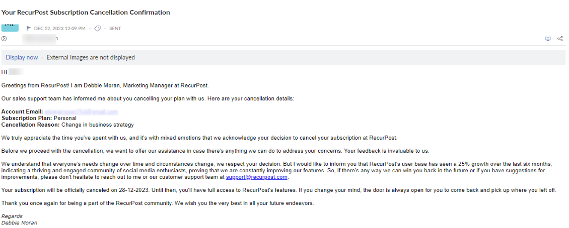
Debbie Moran, marketing manager at RecurPost, provided an example of their email cancellation.
Moran said, “I personally engage with customers canceling their subscriptions as a part of our customer retention strategy. Through this, I aim to understand their reasons, gather feedback, and explore solutions to address their concerns.”
Thanks to Moran’s personal email, she was able to turn this nearly-churned customer back into a subscriber. Moran said, “I realized that the customer’s issue was budget-related, not dissatisfaction with RecurPost. Through open communication and assistance from our sales support team, we customized a budget-friendly plan for her, making her a happy and retained customer.”
Moran believes there are five key reasons why the customer stayed:
- Customized budget-friendly plan.
- Open communication.
- Responsive customer support.
- Flexibility and adaptability.
- Positive customer experience.
Finally, Moran said, “Through these emails, my main goal is to turn cancellations into opportunities for improvement and continued customer satisfaction.”
What I liked about it: It’s cliche, but people do business with people. In this interaction, Moran was able to turn a churned subscriber into a retained subscriber. Looking at the email, the communication, responsive support, and everything else, it’s very clear to me how RecurPost kept their customer.
4. Linktree
This is the cancellation email I received just a few days ago, and it’s pretty effective. I signed up for Linktree because I wanted to give it a test for 30 days, free of charge. I’m notorious for forgetting to cancel subscriptions, so I chose to cancel this immediately to enjoy the 30 days without a potential unwanted bill.
I wanted to test the software and then make a decision about whether or not to stick with it and pay. For someone in this situation, this email is great. It reinforces the pro features, supports the tool with social proof in the form of reviews, and allows me to renew from the email easily.
What you don’t see in this email is the cancellation process. Before I even received an email, Linktree offered me 25% off; honestly, it was tempting.
What I like: This is a clean and well-designed email. I genuinely did read the reviews because although I have currently canceled my subscription, I am very much in the explorative phase with this new software. The renew button in the email gives me an easy place to return to if/when I am ready to commit.
5. Disney
If you’ve canceled a Disney subscription, you’ll receive an email like the one above. It’s pretty to the point but does everything it needs to. Disney expresses its sadness to see you go, confirms the details (cancellation date), and serves as a reminder that you can restart anytime.
The email includes the “restart subscription” button to remove friction. Before canceling my Linktree subscription, I might’ve questioned why Disney and others added a “restart” CTA, but if someone’s subscription is coming to an end without their knowing, the frictionless renewal/restart would be much appreciated.
What I liked about it: I liked how Disney advised customers on what to do if they also had The Disney Bundle. I found this very transparent. Disney could easily allow unknown subscriptions to leave their customers’ banks, but they did the right thing.
Consumers appreciate actions such as this, but they also save customer service a lot of time with a) disgruntled customers and b) refund requests. A good move all around.
6. Twitch Turbo
Twitch Turbo removes ads so you can enjoy your viewing! Their cancellation email is very simple and to the point. They’re giving you all the information and not making any grand gestures, such as discounts or incentives to bring you back.
What I liked about it: This could be slightly contradictory to my previous comments, but I like its simplicity. I appreciate not being pulled back in with an offer. However, I would encourage cancellation emails to include an offer where possible.
7. Kmart
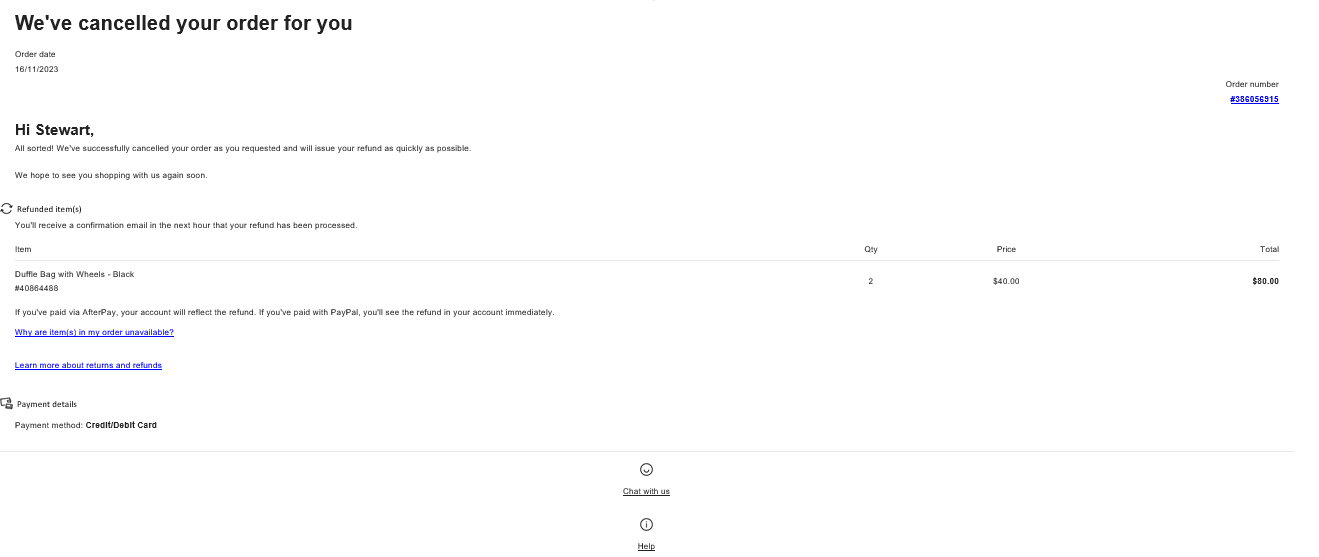
A cancellation of goods requires an email so the buyer knows their cancellation was successful.
This example from Kmart confirms the refund request has been noted. They’ve shared the items within the email so the recipient has a reference. In this case, the user triggered the cancellation, but for circumstances where it was not, Kmart offered the why behind the cancellation. They’ve also got quick access to chat or help, which is great customer service.
What I liked about it: One thing that stands out to me in this email is the confirmation of cancellation, followed by reassurance that the refund confirmation email is on its way. This email ensures that the recipient has more answers than questions and is in the know about what’s going on.
8. Booking.com
Cancellations on Booking.com are not always straightforward as booking.com is the third party between the buyer and the property.
Like Kmart (above), Booking.com has done a good job reassuring the recipient about what’s happening. This simple email includes an update: Booking.com is finding a solution regarding cancellation with the property.
Naturally, booking.com has protected itself and given the recipient all the information, including a reminder about the property terms.
What I liked about it: Although the matter is in hand and Booking.com is negotiating with the property, I like that they gave the recipient full control over everything by providing contact details.
9. Cathay Pacific
This cancellation email was sent during a busy time for Cathay Pacific. As you can see in the email, they’ve received a large increase in refund requests and have clarified to the customer that they’re doing everything they can. Plus, they are also managing expectations with a time period of seven to twenty business days.
Additionally, Cathay Pacific has already apologized for potential delays. Their customer service throughout this email is great.
What I liked about it: The email is polite and to the point, but Cathay Pacific has done everything it needs to appease and serve its customers.
10. Craft Gin Club
I joined and canceled a Craft Gin membership some time ago. This cancellation email followed, and I appreciated it.
A plain text email from Amy felt genuine. It was more like a communication with her than a standard cancellation email that everyone would receive. Though I know everyone would receive this, the email did not lose its charm.
The email offered all the common elements of a cancellation email: Amy tells me she’s sorry I’m leaving, leaves the door open for me to return, and tells me what I’m losing by canceling.
Finally, Amy asked if I could fill out the feedback form.
What I liked about it: The feedback form is in bold text. Craft Gin is interested in knowing the why behind people leaving. I highly recommend adding this to cancellation emails or within the cancellation journey. Sometimes, a cancellation is done with a heavy heart, and the user might appreciate a moment to tell you what’s up.
Plus, if you know why they canceled, you’ve got another chance to bring them back, or if not, you can improve things for the next person.
11. LastPass
This LastPass cancellation email is a great example of someone reluctantly canceling with a company and the importance of the feedback layer.
I ended a two-year partnership with LastPass days after my subscription was renewed.
LastPass graciously refunded the annual subscription cost and sent the email above. I found it incredibly effective. Instead of begging me back, LastPass acknowledged me as a customer, asked why I was leaving, and offered a 15% discount. The offer of a discount felt like a subtle attempt, which I appreciated.
I did give LastPass my time to explain why I was leaving, and they did offer some reassurances. I appreciated LastPass asking about the reason for my cancellation.
While I didn’t renew with LastPass, I do feel good about how I was treated as a customer, and who knows, maybe I’ll go back sometime.
What I liked about it: The politeness of the email alongside the delivery made it hard to leave LastPass. I was tempted back! Although I did not return this time, it turned me from a categoric “I’d never use LastPass again” to a “who knows, maybe I’ll go back in the future.”
12. Washington Post
LastPass and Craft Gin are not the only companies using a plain text email for their cancellation.
Washington Post’s plain text email persuaded Sandra Grauschopf, Marketing Manager at Kodeco, to remain a subscriber.
Grauschop said, “It’s not a fantastic email, but the offer was just right to make the value (to me) worth the money. It convinced me to continue as a subscriber.”
I can see why. The email comes across as sent directly from a person at the Washington Post. It’s polite and to the point. The Washington Post managed to prevent Grauschopf from churning by offering a discount more in line with her budget.
What I liked about it: Emails like this prove that even a plain text email is impactful if the wording or offer is good enough. For me, it deviates somewhat from the notion that people don’t read or have to be persuaded by over-engineered designs to stay interested. If you have something of substance, plain text can work.
13. Adobe
I canceled a subscription with the Adobe Acrobat team, and this is the email I received.
Like all good cancellation emails, Adobe has done the essentials and provided an option to reactivate the subscription. The email is simple and to the point, but it gets the job done.
What I liked about it: Adobe signed off with “Thank you for being a valued customer.” Even as a customer leaves a paid plan, the email sign-off is polite.
14. pdfFiller
Alpana Chand shared a cancellation email from PDF Filler. Chand said, “I appreciated the tone of this email; I did write to them thanking them and saying I will use the paid service whenever necessary.”
The cancellation email from PDF Filler was so well written that it triggered a reply from Chand, who was unsubscribing. This is greatly effective.
Although PDF Filler didn’t turn a churned subscriber into a retained one, they did weather the cancellation well. They ended up with a positive interaction instead of a negative.
What I liked about it: I agree with Chand; the email was polite and helpful. The tone is great. They’ve also included a timeline of when the payment should return to Chand’s account.
15. Audible
I canceled my Audible subscription and received the email above. The email is generally very useful, informing me I have access until July. There’s a little warning about credits expiring, which would encourage me to download anything I need before the deadline.
Like many emails listed, Audible includes the option to keep my membership.
What I liked about it: The email, in general, is great, but I especially like how easy it is to get in touch if there’s an issue. With this particular cancellation, there was some confusion, and I used the Contact Us option to resolve a last query before I subscribed for the year.
How to Write a Cancellation Email (+Template)
Now we’ve analyzed fifteen cancellation emails, let’s look at the winning formula and write a template.
What makes a winning cancellation email
It seems that the formula for making a cancellation email stand out is:
- Cancellation confirmation, including dates.
- Details about refunds, if applicable.
- A genuine “sorry to see you go”.
- Features you’ll miss out on.
- A warning you’ll lose data.
- Resubscribe/renew CTA.
As a bonus, you can add:
- A personal approach (name the sender).
- Reviews from happy customers.
- Quick links to contact.
- Feedback request.
Although many emails in this round-up don’t include these bonus items, I’d highly recommend using them. The true success stories have come from those asking for feedback and offering alternative solutions.
Cancellation email template
Hello, [Name],
We’re sorry to see you go.
Your cancellation request has been processed. From [date], you’ll be moved to the [plan]. This means you will lose access to [benefit], [benefit], [benefit].
With the [pro plan], you also get
- [Pro plan benefit].
- [Pro plan benefit].
- [Pro plan benefit].
[RESUBSCRIBE BUTTON]
You can resubscribe anytime. In the meantime, if you have questions, please don’t hesitate to reach out to me.
If you have time, please fill out this feedback form.
Kind regards,
[Your name]
Say Goodbye the Right Way with a Cancellation Email
I have no doubt that the cancellation email is absolutely essential. Naturally, you need to give your customers some confirmation that the action they’ve taken – i.e., canceling – is in motion.
More than that, a cancellation email could be the difference between a soured customer and a peaceful end to a partnership. Better, your cancellation email could encourage your customer to go back into an alternative product or service, a win-win for all.
![]()


![→ Download Now: The Beginner's Guide to Email Marketing [Free Ebook]](https://no-cache.hubspot.com/cta/default/53/53e8428a-29a5-4225-a6ea-bca8ef991c19.png)
