

Data Visualization: Tips and Examples to Inspire You
I often find raw data overwhelming — endless rows of numbers can be hard to decipher. That’s why I love data visualization; it transforms complex figures into clear, intuitive charts that help me quickly spot trends and understand the story behind the numbers.
Visual charts and graphs not only save me precious time but also empower me to make better decisions by contextualizing information in a way that raw data just can‘t.
![Download Now: An Introduction to Data Visualization for Marketers [Free Guide]](https://no-cache.hubspot.com/cta/default/53/6ecf26a9-faff-4c16-a2d4-b70751ce8b65.png)
In this article, I’ll explain what data visualization is and share some data visualization best practices to help you get started.
Table of Contents
What is data visualization?
Data visualization allows you to organize data in a way that’s both compelling and easy to digest.
It’s about representing data in a visual context, such as a chart or a map, to help anyone viewing it better understand the significance of that data.
How does data visualization work?
Whereas data shared via text can be confusing (not to mention bland), data represented in a visual format can help people extract meaning from that information more quickly and easily.
Data visualization allows you to expose patterns, trends, and correlations that may otherwise go undetected,
Static vs. Interactive Data Visualization
Data visualization can be static or interactive. For centuries, people have been using static data visualization like charts and maps.
Interactive data visualization is a little bit newer: It lets people drill down into the dirty details of these charts and graphs using their computers and mobile devices,and then change which data they see and how it’s processed.
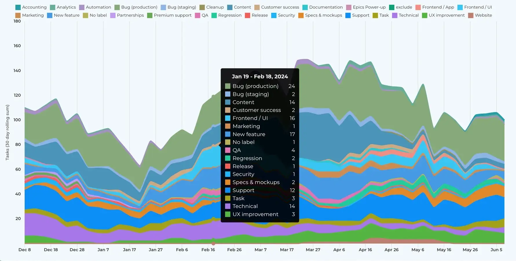
Time Series Visualization
In addition to static and interactive data visualization, you may also hear the term time series visualization. Time series visualization is what it sounds like — visuals that track data, or performance, over a period of time.
This is important because a major reason why people want to focus on data visualization is to show changes in variables over time.
Time Series Data Visualization Examples
There are many ways to use time-series data visualization — you‘ll learn more about these below, but here’s a quick list to give you a better understanding of which visuals are considered time-series visuals.
- Line chart
- Bar chart
- Area chart
- Bullet graph
Featured Guide: An Introduction to Data Visualization
Learn how to apply data visualization best practices in your marketing with this free guide.
How to Visualize Data: 10 Approaches
1. Line Chart
A line chart is a straightforward tool for visualizing data trends over time. It works by connecting individual data points with a line, which makes it easy for you to see patterns and changes across different time intervals.
You can use a line chart to track a single data series or compare multiple series simultaneously. It’s particularly useful for highlighting trends, spotting fluctuations, and understanding overall progress in your data.
2. Bar Chart
A bar chart uses rectangular bars to represent values, with the length or height of each bar corresponding to the quantity it represents. This type of chart is especially useful when you want to highlight differences across various groups or items at a glance.
Whether the bars are displayed vertically or horizontally, a bar chart makes it easy to see which categories stand out, helping you to quickly analyze and communicate your data.
For example, say you’ve been using Casted for your content marketing and need to report on which medium is performing best. You can pull data reports from the dashboard to visualize the data for key stakeholders.
3. Scatter Chart
A scatter chart is a useful tool for examining the relationship between two variables by plotting individual data points on a coordinate plane. Each point represents an observation, allowing you to see patterns, correlations, or outliers in your data.
This type of visualization is ideal for exploring how changes in one variable might relate to changes in another. It gives you insights into trends and relationships that might not be immediately apparent.
4. Area Chart
An area chart is similar to a line chart but fills in the space beneath the line, which helps emphasize the volume of change over time. This visual representation is useful when you want to show cumulative totals or highlight how different parts contribute to the whole.
By filling in the area below the trend line, an area chart can make it easier to spot patterns, compare magnitudes, and understand the overall impact of the data.
5. Map Chart
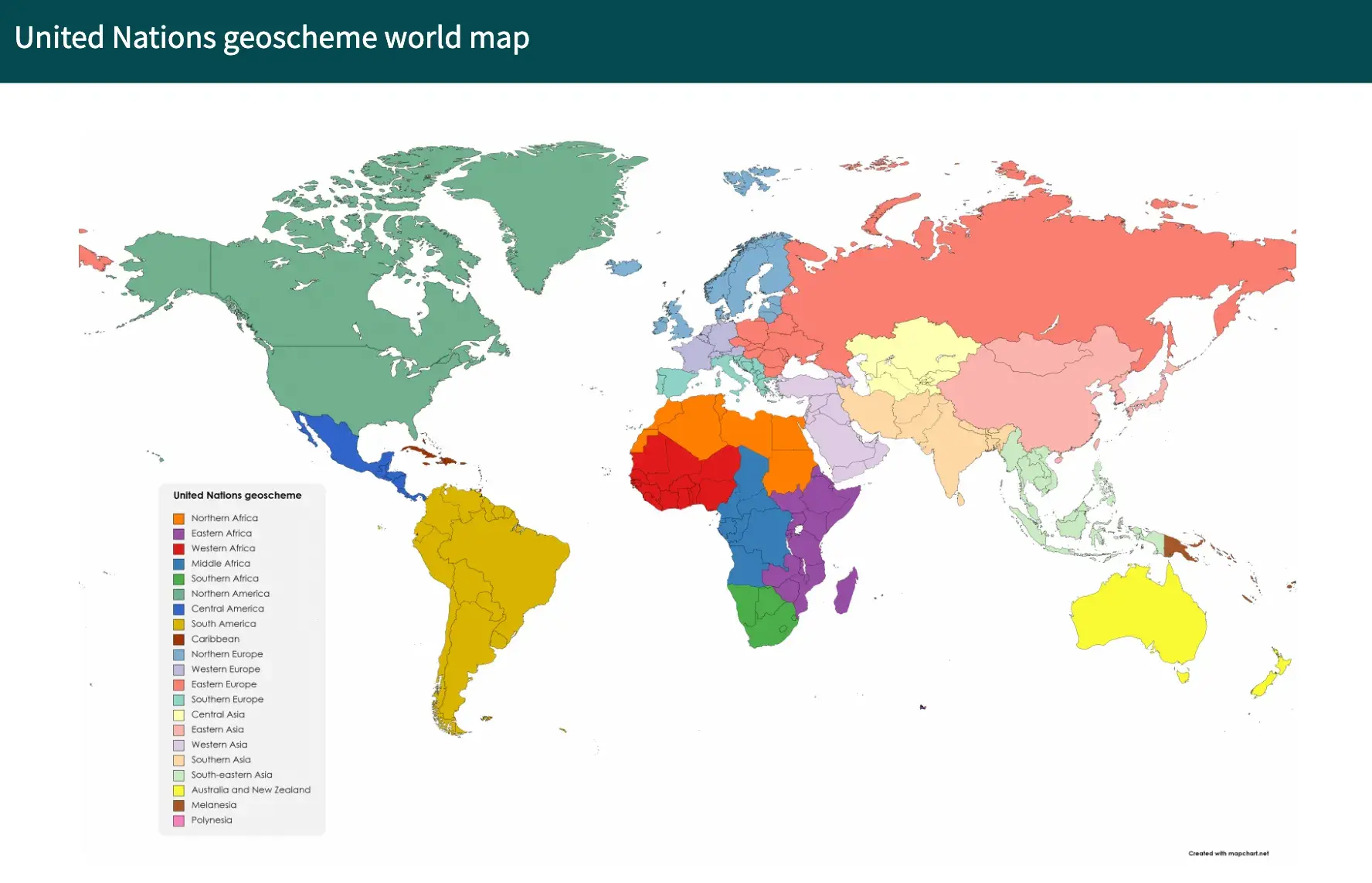
A map chart displays data on a geographic map, which makes it easy to see how values differ across regions or locations. It uses colors, symbols, or shading to represent various data points in areas like countries, states, or cities.
This type of chart is especially helpful when you want to highlight regional trends or compare data geographically. With a map chart, you can quickly identify patterns, clusters, or outliers that are tied to specific areas of the world.
6. Indicator Chart
An indicator chart usually shows one or more large numerical values, often accompanied by visual cues like colors or icons (e.g., gauge, ticker), to quickly communicate whether a metric is meeting its target or requires attention.
You can use an indicator chart to monitor performance over time, compare current values against goals, or highlight important data points on a dashboard. Its clear and direct presentation makes it easy for you to immediately understand the status of a critical measurement without digging into more detailed data.
7. Pivot Table
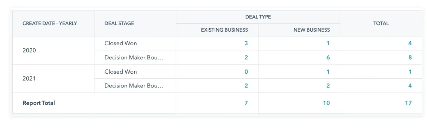
A pivot table is a versatile tool that helps you quickly summarize and analyze large data sets. It allows you to reorganize raw data into a structured format by grouping and aggregating key values, such as sums, averages, or counts.
With a pivot table, you can easily compare different categories or time periods and uncover patterns that might not be visible in the original data.
8. Bullet Graph
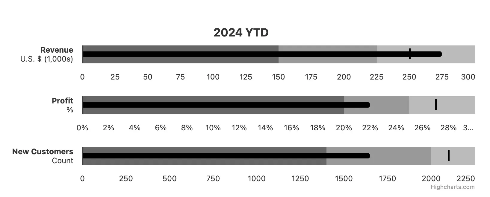
A bullet graph is designed to show progress toward a target in a clear and space-efficient manner. It typically features a horizontal bar that represents the main measure, along with markers that indicate target values or performance ranges.
This type of chart is especially useful on dashboards, where it provides a quick snapshot of how well a metric is performing against set goals. By comparing the length of the bar to the reference markers, you can easily assess whether a value is within an acceptable range or if it needs attention.
9. Box Plot
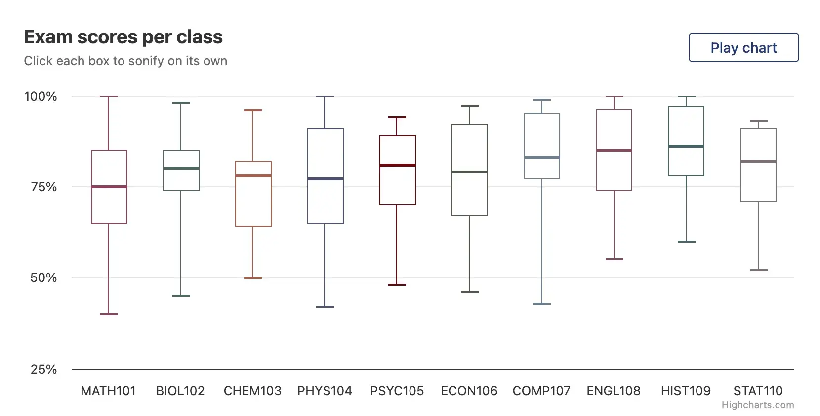
A box plot is a statistical visualization that summarizes a dataset using its quartiles and highlights any outliers. It displays a box that represents the interquartile range, with a line inside indicating the median and “whiskers” that extend to show the range of the data.
This chart is useful for quickly understanding the central tendency, spread, and symmetry of your data, as well as identifying any unusual observations.
10. Pie Chart
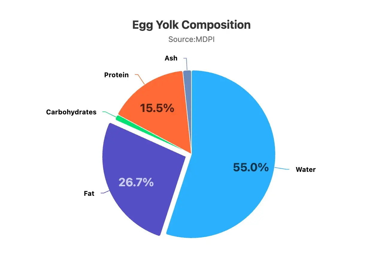
A pie chart is a circular graph divided into slices, where each slice represents a part of the whole. This type of chart is especially useful when you want to show how individual categories contribute to an overall total. By displaying data in proportional segments, a pie chart allows you to quickly grasp the relative size of each category at a glance.
However, it’s most effective when used with a limited number of categories to keep the visualization clear and easy to understand.
Ready to feel inspired? Let’s take a look at some great examples to inspire your data visualization ideas.
Examples of Data Visualization
Below are 20 examples of data visualization, split into two major sections: static and interactive data visualization.
Examples of Static Data Visualization
1. United States Urban Population
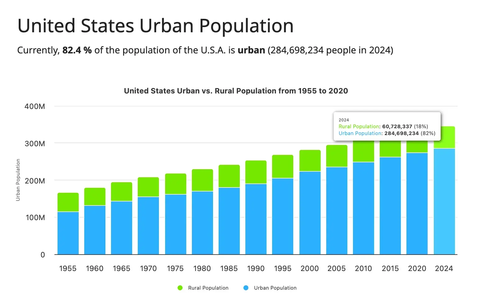
This chart aims to show the growth of the rural population versus the urban population in the United States between 1955 and 2024. On the graph, the rural population is green, while the urban population is blue.
What I like: This graph doesn’t make you do any calculations to figure out exactly what the rural or urban populations are. Instead, when you hover over a bar, you can see the exact figure and percentage of both populations in that specific year.
2. Global Warming
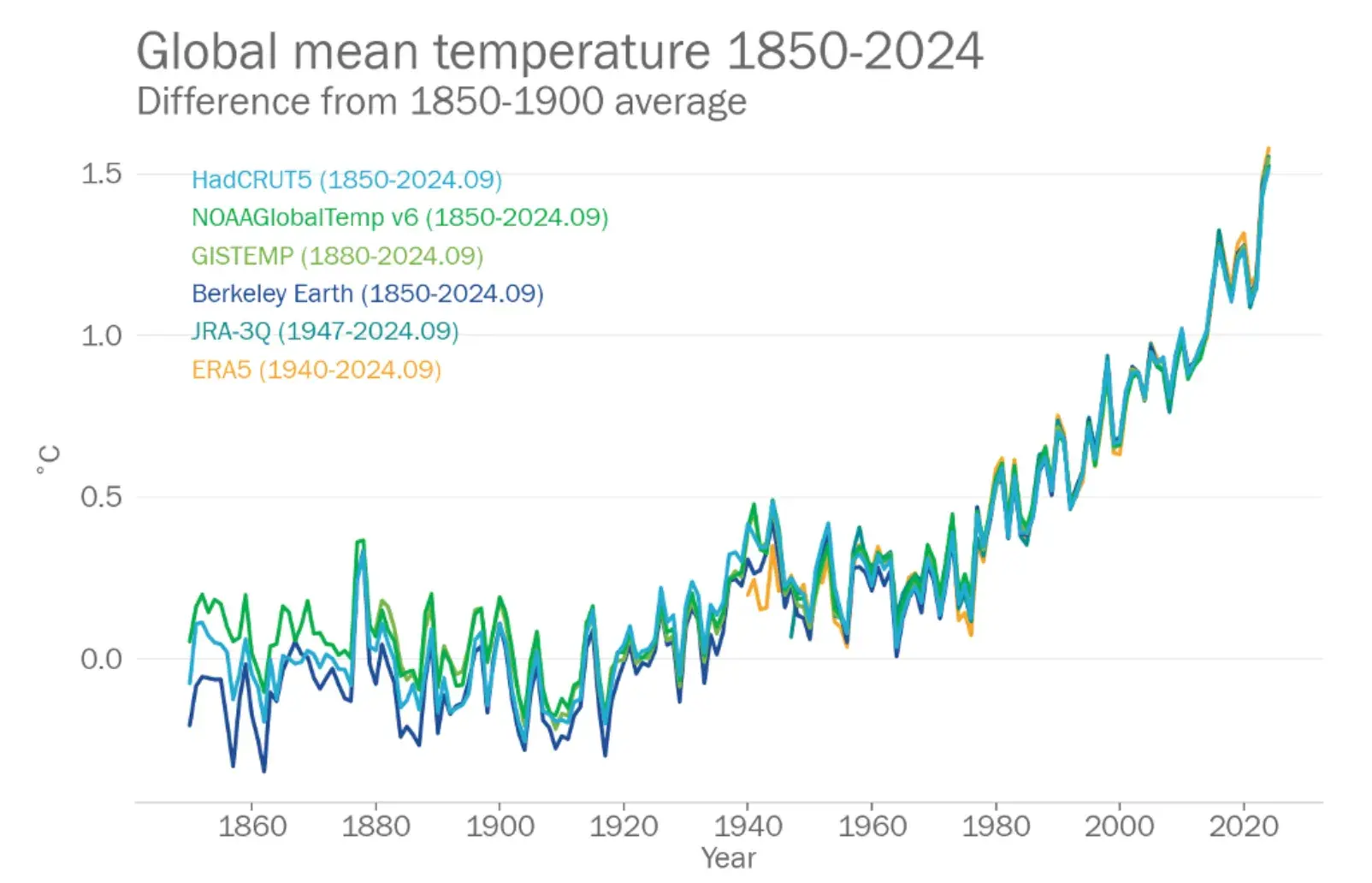
In this chart, the World Meteorological Organization aims to show the increase in global mean temperature over the last two centuries. The chart displays data from six global surface temperature datasets used to track and analyze the average temperature of the Earth’s surface over time.
According to all six datasets, 2024 was the warmest year on record, with a global mean surface air temperature of 1.54C.
What I like: The graph represents each dataset with a different color so you can see when and how they converge. So, while there may be some slight differences between at least three datasets for the years 1860 through 1880, all six agree that the global surface temperature has been rising steadily since 1970 at the same levels.
3. The Advent of Generative AI
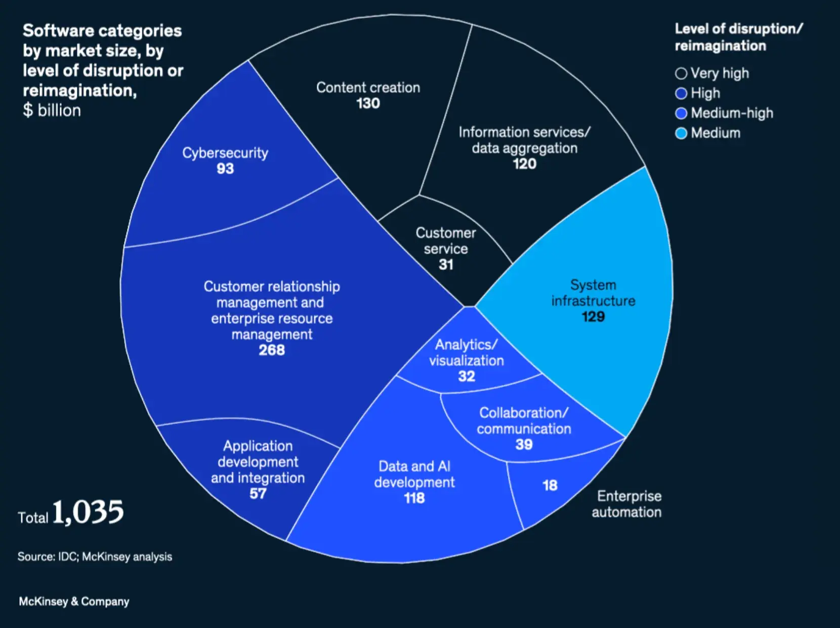
This pie chart aims to show the software categories that will be affected by the rise of generative artificial intelligence (AI). It also shows the degrees to which each categories will be disrupted. For example, content creation would likely be affected the most by generative AI, while system infrastructure would be affected the least.
What I like: I like how easy it is to read the data on this pie chart. The names of the industries are clearly listed, as well as their individual monetary values. There’s also a color scheme that lets you know the level of disruption/reimagination each category will undergo. So, at first glance, you know what you’re looking at and what it means.
4. Labor Supply Growth in Different Countries
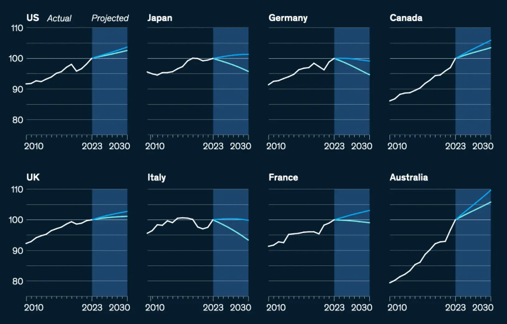
Instead of using eight different-colored lines on a single graph to represent this data, this chart comprises eight distinct charts for each country. Each chart depicts the actual labor supply growth in that country from 2010 to 2023 and then the projected growth from 2023 to 2030.
What I like: If the lines don’t converge at some point (like in the global warming chart), a stacked line chart can be a bit difficult to read. I like that McKinsey decided to separate all eight charts and make the data easy to read.
I should note, though, that the point of these charts isn’t to know the exact figure of labor supply. Instead, the visualization notes where labor supply has been growing and will continue to grow (or not).
5. Workforce of B Corps
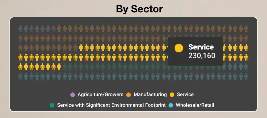
This pictogram aims to show the population of the workforce of the B Corps by sector. It divides the workforce into five sectors: Agriculture, Manufacturing, Service, Service with Significant Environmental Footprint, and Wholesale/Retail. Then, it uses different-colored pictograms to depict the number of B Corps workforce in each sector.
What I like: Pictograms are a neat and engaging way to display data, especially when you’re able to hover over each variable and get the exact number/value of the data. For example, in this chart, hovering over the yellow pictogram (which represents Service) shows that the population of the B Corps workforce in that sector is 230,160.
6. Popular Opinion of China Over Time in Select Indo-Pacific Nations
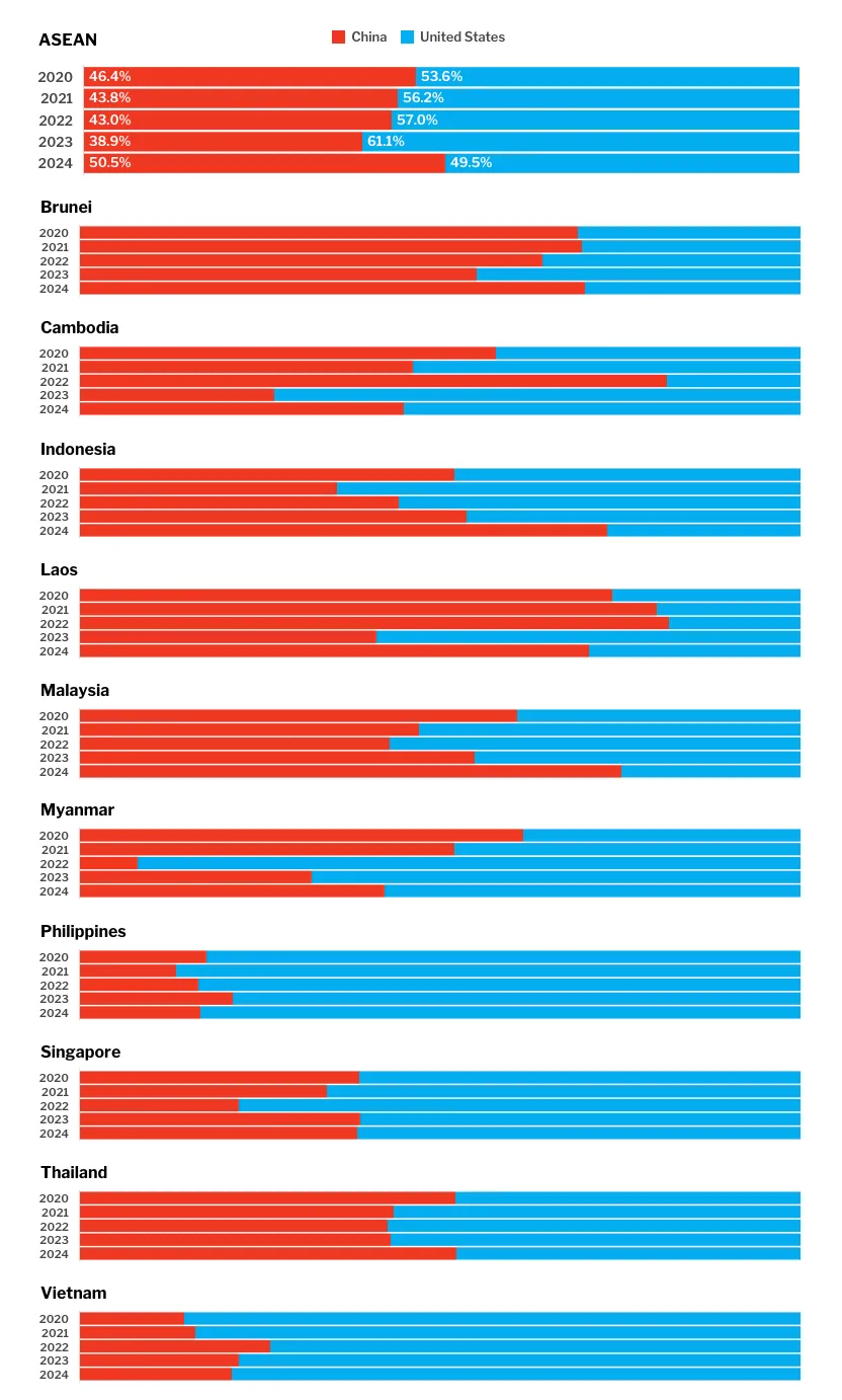
This chart depicts the results of five surveys in which 1,000 – 1,700 respondents were asked, “If the Association of Southeast Asian Nations (ASEAN) were forced to align itself with one of the strategic rivals, which one should it choose?” The rivals in question are China and the United States, and the surveys were done yearly from 2020 to 2024.
What I like: At the top of the chart, there’s an aggregated graph compiling the answers of all the member countries of ASEAN, which determined that, as of 2024, they’d rather side with China than with the United States.
However, I love that the charts below break down how respondents from each member country responded over the years. When you hover over the red or blue bars, you see the percentages of people who picked either option.
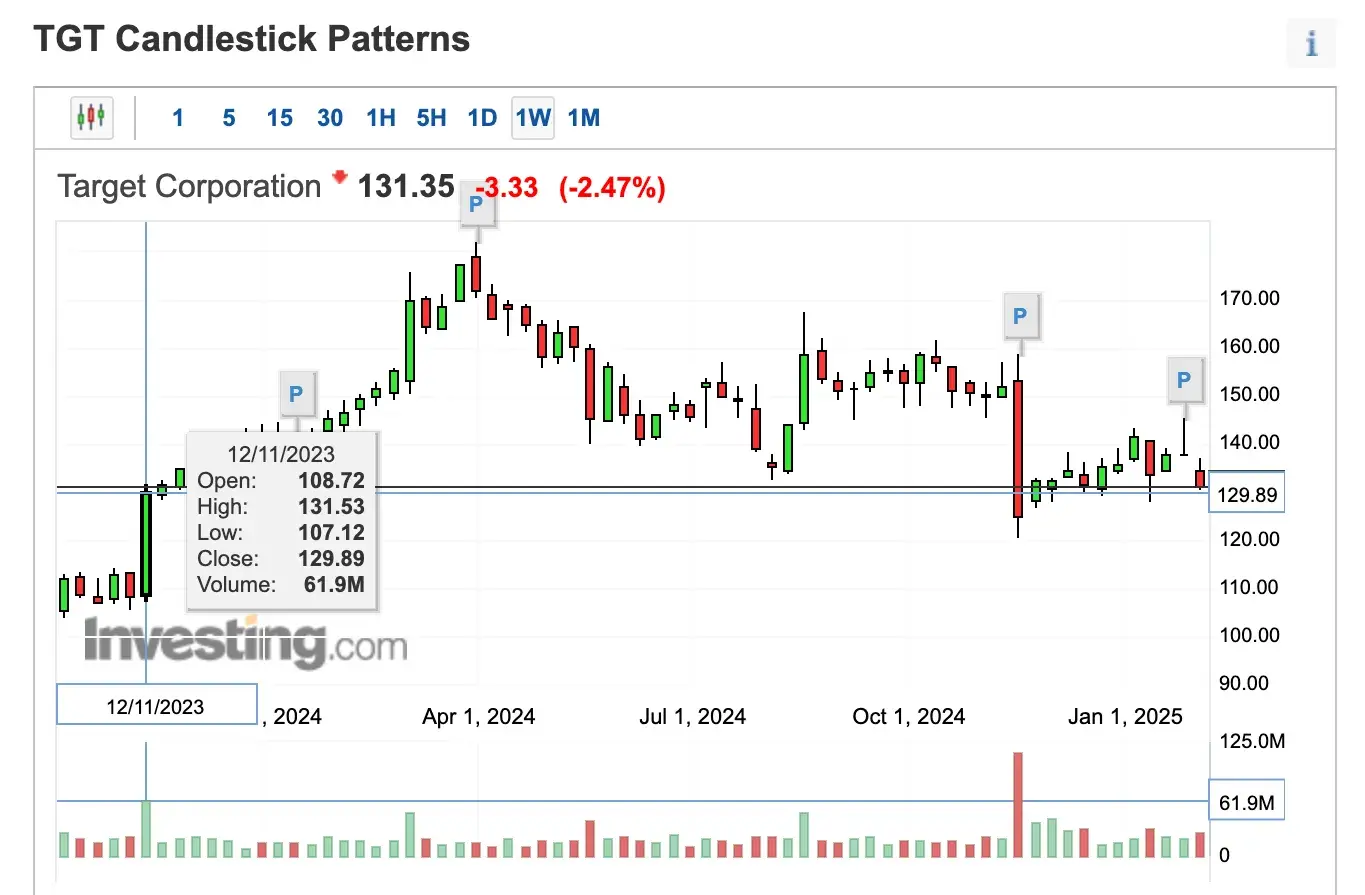
7. Target Candlestick Chart
This boxplot chart follows the movement of Target’s stock in the market over the past week. Each candlestick represents certain values that show traders/investors when it’s okay to enter or exit the market to maximize profits and minimize loss.
What I like: Beginner traders/investors (like me, for example) might not be able to look at the candlestick patterns and immediately know what they mean. So, I appreciate that hovering over each candlestick reveals important values like Open, High, Low, Close, and Volume, which can inform my trading decisions.
9. Popularity of Basketball and Football in the United States
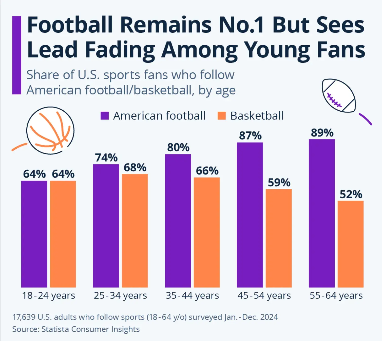
In 2024, Statista surveyed 17,639 American adults who followed sports and asked them which one they followed: American football, basketball, or both. These adults ranged from 18-64 years old, so Statista broke them up into five categories based on age and plotted their answers on this bar chart.
What I like: I like how each variable was represented with two highly contrasting colors and how the percentages are put atop each bar. This ensures that, at first glance, you can glean information from the chart. For example, I immediately know that Americans between the ages of 35 and 44 follow American football more than they do basketball.
Examples of Interactive Data Visualization
10. Private Equity Interest in Mining
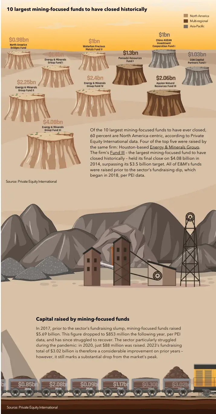
This infographic-like chart shows the history of private equity’s interest in mining. It starts with a breakdown of the 10 largest mining-focused funds to have closed historically, with the colors of the tree stumps signifying the locations of the funds (e.g., North America, Asia-Pacific, and multi-regional).
It’s a really long graph (only half of it is in the screenshot above), and as you scroll, the information, graphics, numbers, etc., slide onto/appear on the page.
What I like: This interactive chart is made up of different kinds of graphs, including pictograms and bar graphs. I love how the chart compiled all this data in an engaging and reader-friendly manner.
11. How Different Nations Approach Governance
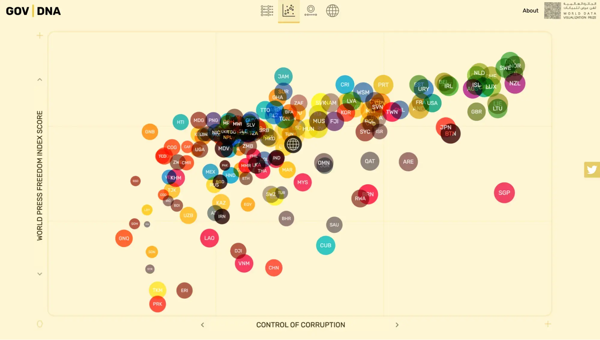
There’s no definite answer to the question of what role the government should play in everyday people’s lives. However, this interactive visualization lets you explore how different nations approach governance today.
It measures several indicators, including the rule of law, control of corruption, judicial effectiveness score, government integrity score, property rights score, tax burden score, overall economic freedom score, financial freedom, and life expectancy, among others.
What I like: I love how in-depth this interactive visualization is. Not only does it show you the scores of different countries based on one of the several indicators it measures for, but it also has different chart types to help you discover trends and interpret the mountain of information better.
For example, if I want to see the details of Malaysia’s control of corruption, I could click on it and get information about Malaysia’s Gross Domestic Product (GDP), GDP growth, health expenditure rate, employment rate, government spending score, school life expectancy, and more.
12. NASA’s Eclipse Explorer
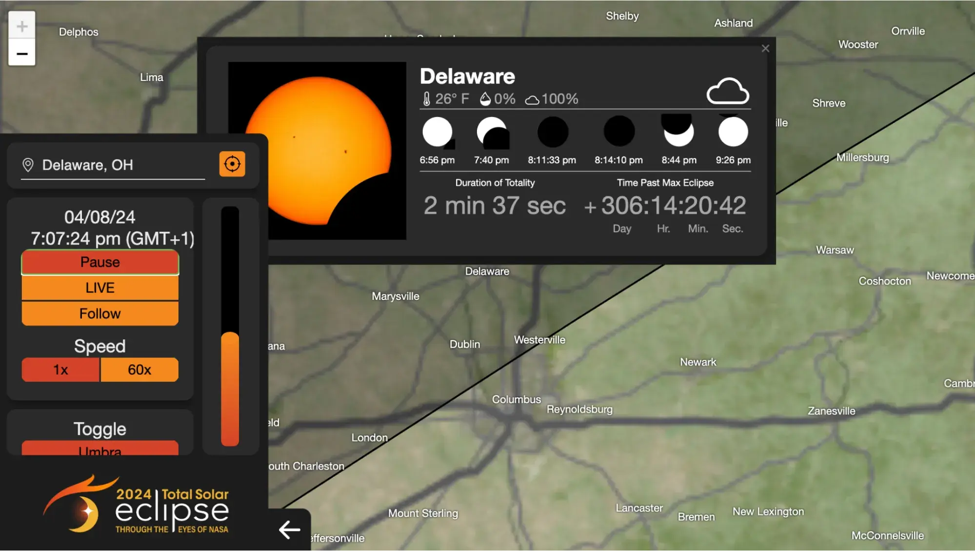
NASA created this interactive map to help people who’d like to witness a solar eclipse know when one will be happening in their location. On the map, you can look up your city, zoom in and out of the map, and get information on when the next eclipse is estimated to happen.
What I like: I like that the information is spelled out for people, but they’re still able to dictate what they’re looking for. For example, I searched for Delaware, Ohio on the map. It immediately brought up information about the next eclipse to happen in the city, what time it will happen, how long total coverage will last, and even the estimated temperature of that day.
13. North Korea’s Trash Balloons Explained
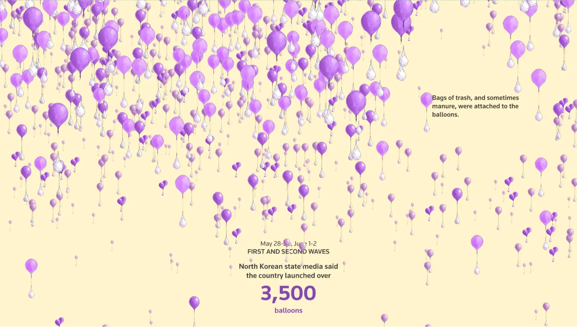
For this interactive visualization, Reuters takes the storytelling route to explain the balloons North Korea launched into South Korea last year. The visualization comprises mostly purple balloons with other bags attached to the ends, symbolizing the bags of trash/manure that North Korea attached to the ends of the balloons it launched into South Korea.
What I like: This visualization takes you on a journey. When you first scroll, there are tons of balloons to give you an idea of the scale of the balloon launches. Then, the number of balloons will be reduced relative to the batches that North Korea sent.
I love how Reuters accompanies each wave of balloons with some information about the dates North Korea sent it and how many balloons it sent.
14. Parallel Lives
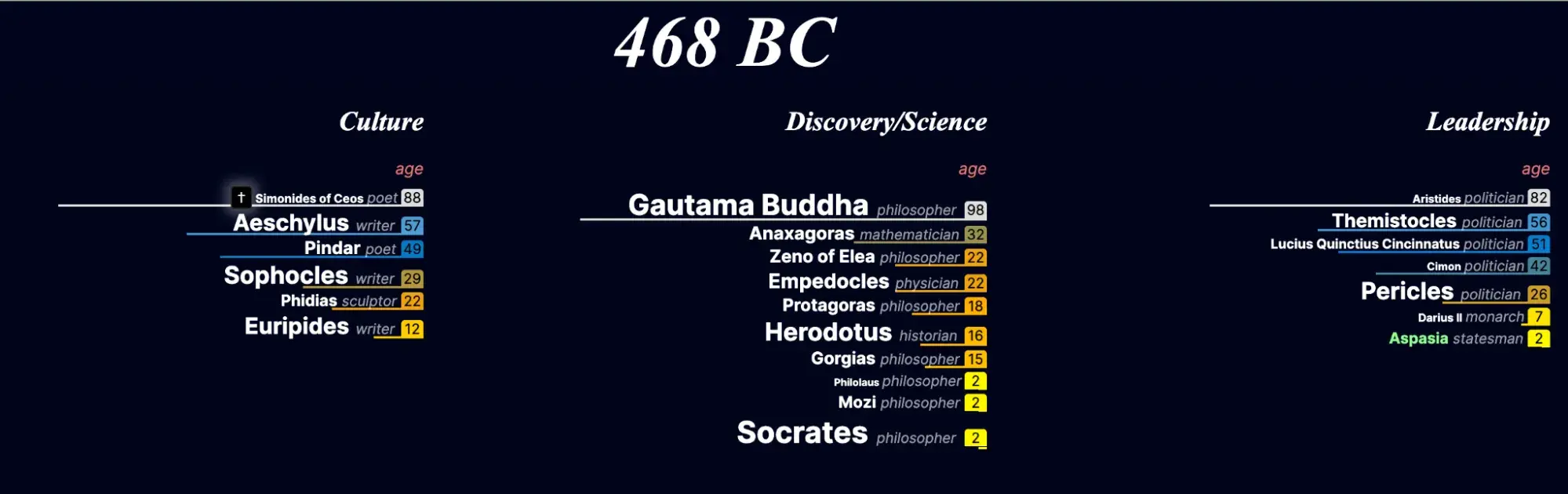
This Parallel Lives interactive visualization is a database of prominent historical figures. These figures are grouped into three categories based on their professions and impact: Culture, Discovery/Science, and Leadership.
This graph starts at 3,345 BC, and as you scroll down the graph (and down the years), you see the names of prominent people who existed at the same time across these categories. For example, in 486 BC, Euripides, Socrates, and Pericles were all alive, although they were 12, 2, and 26 years old, respectively.
What I like: I love how this visualization allows you to contextualize the lives of these figures in relation to one another. It provides their names, professions, and ages, which gives you a broad look at what life might’ve been like at that time, especially if said figures existed in different parts of the world.
15. The Wealth Disparity Gap

The larger a number is, the harder it becomes to mentally picture and understand just how large it is. So, while most people know the difference between $100 and $1,000, a lot of people (myself included) can’t really picture $1 billion, let alone $320 billion (Elon Musk’s net worth).
With this interactive visualization, Jason Zhang (the creator) uses familiar objects to help folks understand the growing wealth disparity and its societal implications.
What I like: Just like the Reuters visualization, I love how Jason used objects people see fairly often to help people contextualize wealth.
For example, this visualization explains that $320 billion is the same as stacking checks of $1 million each atop each other till they reach the height of a 10-story building. It also notes that even if you (and I) make $1 million per hour (I wish!), it’ll still take over 100 years to make as much money as Elon Musk.
That description alone makes it easy for me to understand the wealth disparity gap between the upper 1% and the rest of us.
16. Is the Love Song Dying?
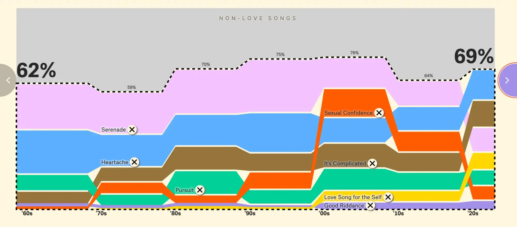
The creators of this fun and insightful visualization wanted to explore the idea that love songs are dying. To do that, it analyzed all 5,100 Billboard Top 10 hits from 1958 to 2023 and isolated the love songs from the bunch.
The visualization then put these love songs in different categories (e.g., Serenades, Heartache, Pursuit, It’s Complicated, etc.) and plotted them on a chart to see if they’ve increased or declined over the years.
What I like: This data visualization comes in 25 slides, and I love how the creators, David Mora and Michelle Jia, created a narrative for each slide to explain the different kinds of love songs and the evolution of this genre over the last 5-6 decades.
17. Most Popular Thanksgiving Pies Across the U.S.
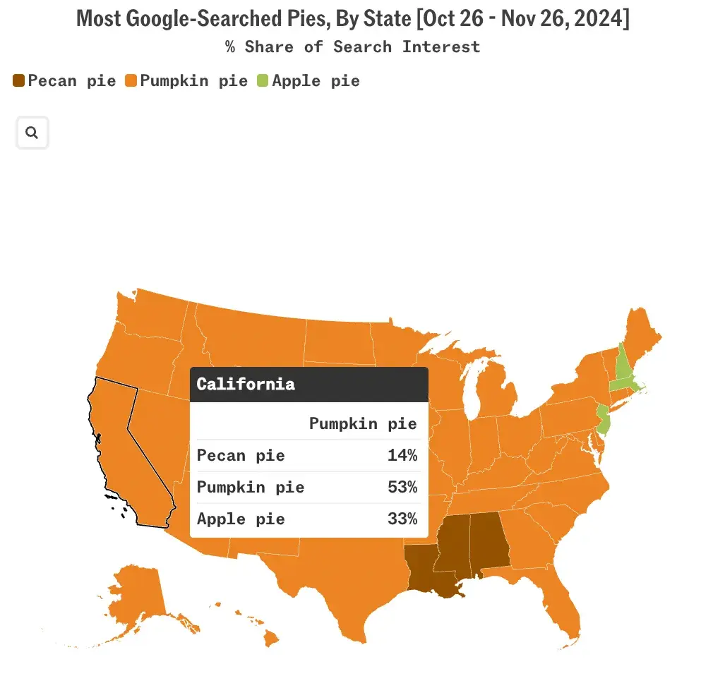
Many American families enjoy pie on Thanksgiving, but the flavors they choose vary significantly across different states. Using the Google Trends data from October 26 to November 26, 2024, Sherwood News created an interactive choropleth map showing the most googled pie types by state.
What I like: Because of the colors, I can immediately tell that pumpkin pie dominated the Google searches in most American States. However, the map goes on to provide more information when I click on a specific state.
So, while pumpkin pie was the most popular in California (53%), the map also shows that 33% of families searched “apple pie” and 14% searched “pecan pie.”
18. Sitters and Standers
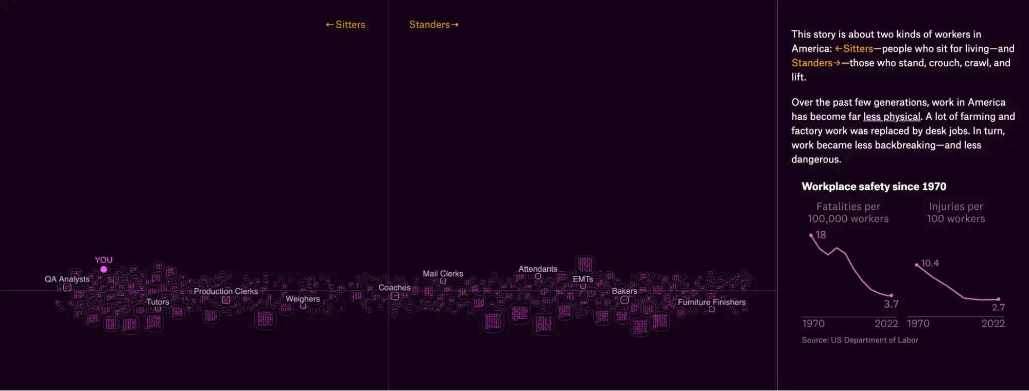
Over the last five decades, work in America has become far less physical. Farm work and factory work that require standing are increasingly being replaced by desk jobs, which are sedentary.
The Pudding developed this interactive scatter plot that shows the divide between occupations where workers typically stand and those where they typically sit in relation to your own job (whether you sit or stand).
Each square represents a specific occupation, with each person icon within it representing 50,000 Americans in that role. The occupations are arranged horizontally, with “sitter” jobs on the left and “stander” jobs on the right.
What I like: I like how this interactive scatter plot allows you to zoom in and out to explore the jobs in the middle of this divide. It also plots for different job attributes, such as the ability to choose whether to sit or stand, education levels, income, opportunities to pause work, and exposure to environmental elements.
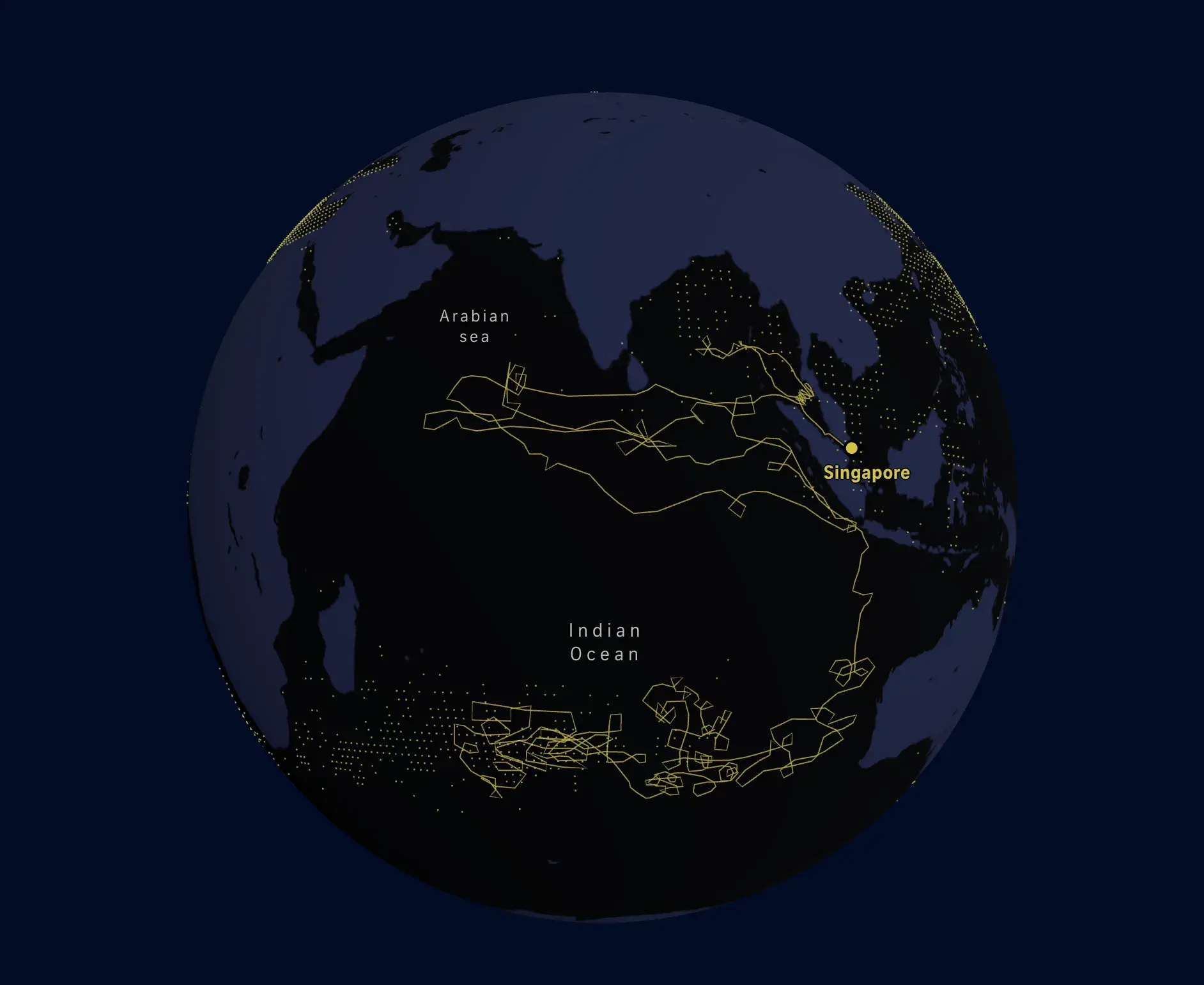
19. Iran and South China Sea Oil Trade
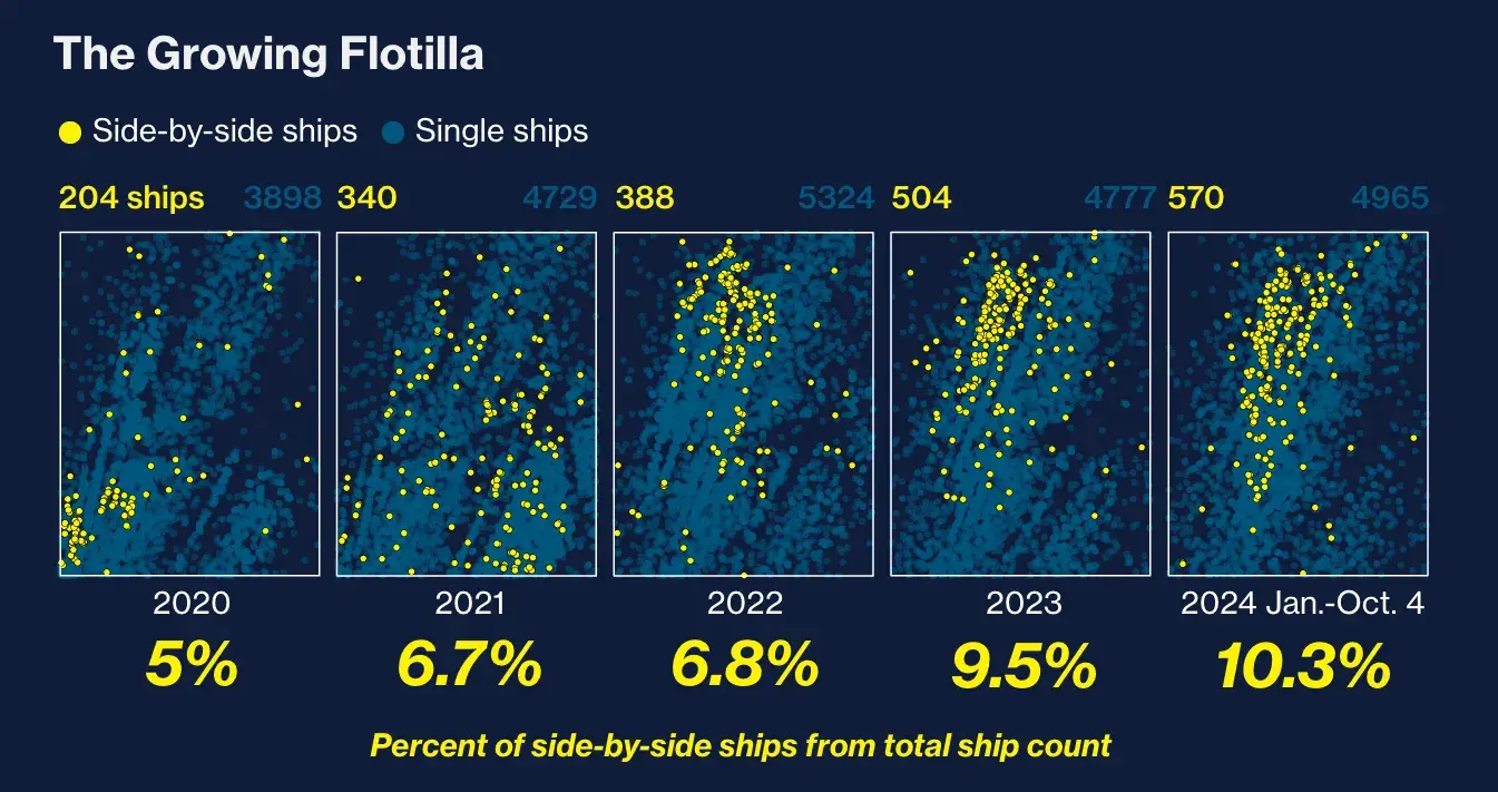
The world’s largest gathering point for dark fleet tankers is forty miles east of the Malaysian peninsula. Here, these tankers, which operate without insurance, transfer millions of barrels of sanctioned Iranian oil to China.
The charts above are a result of Bloomberg analyzing five years of satellite imagery of this region to reveal the rapid growth of this shadowy oil trade.
What I like: I love how these charts clearly show the increase in side-by-side ships in the region from 2020 to 2024, especially with the exact percentages written underneath each chart.
Rather than plot this information on a line or bar chart, Bloomberg used a scatter plot to help viewers visualize the areas where these ships appeared each year. This way, you can see that between 2020 and 2024, the ships grew by over 100% and became more concentrated.
20. Tracing Microplastics
About 170 trillion microplastics are floating in the world’s oceans, posing serious threats to marine life, aquatic ecosystems, and our food chain.
To give readers an idea of how dangerous these microplastics are, The Strait Times uses an interactive storytelling experience to explore the Indian Ocean Garbage Patch, where microplastic concentrations can reach over one million particles per sq km.
What I like: I love how methodically this “scrollytelling” experience breaks down the effects of microplastics in oceans and why people should care more about it. It takes you on a journey from South Asia to East Africa, illustrating how textile microfibers from washing machines enter these garbage patches and the consequences of this environmental hazard.
21. PIN Code Popularity
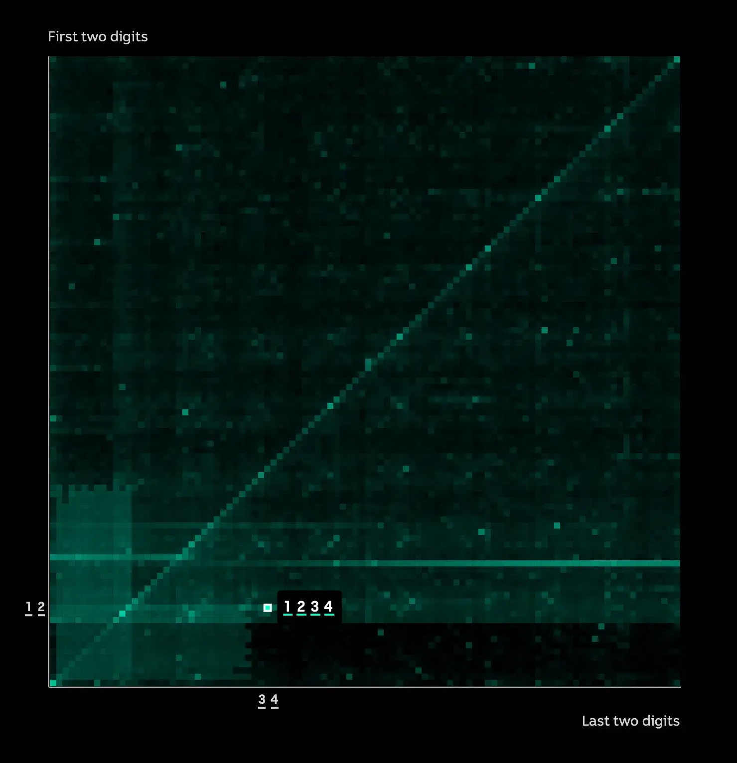
Many people rely on four-digit PINS to unlock their phones, access their bank accounts, and verify their digital identities. Yet, many people subconsciously choose highly predictable codes that scammers can guess.
ABC News analyzed millions of PINs exposed in data breaches and created this interactive heatmap chart to show how common and vulnerable certain PIN combinations are. The brighter the square (bright green), the more vulnerable that number is.
For example, the combination 1234 makes up nearly 1 in 10 of the millions of PINs ABC News analyzed.
What I like: I like how this heatmap isn’t just a chart; it’s a mindreader of sorts. Beyond exposing vulnerable PIN combinations, it goes into why people are likely to choose these numbers. When you’re aware of how high your chances are of being hacked when you use these numbers, you’re more likely to avoid them.
The good examples of data visualization above are great to reference while you develop your approach. However, it‘s also important to consider the less effective ways to go about data visualization so you know what to avoid — so, let’s cover some bad examples next.
Bad Data Visualization Examples
There are many ways in which data visualization can go wrong.
For instance, look at this data visualization example of MLS salaries in 2013. The sheer amount of information on this chart makes it difficult to read.

Additionally, the scale of the variables requires audience members to zoom in significantly to read the data. Some of the boxes that are being used to depict data appear to be vertical while most are horizontal — this also makes the information confusing to read.
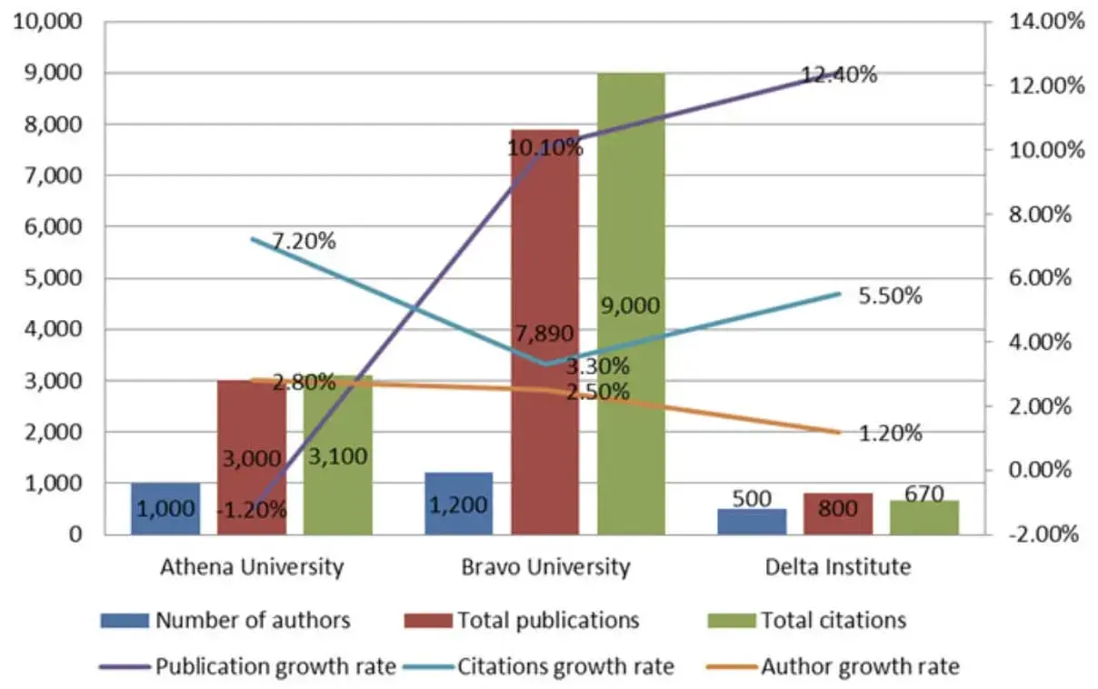
When you include several completely different variables within a single visual, it also becomes complicated for audience members to understand — the following chart is an example of this.
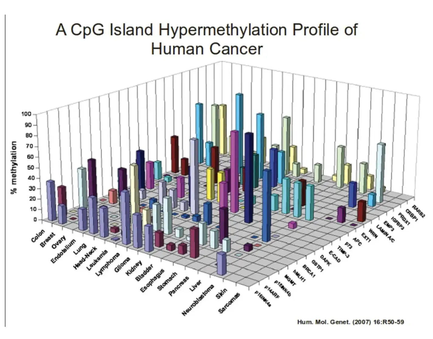
Something else you‘ll want to do is make sure you’re not making your visual more complicated than it needs to be. For example, this chart has a number of variables that are depicted by 3D bars. This graph doesn’t need to be 3D — in fact, it simply makes the information more difficult to understand and view.
Lastly, let’s review some data visualization tools to help make this process simpler.
Data Visualization Tools
There are a number of data visualization resources available today but the following list is here to help get you started. Don’t be afraid to test out a few options to determine which option suits your needs (and data) best.
1. HubSpot
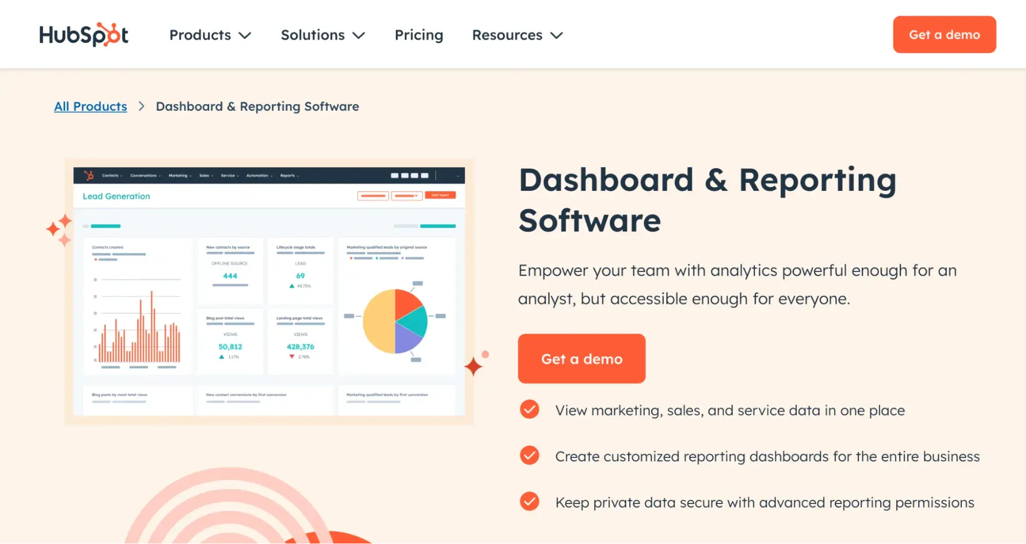
HubSpot’s Dashboard and Reporting Software is designed to bring all your critical business data into one centralized platform. It allows you to create custom dashboards and reports that reflect your marketing, sales, and service performance.
With its intuitive drag-and-drop interface, you can easily build visualizations that highlight key metrics, track campaign progress, and monitor customer interactions. The tool also integrates seamlessly with other data sources to ensure that all your important information is easily accessible in one place.
2. Tableau Desktop
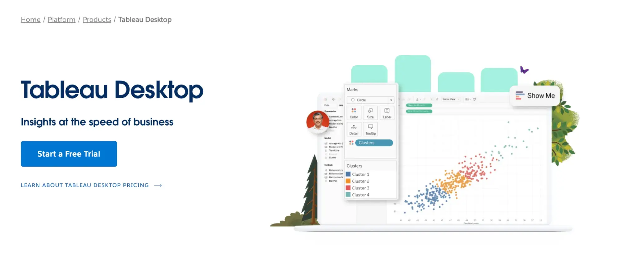
Tableau Desktop is a powerful data visualization tool that helps you connect to various data sources and create interactive dashboards with ease. There are easy-to-make maps, indicators, and many more visuals, as well as straightforward analytics that allow you to derive actionable information from calculations, reference lines, and forecasts as a result of your visuals.
With built-in analytics features and support for a wide range of data connectors, Tableau Desktop simplifies the process of exploring and sharing your data.
3. Databox
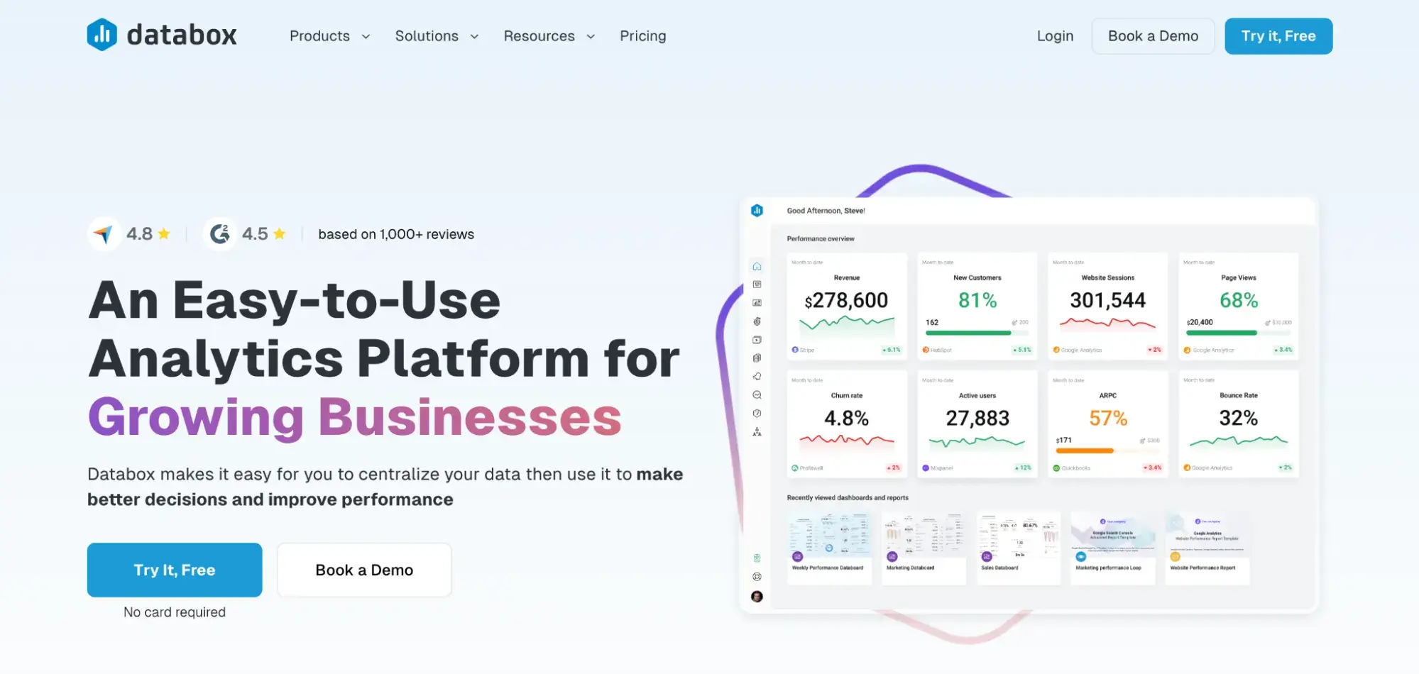
Databox is designed to bring all your data sources together into one centralized dashboard. There are over 100 integrations that can help you quickly and easily create visuals with pre-built dashboards and reports. You can also create custom metrics and monitor your KPIs in real-time.
Databox then allows you to connect to Google Sheets or an SQL database, or you can push it via API to view and share your data.
4. Google Charts
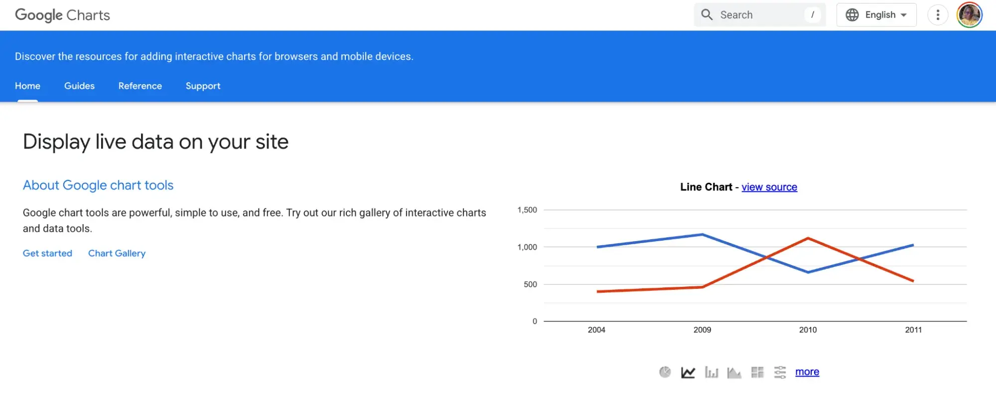
Google Charts is a free tool from Google that lets you create a wide variety of interactive charts for your website or web app. It uses HTML5 and SVG technology to render high-quality visuals that work across different devices and browsers. The tool offers a simple API that makes it easy to integrate custom charts into your projects.
With extensive documentation and many chart types available—from line charts and bar charts to more complex maps and gauges—Google Charts provides flexible customization options to meet your specific data visualization needs.
Grow Better With Data Visualization
Working on this piece has made me realize that data visualization isn’t just about making data look appealing—it’s a powerful tool that helps me (and you, hopefully) quickly identify, discuss, and act on insights.
By experimenting with various visualization tools and drawing inspiration from both successful examples and common pitfalls, you can transform complex data into clear, actionable information for your audience.
Editor’s Note: This post was originally published in March 2015 and has been updated for comprehensiveness.
![]()