How to Create a Heat Map in Excel
Heat maps in Excel help businesses to visualize large data sets, transforming a pool of numbers into easily interpretable graphs. For example, a retailer can use a heat map to analyze sales data and find products that sell more during specific seasons.
In short, heat maps help you find and color-code correlations that may have been difficult to discern from raw data.
This guide will show you how to create heat maps in Excel of different types:
- A simple heat map with conditional formatting.
- A heat map with a custom color scale.
- A geographic heat map.
Let’s get started.
What is a heat map in Excel?
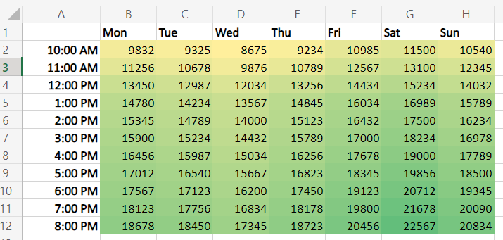
A heat map in Excel is a color-coded snapshot of your data, which helps you analyze thousands of data points and spot negative and positive trends and correlations at a glance.
Lighter colors represent lower values. Darker shades stand for higher ones. Though, you can invert them.
For example, you can depict higher conversion rates in green and lower in red.
What falls in between will be colored in orange and a gradient with different shades of the three colors based on the value. Or you can fill cells in gradient shades, as shown in the example below.
The Benefits of Using Heat Maps.
Let’s go over four core benefits of Excel heat maps tailored to business needs.
1. Quick Data Interpretation
One of the primary benefits of using heat maps is the speed of data interpretation.
Consider a financial analyst assessing a company’s monthly expenses across different departments. Instead of working their way through a sea of numbers, analysts could use a heat map to quickly identify the departments with the highest and the lowest spending alike.
This allows for rapid insights and informed financial planning.

2. Discerning Trends and Patterns
Heat maps unveil hidden trends and patterns in your data that might be missed in raw, numerical form. For instance, a pet store could apply a heat map to analyze sales data over time (or for specific goods).
This way, you can spot a trend of higher sales during certain months or days, indicating peak shopping periods and helping in inventory and marketing planning.
3. Enhancing Presentations and Reports
Turn dull spreadsheets into engaging and representative visuals, making your reports easily read.
Suppose a marketing manager is presenting campaign performance to stakeholders. A heat map can quickly communicate which campaigns were successful and which fell short and why, ensuring clear and effective communication.

4. Simplifying Decision-Making
Are you a logistics manager at a manufacturing firm who must understand delivery times across different regions? Use Excel heatmaps.
Color regions with longer delivery times in darker shades to point out logistical inefficiencies.
So, how do all of these work in real life? Keep reading for tutorials.
How to Create Heat Maps in Excel
Find step-by-step guides on creating heat maps with different formatting and for a map chart.
How to Create a Heat Map with Conditional Formatting
For example, you want to analyze a company’s monthly expenses across various departments.
1. Open Excel and input your data. Click and drag to select the numeric data you want to include in your heat map. In our example, these are the numbers from January to June for each department.

2. Open the Conditional Formatting menu. Navigate to the “Home” tab and click “Conditional Formatting” in the “Styles” group.

3. Apply Color Scale. From the dropdown, select “Color Scales.”
A set of preset color gradients will appear. Choose one that suits your needs. For this example, you might select “Green – Yellow – Red Color Scale.”
This scale will apply a gradient of colors where green indicates lower expenses, red indicates higher expenses, and yellow falls in the middle.
How to Create a Heat Map with a Custom Color Scale
Sometimes, Excel’s default color scales may not adequately represent your data, or you might want to align the color scheme with your brand colors. Or maybe you want to highlight the cells with lower/higher values than a given number.
In such cases, create a custom color scale. Here’s how to do it.
Suppose you want to find out which brands of dry dog food brought over $11,000 in revenue in the last six months.
1. Go to “Conditional Formatting” in the “Styles” group again. But from the dropdown, select “New Rule” or “More Rules…” It depends on your Excel version.
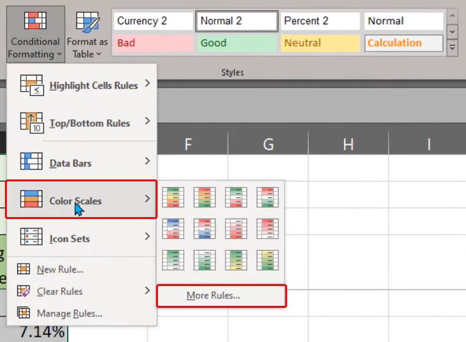
2. Select Rule Type. In the “New Formatting Rule” dialog box that appears, choose “2-Color Scale” or “3-Color Scale” based on your preference.
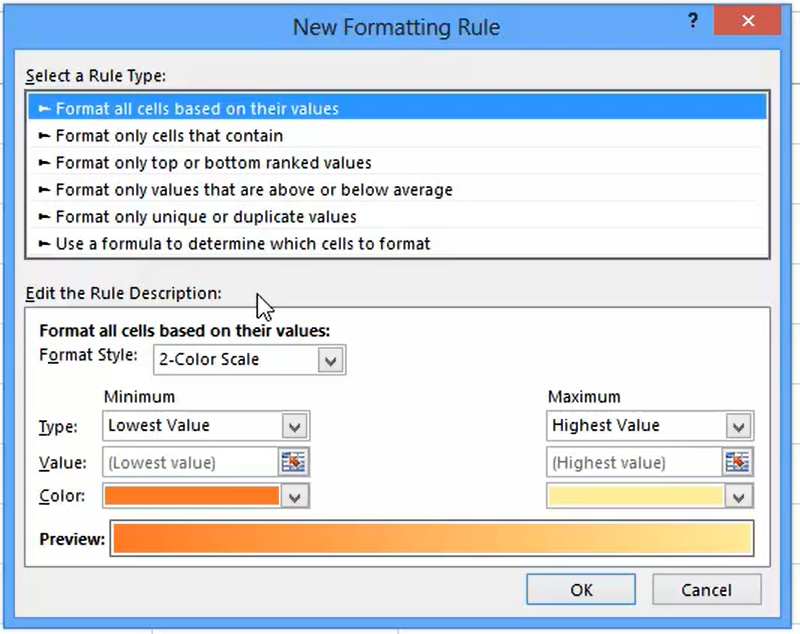
3. Set Colors and Values. Here, you can customize the colors for the maximum, midpoint, and minimum values.
Let’s say we choose dark blue for the highest values (>= $11,000), red for the lowest values, and white for the midpoint. You can also set the value for each point.

Click “OK” to apply the rule.
Watch the video on how to create advanced heatmaps in Excel.
How to Create a Geographic Heat Map in Excel
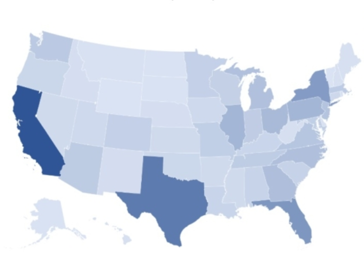
Creating a geographic heat map in Excel allows you to compare values and show categories across various geographical regions.
It‘s a valuable tool when you’re dealing with geographical entities like countries, states, counties, or postal codes.
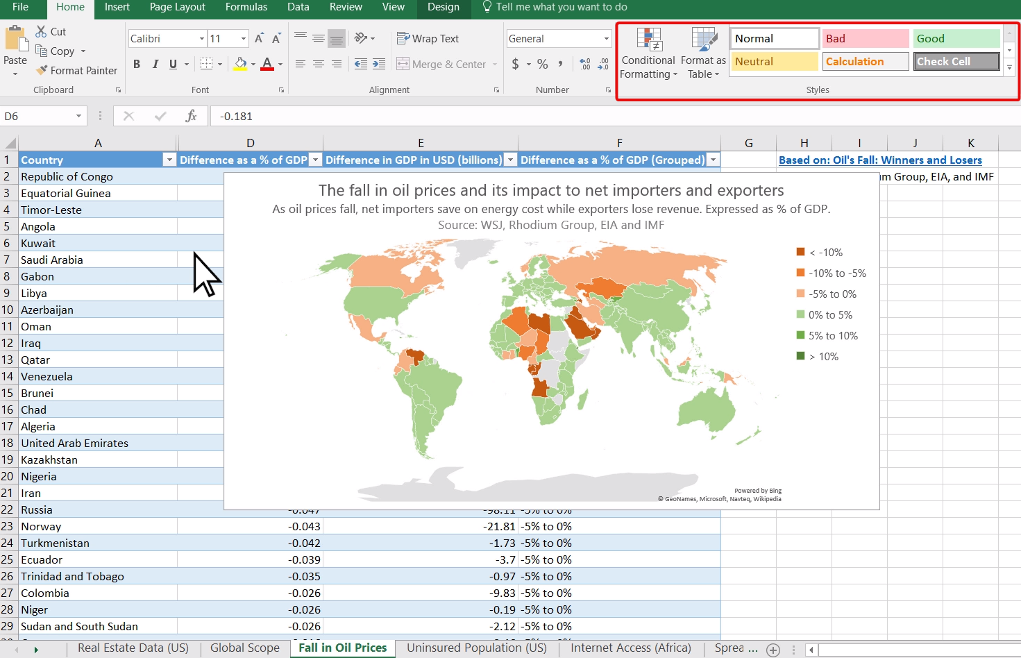
To create similar maps, simply select your data, including the headers, and in the Ribbon bar, select a Map chart or Recommended charts, so Excel can offer the most convenient map chart for your data.

If you want to color-code your map with conditional formatting, double-click on the map to trigger the formatting menu for maps. Then, select the color scheme. 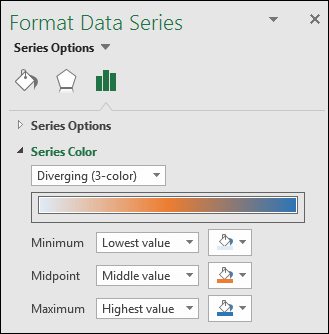
As you’re switching between options and colors, the changes are automatically applied. Thus, you can play with different options to choose the best one for your map visualization without going back and forth.
Discover all the intricacies of geographic map charts in Excel.
Use Heatmaps to Communicate Data and Get Buy-In
Visualizing data with heatmaps in Excel helps you effectively deliver key insights to your team, management, or stakeholders.
Whether you’re analyzing marketing campaign performance, tracking monthly expenses, or spotting trends in sales data, heatmaps offer an easily digestible, color-coded overview that aids strategic decision-making.
Go and try it out!
![]()


![Download 10 Excel Templates for Marketers [Free Kit]](https://no-cache.hubspot.com/cta/default/53/9ff7a4fe-5293-496c-acca-566bc6e73f42.png)

