How to Make a Histogram on Google Sheets [5 Steps]
Google Sheets offers many data visualization tools within its platform, with one of the most popular ones being the histogram.
Read more to learn what exactly a histogram is, what it’s used for, and how to make one on Google Sheets.
What is a histogram and what is it used for?
A histogram is a graphical representation showing the distribution of data points that have been grouped into specific ranges or categories.
Say you have a blog and you have blog posts ranging from 1 to 500 words, 500 to 1,000 words, and 1,000 to 2,000 words. You want to analyze which bucket gets the most organic traffic. You can use a histogram to accomplish this.
While a histogram looks like a bar chart, the two are not interchangeable. A histogram displays the frequency distribution of variables within a data set. A bar graph, however, serves as a comparison between separate variables.
Now that you know how to use it, let’s go over how to make one.
How to Make a Histogram on Google Sheets
-
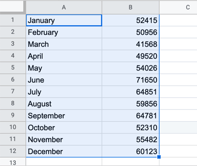
Select your data set.
-
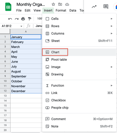
Click on “Insert” then select “Chart.”
-
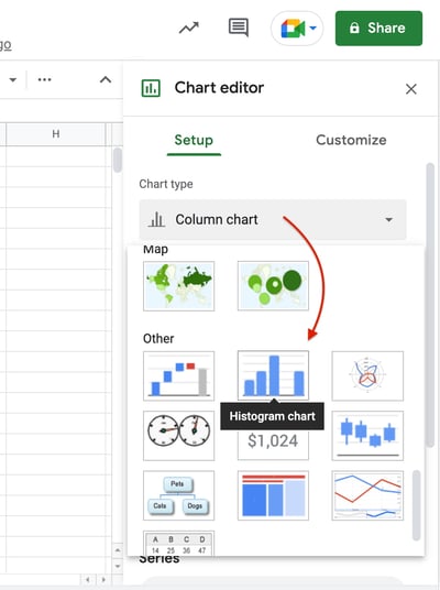
Click the drop-down menu in “Chart Type” then scroll down to the “Other” section.
-
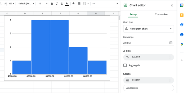
Review your histogram.
-
Edit your chart by clicking on the three dots and then clicking on “Edit chart.”
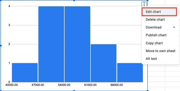
Use the chart editor to get the most out of your histogram. You can edit:
- The chart style by showing item dividers or changing bucket size for instance.
- The titles
- The series
- The legend
- The axis (both horizontal and vertical)
- The gridlines
There you have it – another helpful visualization tool you can use to understand your data.
![]()


![→ Access Now: Google Sheets Templates [Free Kit]](https://no-cache.hubspot.com/cta/default/53/e7cd3f82-cab9-4017-b019-ee3fc550e0b5.png)
