24 Best Free Marketing & Sales Icons for Your Website or App
I’ve abandoned numerous websites that were crammed with excessive text and bulky images due to their challenging navigation and overly bookish appearance.
 Being both a marketer and a customer in one, I naturally lean towards using icons. They are visually appealing, convey information and intent instantly, and make clicking effortless.
But not all businesses use icons to their full potential. So, I scrutinized dozens of websites and apps and talked to industry experts who’ve witnessed the “iconicness” of icons to gather their insights.
Explore how to use marketing and sales icons in the best ways possible. We’ll cover:
- Why use icons in marketing and sales materials?
- 5 Examples of Marketing and Sales Icons
- 7 Best Practices for Using Marketing and Sales Icons
- When Not to Use Icons
- Free Marketing Icons
- Free Sales Icons
Why use icons in marketing and sales materials?
Photography and typography are limited in business communication, and generic stock photos rarely align with the accompanying text. Icons, in turn, make your messaging unique, appealing, and memorable. They facilitate the understanding of ideas and concepts.
Let’s explore icons’ use cases in marketing and sales materials.
1. Icons make stuff easy to understand.
The brain processes graphic symbols much faster than actual words by giving them meaning and turning them into words. When we see an icon, it helps us understand the intended meaning faster — making complex concepts and terms easy to digest.
For instance, a checklist or a chart icon in sales presentations helps visually represent goals achieved and company growth.
![]()
![]()
2. Icons boost engagement.
Icons encourage and improve engagement. Adding clickable icons on social media, websites, or apps significantly increases users’ interaction with them. Similarly, when you add them to product guides, promotional videos, or sales playbooks, they bring in more responses and encourage readers to interact.
Some icons to use for engagement can be for simply displaying contacts, details, and info icons.
![]()
3. Icons help cut down on text.
Icons save space where text is excessively wordy. For example, if you’re listing the nutritional components of a product on a product guide, using icons for stating categories like 🍗 for protein, 🍞 for carbs, and 🍬 for sugar saves space and gets the point across creatively.
4. Icons support the text.
Icons provide additional context quickly and make the message more engaging and interactive. The “envelope” icon, along with the message “Contact us,” adds an inviting touch to an email or a web page.
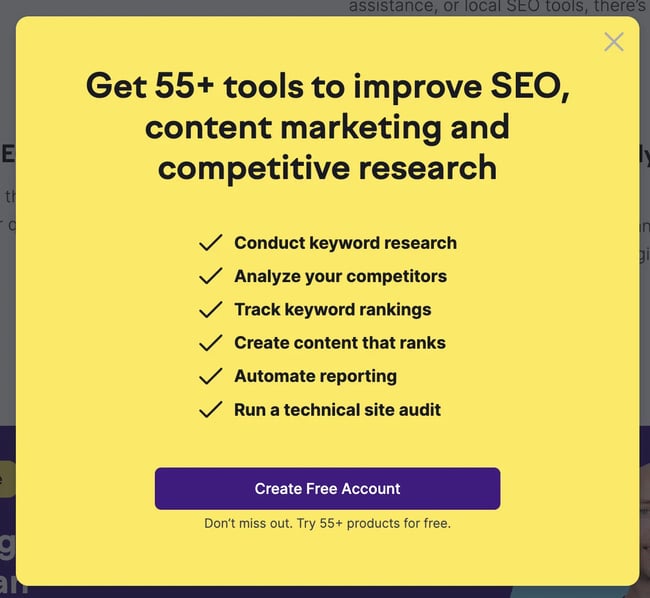
Likewise, the “checkmark” icon grabs the target audience’s attention when used in pop-ups — see Semrush’s example.
5. Icons break up the text.
Nothing makes a sales or marketing report as boring as long, continuous pages of text. Breaking it up with icons adds a visual appeal and conveys your message better than generic stock photos. They’re also easier on the eyes, which makes them an excellent replacement for heavy images.
Learn how to make sales performance reports in Excel interesting with this video.
6. Icons set your brand apart.
Using branded icons across different platforms and streamlining them with your marketing and sales materials helps you differentiate your brand from competitors and makes your material stand out.
Lavender.ai, an AI-powered tool for enhancing your sales emails, chose the “wizard” icon to be recognizable and memorable. Visit Lavender’s website, and the next time you think of an AI writing assistant, Lavender will pop up in your head. It happened to me at the time Lavender was just taking off.

7. Icons are universally understood.
You don’t need to translate an icon into a bunch of languages. They have a universal appeal and are instantly recognizable. Everyone knows a “bulb” icon means a “good idea.” A “star” icon shows certifications, and the ol’ right arrow button prompts you to keep going.


Get 30 customizable image icons for free.
Why are icons important in branding?
Icons become a part of your brand’s identity, set you apart, and facilitate brand recall. They also provide a consistent visual element across different platforms, reinforcing your brand identity and creating a uniform look and feel.
This also works for personal branding or employee advocacy when used on a large scale.
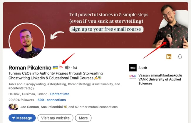
Roman Pikalenko’s LinkedIn page makes for a great example. He uses the flamingo icon in his marketing materials, name, sales deck, posts, and even on his shirt. If you’ve stumbled upon Roman’s page, chances are high you started associating 🦩with him.
When used on apps and websites, they improve user experience by making navigation and understanding of features and services more intuitive — making your brand user-friendly.
💡Pro Tip: Take the time to design well-structured and high-quality icons. I often associate a company that uses low-quality or poorly designed icons with a lack of authenticity and dedication to quality.
Learn how to design icons for your brand with this video:
5 Examples of Marketing and Sales Icons
Icons are used on websites and apps in a multitude of ways for countless reasons. Explore the prominent five.
1. HubSpot Icons
HubSpot offers a range of free icons for you to use as you please. Use them on websites, apps, and marketing and sales materials for the range of benefits they offer.
The clock icon, for instance, can be used to show time sensitivity on a sale, for scheduling meetings and appointments, for different time zones, or even as a loading icon. The “chat typing” icon is widely used on websites and apps for chat options, comments, feedback, sharing, notifications, and, of course, text messages.
2. Sharing Icons
Be it on Facebook, Instagram, or Pinterest, I find “sharing” icons incredibly convenient. They allow me to effortlessly share enjoyable content (like this post, wink wink 😉).
Add “sharing” icons to your website to allow users to distribute content across their own social networks. Plus, you get valuable data on popular content and platforms where the content is being shared. Use these insights to refine your content strategy.

3. Engagement Icons
These icons are commonly used for signing up, feedback, following, bookmarking, and downloading. They encourage website visitors to express approval, sign up, or ask questions.
For instance, Cognism uses the envelope icon to prompt the newsletter sign-ups.

4. Under Construction Icons
I particularly appreciate it when companies go the extra mile to include an icon when a page or website is under construction. Instead of feeling disappointed, I look forward to when the page goes up again.

5. Storytelling
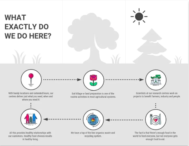
You can tell a story, or you can show it. Many companies now use icons to show processes and their brand story using icons. It sets you apart and looks appealing. But the best part is that icon usage makes your brand more likable and memorable.
7 Best Practices for Using Marketing and Sales Icons
Regarding branding, communication, navigation, and relatability, icons are used for almost any project from logo designs to CTAs to infographics.
Connor Gillivan, Growth expert and CEO of Trio SEO says, “These seemingly small graphics are communication powerhouses, capable of transcending language barriers and instantly conveying messages in an aesthetically pleasing manner.”
Gillivan notes icons resonate with visual appeal and direct comprehension, making them integral for platforms where brevity and impact are essential.
So, we know icons bring lots of value to your brand, but how do marketing and sales gurus get the best out of them?
Read these tips to find out.
1. Accentuate your services.
Use icons to creatively showcase your services without appearing pushy or overly assertive.
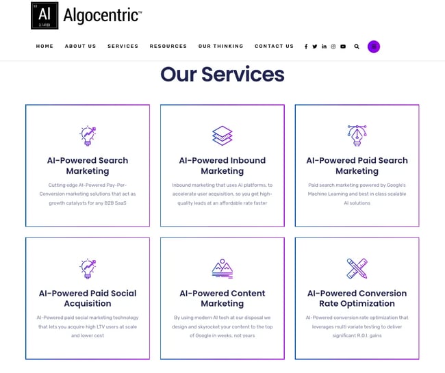
“We utilized marketing icons on our website’s landing page to highlight our core services: AI-Powered Search Marketing, AI-Powered Content Marketing, and AI-Powered CRO. Each icon was designed to resonate with the service it represented,” says Sergey Solonenko, founder and CMO of Algocentric Digital Consultancy.
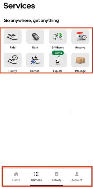
The use of icons is also a great solution for apps where space is limited. Uber relies on icons to succinctly convey information about its services and features with minimal text on their app. These icons cover a wide range of services while maintaining a simplistic and elegant look.
2. Highlight features on ecommerce websites and apps.
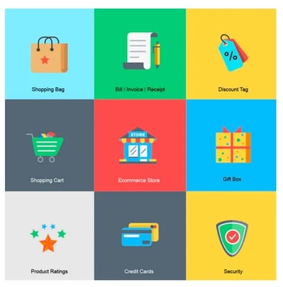
Use icons on your ecommerce website and app to make the shopping experience quick and enjoyable. They provide customers with a one-click solution for giving a rating, viewing their cart, or deciding on a payment method.
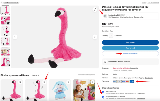
eBay uses icons to make their customer shopping experience easy. Customers can add a product to their wishlist or see the available payment options without going anywhere else.
3. Highlight information and services in emails.
Stuffing your emails with text is the fastest way to ensure unsubscriptions. Use icons for supporting links where you don’t want to use excessive text or in your email signature.
But make sure you add icons the right way. Adeline Knight, SEO Content Manager at Icons8, suggests using a special size.
“Maintain the right size. In email marketing, having undersized icons might lead customers to overlook key offers or information,” Knight says. “For better engagement, use distinct sizes like a 48x48px shopping cart icon. If resizing is essential, always scale in multiples, such as from 24x24px to 48x48px, to ensure visual quality.”
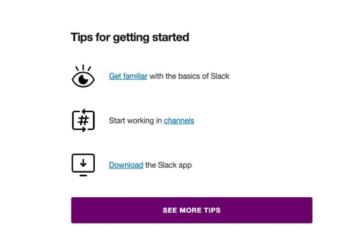
Look at this welcome email from Slack. It seamlessly incorporates these strategies to guide the reader without text.
4. Simplify your infographics.
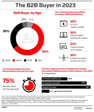
Infographics can be hard on the eyes and confusing when stuffed with text and heavy images. Substitute icons for words or legends when labeling chart columns or bars, as well as for numbers and bullet points.
See the example by Insider Intelligence; they’ve managed to get that balance.
5. Simplify complex concepts.
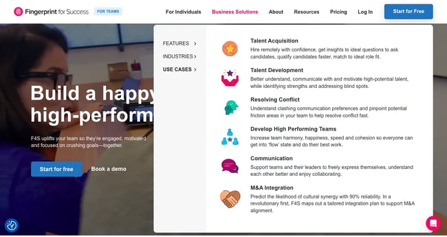
Icons help you support complex ideas or concepts by linking the outcome (an icon) with supportive text. For example, Fingerprint for Success visualizes their business solutions to facilitate the understanding of each.
6. Show your commitment to a cause.
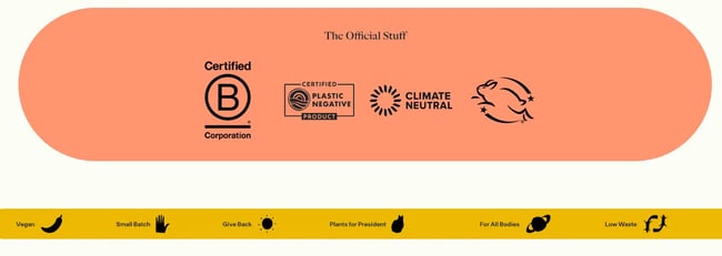
Small details account for big impacts. Show your commitment to social causes with relevant icons. Organic skin care cosmetics manufacturer Meow Meow Tweet astonishes with the creative use of icons to highlight their core values.
7. Provide structure.
Icons give your information a clear hierarchy, save screen space compared to text labels, and make for a responsive design.
Species in Pieces, an educational website dedicated to endangered species, creatively employs icons to inspire exploration and engagement with vital information. Icons make them look sophisticated and minimalistic.

“Prioritize alignment. Aligning icons evenly and spacing them consistently aids in creating a clean, organized layout that’s visually pleasing, making information more accessible and digestible for customers,” adds Adeline.
When Not to Use Icons
Icons have many benefits, yet there are instances where the use of icons may not be the best option.
- Using icons without clear text labels may hinder accessibility for blind individuals who rely on screen readers.
- In formal documents (like legal contracts or academic research papers), using icons may appear unprofessional or out of place.
- In technical or scientific diagrams (where precision and clarity are a must), use technical symbols (not icons) to avoid confusion.
- Research the cultural context when targeting a diverse audience. Icons that are innocuous in one culture might carry different meanings or connotations in another.
- Icons might come across as insensitive or trivializing when dealing with serious, sensitive, or emotionally charged subjects.
Free Marketing Icons
Designing the perfect marketing and sales icons takes a lot of time and resources; explore free marketing icons from these awesome companies.
Use free marketing icons for websites, social media, email marketing, print materials, apps, presentations, advertising, infographics, product packaging, and marketing collaterals.
- Icons8
- Flaticon
- Smashing Magazine
- Iconfinder
- Freepik
- Iconmonstr
- Behance
- Font Awesome
- Icon Archive
- Captain Icon
- Icon Scout
- Dry Icons
Free Sales Icons
Use free sales icons for presentations, reports, emails, CRM systems, training materials, pitches, invoices and payments, promotions, and sales collaterals.
- IconArchive
- Flaticons
- Noun Project
- Font Awesome
- Icons8
- Iconfinder
- Icon Packs
- Pngtree
- UXwing
- Icon Archive
- Icons-Icons
- Very Icon
Icons Enhance Branding Efforts
Blow away your customers by placing marketing and sales icons strategically and using them to enhance visual appeal, streamline information, and add value to your brand.
Provide a kick-ass user experience and boost engagement with high-quality, creative, and smartly placed icons.
Editor’s note: This post was originally published in September 2013 and has been updated for comprehensiveness.
![]()

