The 7 Best Practices for Building Fantastic Lead-Capture Forms
So you’ve created the perfect offer and built a web page to promote it. You now need a lead-capture form to collect information. So, what is a lead capture form?
In this post, you’ll learn the benefits of lead capture forms, as well as seven best practices that will help you attract prospects. This guide includes the following:
A lead-capture form helps you generate prospects who download resources from your landing page. These forms are common when promoting ebooks, case studies, research reports, and webinars.
Customers see a clear value in the offering. This value proposition compels them to trade their personal information for access.
Seven Best Practices for Building Lead Capture Forms
While lead-capture forms have many use cases, the best forms include the same components. See the seven elements your form must have and best practices for generating results.
1. Choose the right position on your landing page.
There’s no hard and fast rule on where to place your lead-capture form. Regardless, you’ll always want to keep your form above the fold. This means the form is prevalent and easy to spot without scrolling. Visitors then know the intent of your landing page immediately.
To ensure your lead-capture resource is the primary appeal of your landing page, consider using these four form positions.
Beside the Landing Page Offer
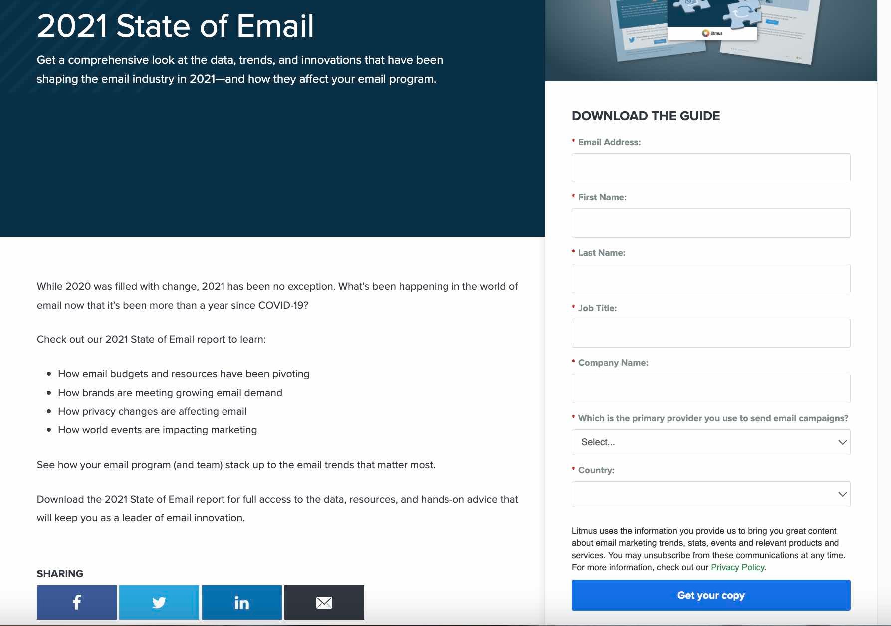
The form below is an example of one that’s above the fold. However, it’s not the most eye-catching element on the page — the content is.
Putting the form beside the landing page copy is a brilliant way to remind users of the valuable resource they’ll receive if they submit their basic information.
Within the Landing Page
If you have a lengthy landing page, including your form in at least three positions is ideal. We see this at play in this report, which contains over 1,000 words of content.
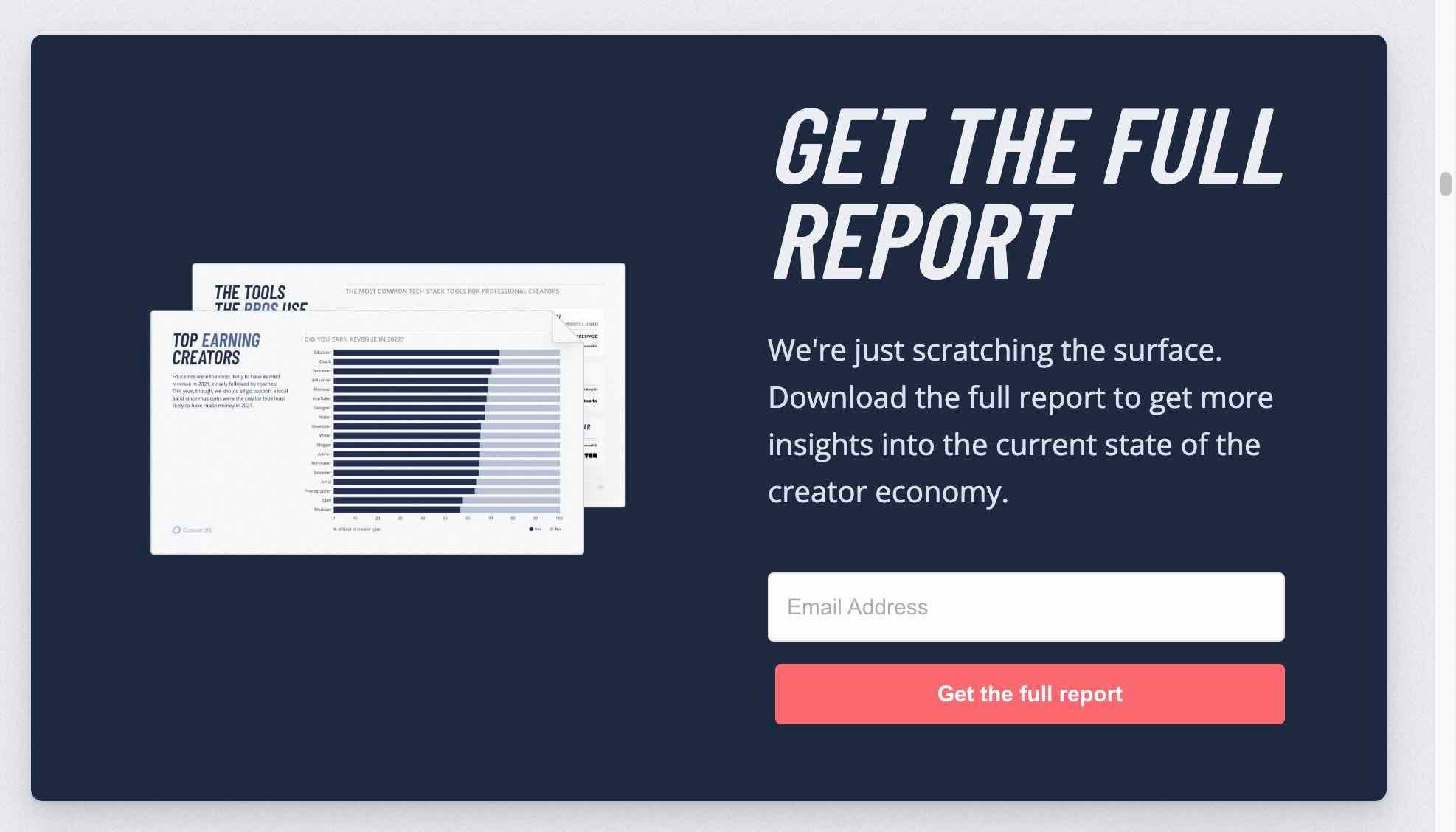
Pro Tip: As a rule of thumb, include a lead-capture form after every 350 words on your landing page.
In a Chatbot
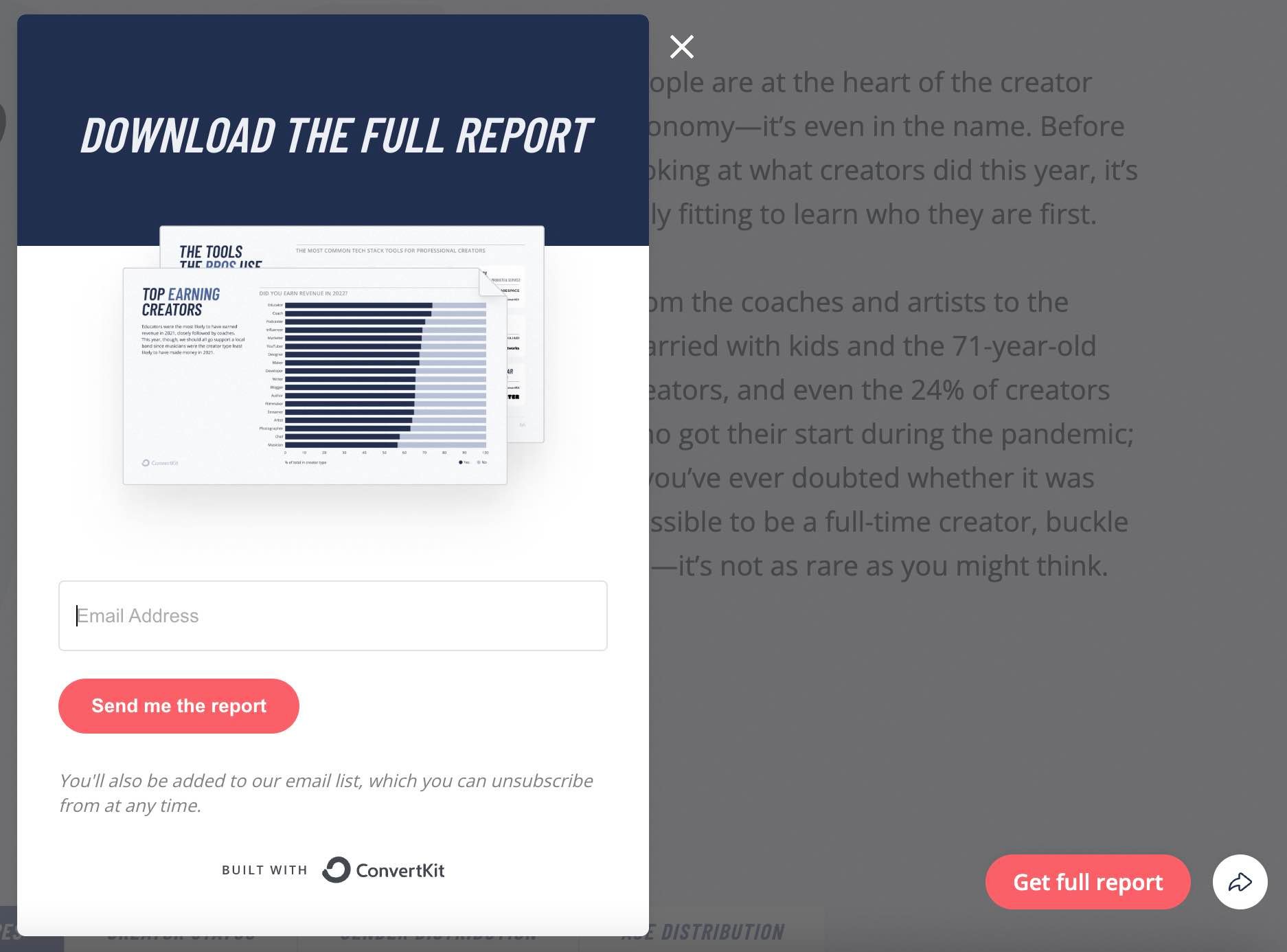
Besides using chatbots to automate responses and communicate with your visitors, you can use them to share your lead-capture form. For instance, when you click “Get Report” on the landing page below, the form pop-ups, requesting your email to “Download the Full Report.”
At the Bottom of an Auto-Scroll Landing Page
Placing a lead-capture form at the bottom of your landing page offers one more chance to acquire a visitor’s information. This position also allows your content to take center stage, allowing visitors to determine if it’s worth downloading.

If visitors decide they want the content, clicking the “Download the Full Report” button automatically scrolls them down to a brief form at the bottom of the page.
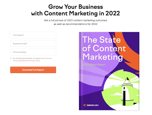
Once they fill out the form, they can confirm their download and retrieve their content.
2. Determine the right length for your lead-capture form.
The next — and probably biggest — concern when designing your forms is the length. The number of form fields you use creates a tradeoff between the quantity and quality of leads you get.
Shorter forms usually generate more leads since people can fill them quickly. However, your leads from short forms vary widely in quality.
Longer forms require that visitors provide more details of their needs, meaning they show a better purchasing intent. So you may get fewer leads, but they’ll be of better quality.
When creating your form, find a good balance between collecting enough information and not asking for excess information that your visitors are reluctant to give.
Pro Tip: Prospects tune off when they see a long lead-capture form. To get around this, use a progressive lead-capture form that includes steps. This gives visitors a mental picture of how quickly they can complete the form and download your resource.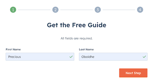
3. Choose relevant form fields.
Irrespective of your preference for short or long forms, it’s best practice to only ask essential questions that’ll help you contact and qualify your lead.
For instance, if you spend over $10,000 to create a marketing report, you’ll want to generate high-intent leads from this resource. Meaning you’ll have to go beyond the name and email of those who want to download the report.
You may need to know their company, website, role, and number of employees. Asking these questions allows you to assess their fit for your company, gauge their need for your product, and know their likelihood of purchasing your product. With this info, you can decide whether to add a lead to your sales flywheel.
Pro Tip: Ask as few questions as possible with your lead-capture form. This will significantly increase your conversion rates. You can also ask more questions after the lead enters your funnel.
4. Include your privacy policy.
Laws in the United States, European Union, Canada, and Australia you must include a privacy policy when collecting “personally identifiable information” (PII). PII covers sensitive information like the full name and mailing address of your visitors. It also encompasses non-sensitive information, like zip code, race, date of birth, etc.
Irrespective of a form’s location on your website, you should place your privacy policy where it’s easily noticeable. This puts prospects at ease if they are skeptical about sharing their information.
For example, our lead-capture forms show a privacy policy preview right above the download button.
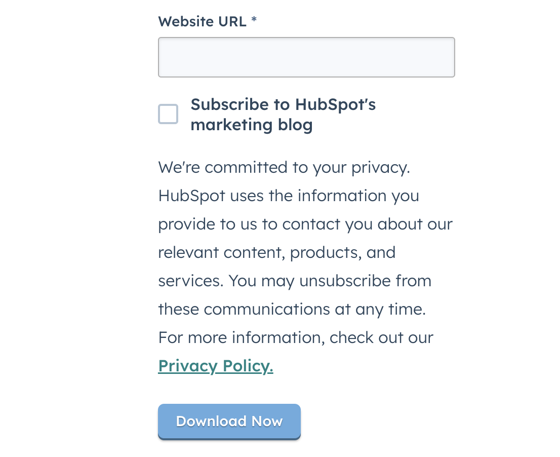
Pro Tip: Have client testimonials, authority endorsement, third-party security certification, or a guarantee seal beside your privacy policy. This helps reduce the objections of visitors who are concerned about filling out your form.
5. Change the text in your submission button.
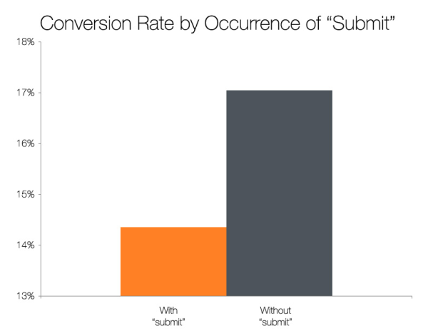
The last major component of your lead-capture form is the submission button. The default text for this button is “submit.” However, this isn’t the best messaging.
How do we know? Well, we studied the landing pages of over 40,000 HubSpot customers. What did we find? Buttons labeled “submit” had lower conversion rates.
The top-performing variations in this study were “click here” and “go,” which had 5% to 12% more conversions than “submit.”
Pro Tip: Besides the text in your button, further research shows you can get amazing results by tweaking the color of your button. This is where A/B testing shines.
6. A/B test your lead-capture form.
Conducting A/B tests is a brilliant way to identify the most effective variation of your form’s design, copy, and calls-to-action. Put another way, A/B tests allow you to get better conversions.
When testing your form, ensure you test one element at a time. For instance, if you’re testing the color, shape, or size of your submission button, don’t simultaneously test the form length.
7. Automatically email visitors after they submit your form.
Whether people are applying for a role in a company, downloading a free resource, or contacting you about your services, they want a response once they hit your submit button.
This is where autoresponders come in handy. Many form builders have this functionality, so take advantage of it. Besides providing an excellent experience, having an autoresponder in place helps you begin your relationship with prospects on the right foot.
![]()


