What is a Media Kit — and How to Make One [+ Press Kit Examples]
Your competitor releases a new product or service. You offer something similar — but, of course, much better.
Then, suddenly, your competitor’s product is everywhere. News articles, online reviews, best-of lists, buyers’ guides, even TV segments.
How is this happening? And your real question: why isn’t it happening to you?
To compete against your competitors, there’s one thing you’ll need in your wheelhouse: a media kit.
Here, we’ll explore what a media kit is, and how it can help you increase brand awareness and, ultimately, sales.
Plus, how to make one for your own brand.
Media kits may live fully-online as responsive online press pages. Or, businesses may choose to make their press kits available as static, downloadable resources, like a presentation deck.
Whatever format you choose, this much is clear: businesses of all sizes benefit from having a professional, readily-accessible media kit. This vital resource is a key to the earned media coverage all businesses covet — from massive Fortune 500 corporations all the way down to individual influencers and solopreneurs.
A comprehensive media kit should include a description of the company or individual, contact information, social media statistics, case studies, information on partnerships and collaborations, and testimonials from past customers.
Basically, it’s all the information a journalist would need to feature your brand in a breaking news story — without the headache of a last-minute information request.
How to Make a Media Kit: What to Include
So, you want press coverage and partnerships (what brand doesn’t?). And you understand how a media kit helps make this all possible. But how do you make a media kit?
Here’s some good news: most of the content and creative assets you need to create your press kit likely already exist.
Key elements of a media kit include a bio or About Us page, social media statistics, case studies, partnerships and collaborations, and testimonials. To make it even easier for the press to cover your work, you’ll want to include high-quality brand identity images (think both logos, and other brand images or product/service images).
It’s up to you to (1) find this information, (2) make it look spectacular, and (3) make it painfully easy to find on your site. The rumors you’ve heard about journalists and how overworked they are? Entirely true.
To catch the attention of someone on tight deadlines with an internet full of story prospects, you’re going to want to make this simple. Most brands choose a direct page name like “Press” or “Media” –– or, if they’re really fancy, “Newsroom” –– and make it accessible directly from their homepage (often in the Footer).
Even if you prioritize a web version, having a downloadable media kit or deck is worth the time investment. Some media users might prefer the traditional form of this resource, and it gives you the best opportunity to control your pitch and tailor content to all audiences.
Biography or About Us
Let’s start with the star of your media kit: you. Here’s where you introduce your name, your logo, your mission. Make sure your media kit design reinforces your overall brand identity, utilizing the colors, fonts, and other visual hallmarks set out in your branding guide.
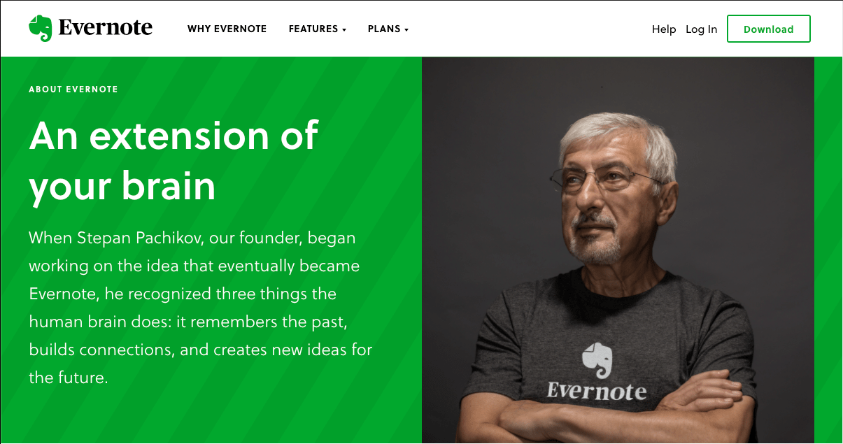
Evernote goes all-out in this section, housing their press kit information within the broader “About Us” portion of their website. All the essentials for journalists and partners are there too, but the organization’s values take center stage.
Social Statistics
For social stats, you’ll need to conduct a social media audit or collect this data from whoever manages your social channels. Remember your audience for the press kit: media and PR professionals.
Your media kit needs to effectively pitch your brand to people who specialize in getting people’s attention. So show them you’re capable of sparking conversation — and show them there’s already an audience eager for stories about you and your work.
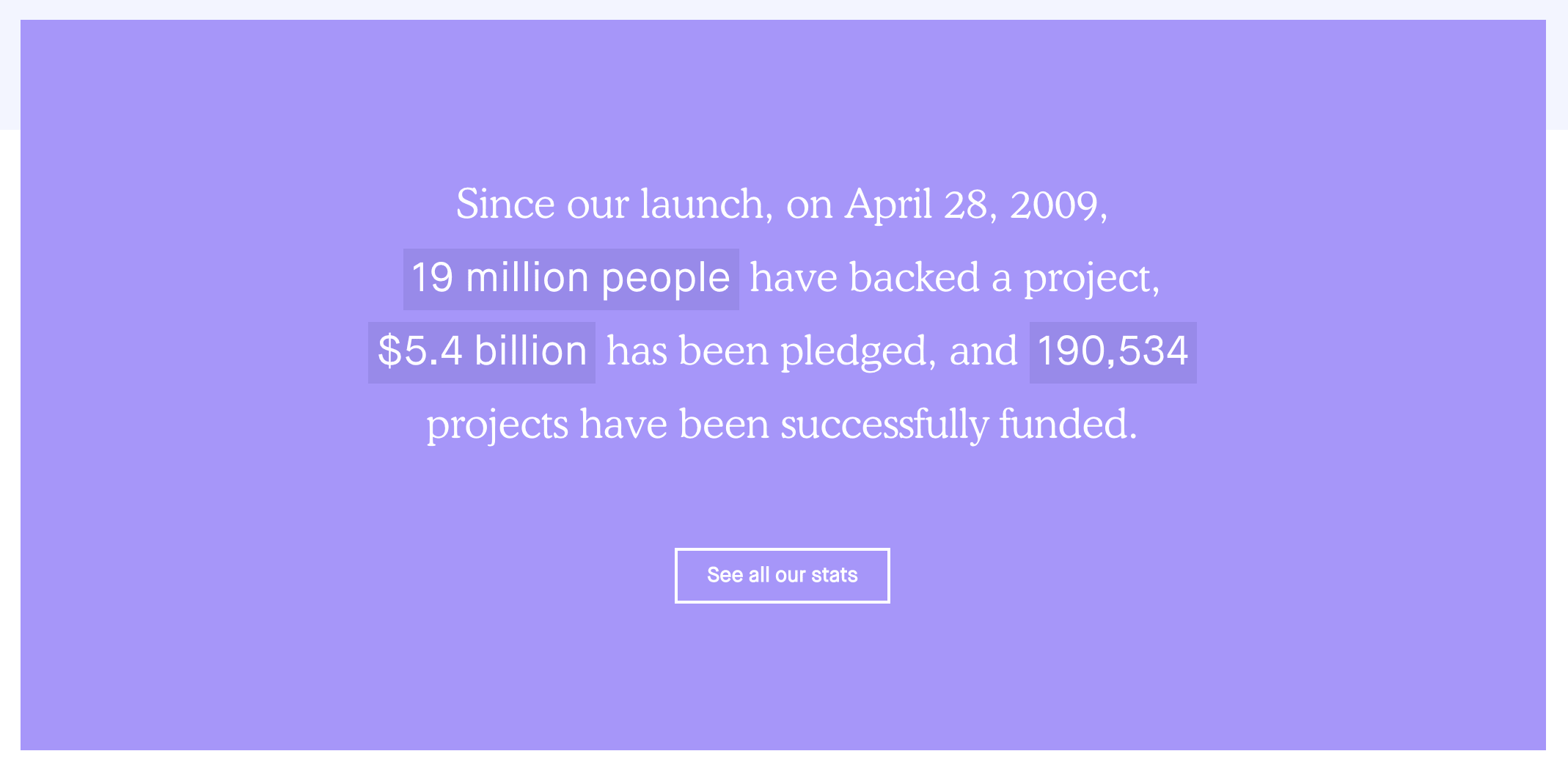
Kickstarter puts a unique stamp on this section of their media kit page, highlighting a few top metrics that show massive engagement with their service.
Media kits aimed at partnerships and collaborations should prioritize engagement rates and similar actionable metrics alongside the bread-and-butter statistics like follower counts. Savvy marketers want to partner with brands and influencers that move people to action.
[Note: If you are a HubSpot Social user, you can use Reports to analyze the performance of your social posts and determine how well your social media efforts are performing.]
Partnerships and Case Studies
This section is your chance to let past partnerships and brand collaborations speak for themselves. Let the old adage “show; don’t tell” be your guide here. Featuring the right partnerships –– either via logos or through short case studies –– is a subtle but powerful tool for positioning your brand.
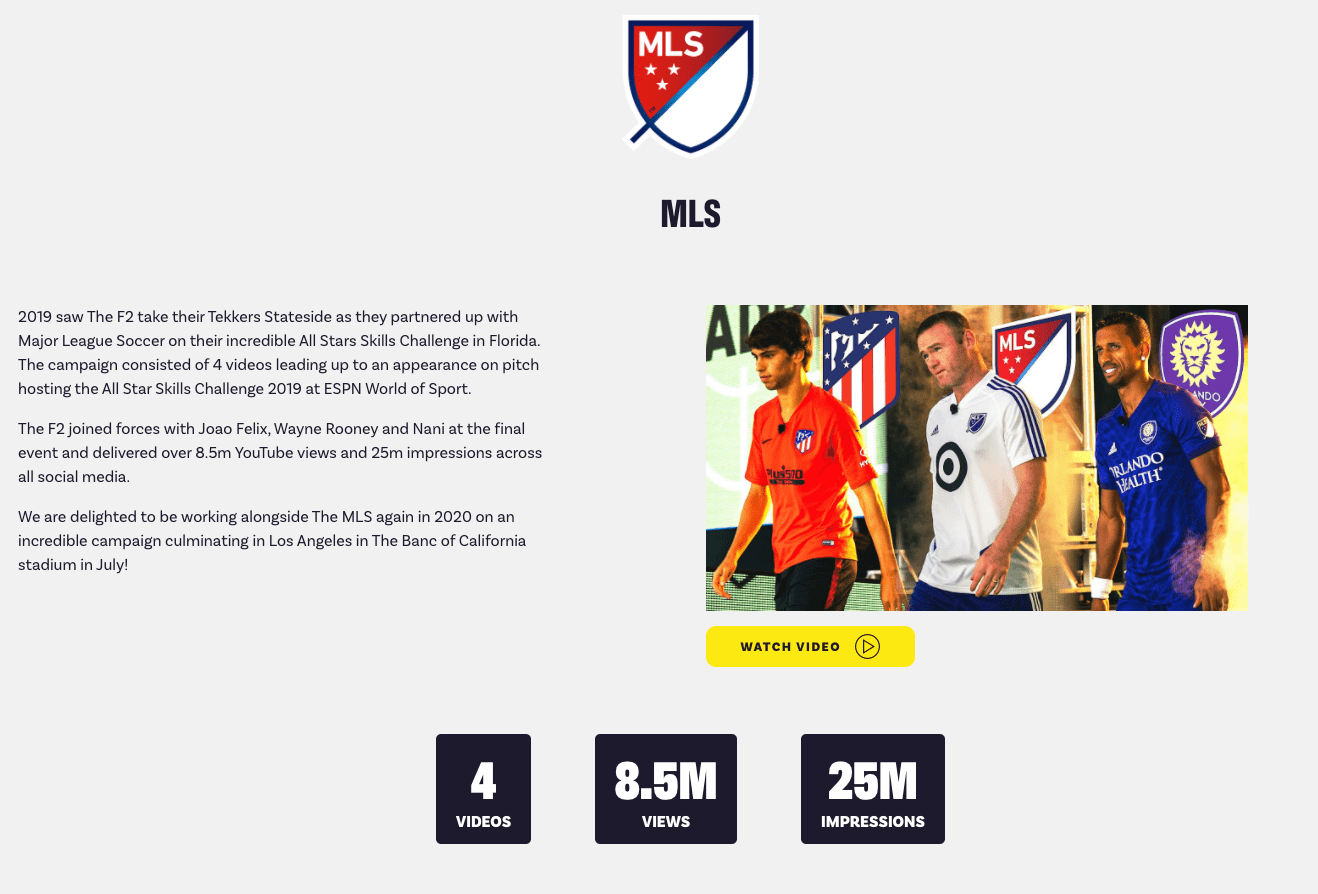
International football influencers The F2 highlight past campaigns, putting reputable brand names and logos front-and-center. They also note key engagement statistics for these campaigns
Testimonials
Testimonials are another great way to show media professionals the impact and effectiveness of your brand or product.
Keep this section succinct: just a single testimonial should suffice. Only a few lines of text (even just a single short quote) and a single related image gets the point across, lending your pitch greater credibility thanks to social validation.
Briogeo does a fantastic job highlighting testimonials on its Press & Buzz page, right below the rewards section for easy access: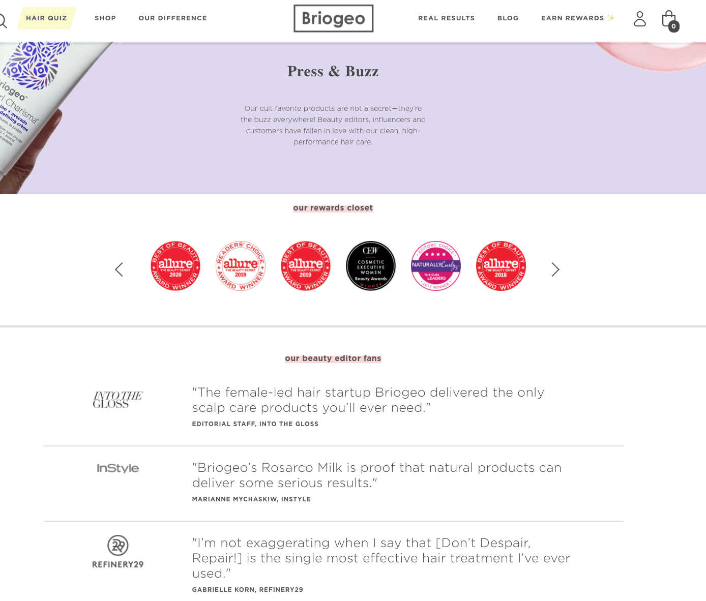
Visual Assets (Downloadables)
Your media kit isn’t a style guide, but it should pull in the most essential elements of your visual brand. Want your logo and that slick product screenshot to display correctly?
Provide exactly the images and files you want featured. Have a killer data visualization, infographic, or product video? Include that, too.
Journalists will especially appreciate portraits of your management team. They’re most likely to cover stories involving people, so show them the people they’ll want to write about.
Birchbox makes this easy. They highlight “Press Materials” and link to a short but comprehensive set of resources. Having everything in well-organized cloud folders is a nice touch –– especially for those browsing on mobile.
Without downloading or unzipping a large batch of images, visitors can quickly confirm you have visual assets to make their publication look good. Remember, the audience for your media kit is especially busy and juggling lots of competing priorities. Jump to the top of their “potential posts” pile by making their job as easy and painless as possible.
(Added bonus: your external media resources are easily updated –– sparing you anxiety about outdated media kits and image files misrepresenting your brand.)
Media Kit Design
Now that you know what to include in your media kit, you might be wondering how to put all of that valuable information together so that it’s navigable and easy to understand. You’ll do this through a table of contents.
The way your table of contents looks can vary depending on how you design your media kit. On Slack’s website, its media kit has a table of contents that features summaries of each section with hyperlinks that bring users to a separate page, as shown in the image below.
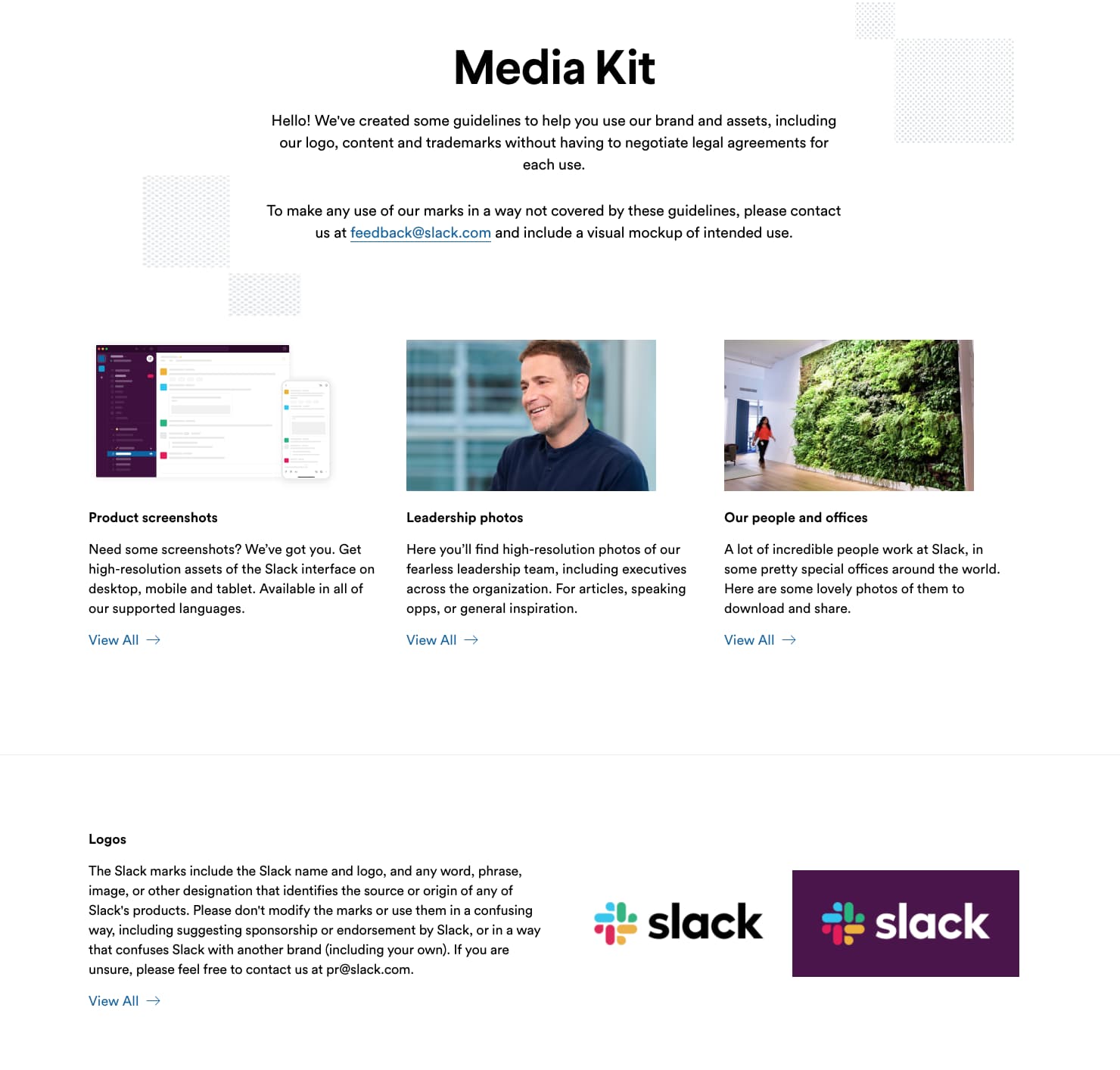
If you download Slack’s media kit as a PDF, the table of contents lists a page number for each section, so viewers can quickly scroll to the page they need or type the page number into the search bar.
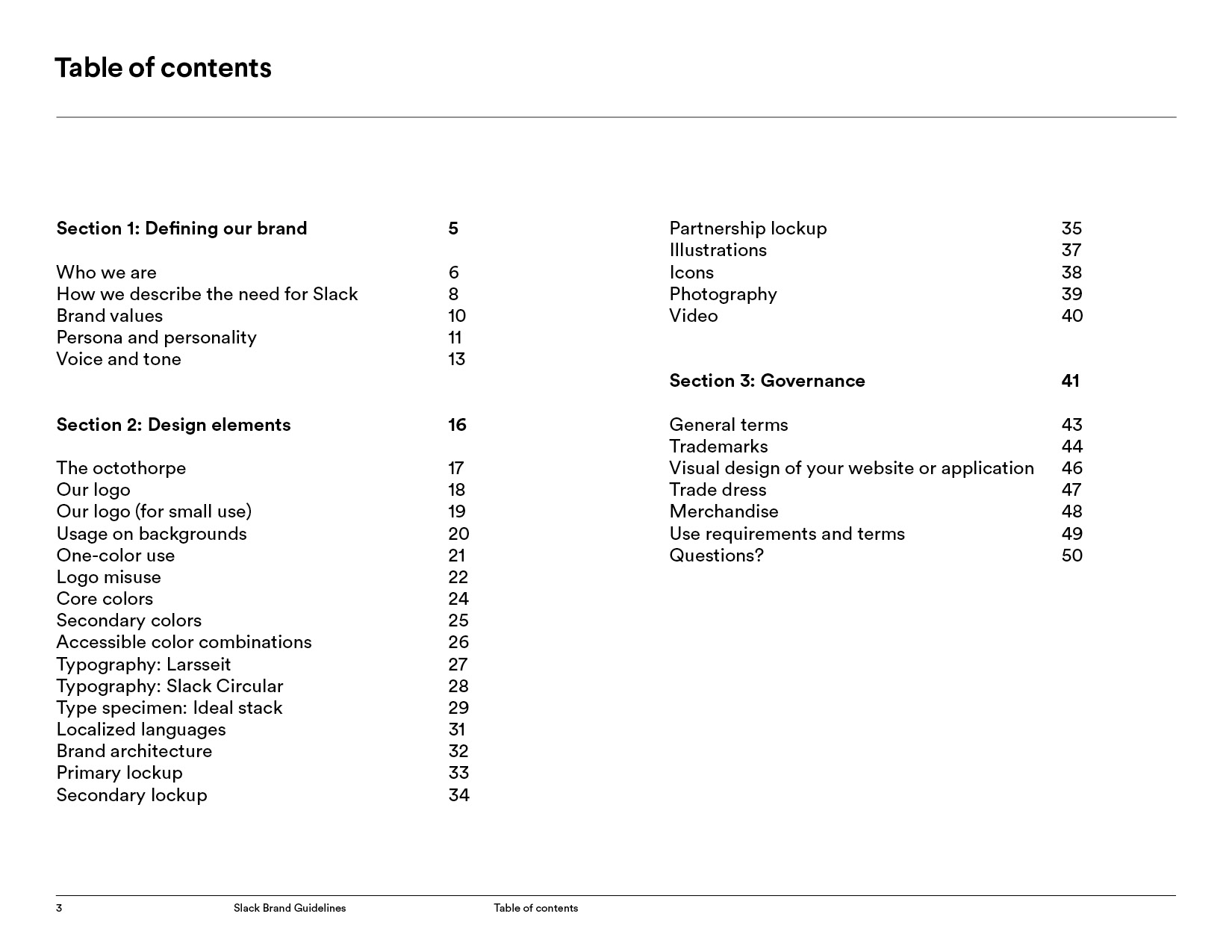
Regardless of how you present your kit, it needs to be designed for ease of access. Aim to create distinct sections for the content you’re including, and create a form of navigation that helps those making inquiries quickly find what they need.
Let’s go over some high-quality examples of media kits that you can use for inspiration when creating one for your business.
Media Kit Examples
1. Hinge
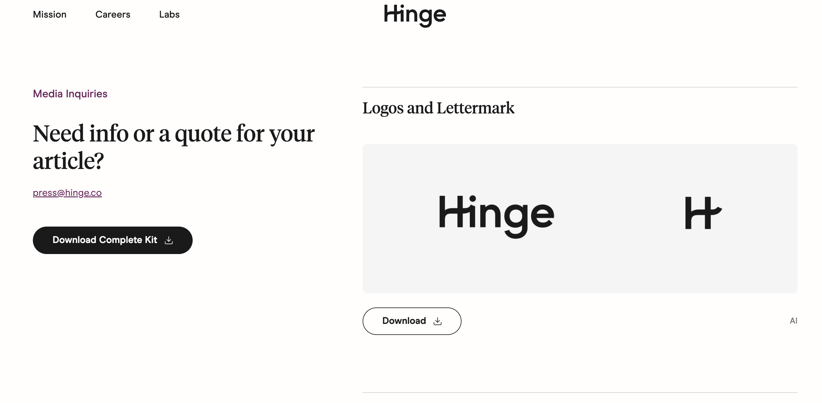
Hinge, a dating app, has a straightforward and easy to navigate press kit that gives those doing media inquiries quick access to critical information, like internal press releases:
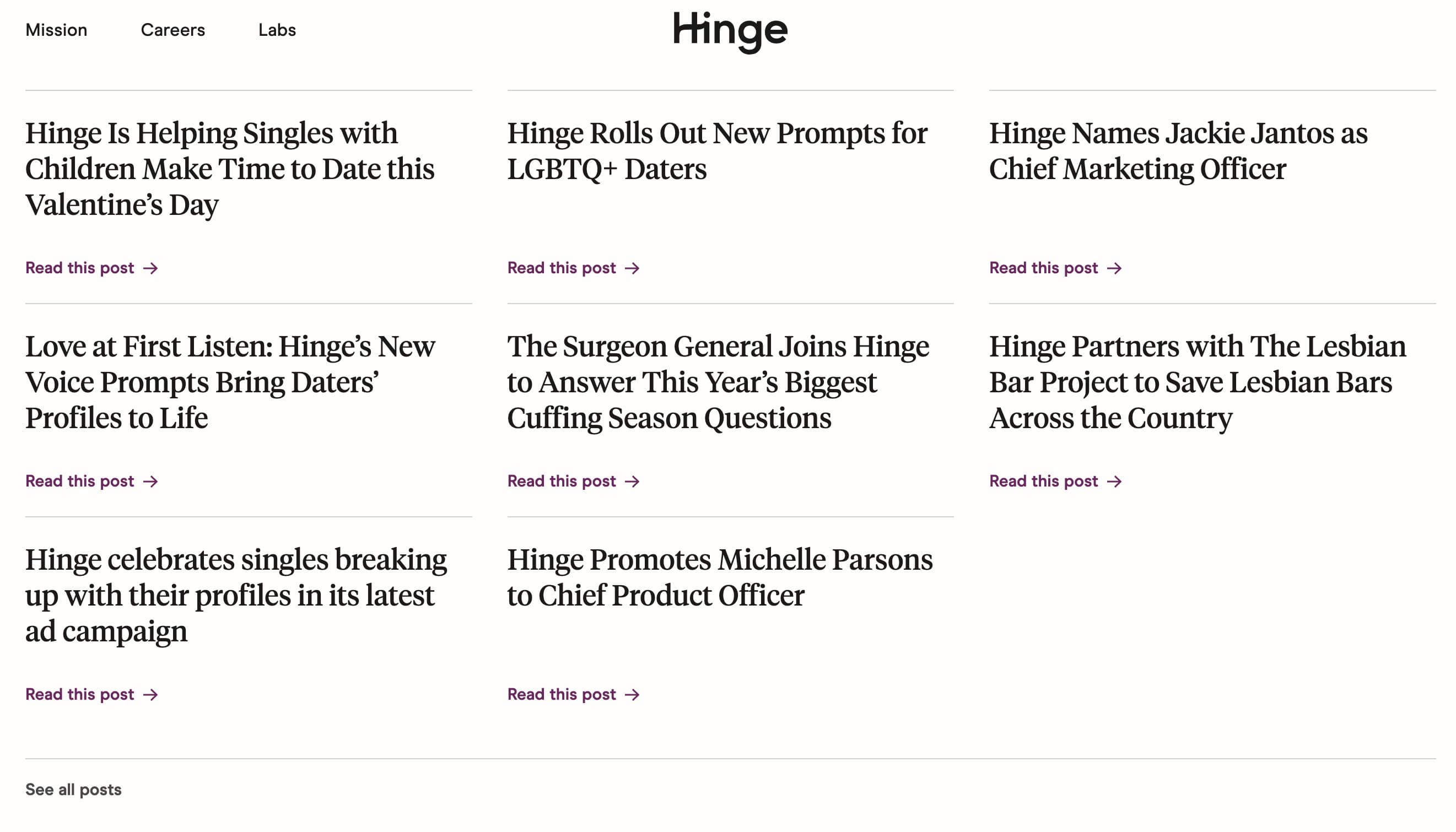
As well as external news articles, employee profiles, business background, and image downloads (logo, screenshots, etc.).
2. Spotify
Spotify has a unique media kit, namely one that supports one of its key features — Streaming Intelligence. Media and other parties can read through the kit, understand the specifics of the tool, how it works, performance stats, as well as partnerships with notable sources that support its effectiveness.
Spotify shows us that general press kits are great for your business to have, but are also relevant for things like product launches or specific business tools.
3. Delta Airlines
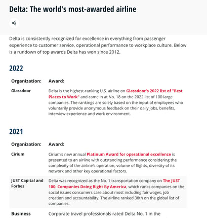
Delta Airlines’ press kit is hosted on its website and contains all of the elements you’d expect from one. As it is such a large company, each section of the press kit is on a different site page that users navigate to by clicking a hyperlink.

If you click on a link for, say, Awards and Recognitions, you land on a page that features noteworthy recognitions about Delta and the service it offers.
Now you know the what and the how of creating a media kit to garner beneficial coverage for your brand. Click here to download our free media kit template and get started.
And go ahead, give yourself a pat on the back when that Features story comes out. You won’t see your name on the byline, but we both know who the real hero is here.
![]()


