24 Best “Meet the Team” Pages We’ve Ever Seen
To a prospect seeking out a new service provider, the process can be a little overwhelming. It’s easy to wonder: Who are the real people behind all the smoke and mirrors?
Adding a “Meet the Team” page or section to your website is an easy, effective way to give your business an accessible face.
This also gives prospects an idea of who exactly they’ll be working with and shows potential employees that you’re proud of the people on your team.
For inspiration, see how these companies introduce visitors to their most important creative assets: their people.
1. Yokel Local
 Yokel Local is a HubSpot Agency Partner that positions itself as an extension of its clients’ marketing teams. For that reason, this agency showcases its staff to highlight the humans behind the brand.
What’s pleasing about this particular page is the simplicity: The grid design provides a modern feel, and clicking on a face opens a box with more information about the team member, including their bio, credentials, and social profiles.
Why this works: Yokel Local doesn’t go overboard with its “Meet the Team” page, and it doesn’t need to. Everything potential clients need to know is presented in a clean grid format. This way, it’s clear who’s behind the agency.
2. Philly Reps
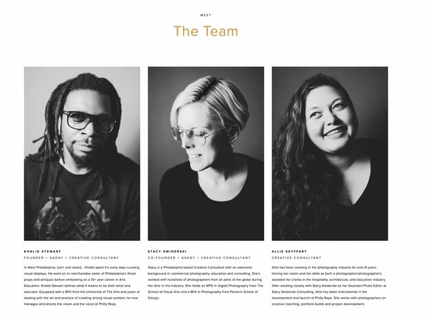 In contrast to more elaborate designs, Philly Reps is another agency that takes a cleaner, minimal approach to its team page.
Members are presented in grayscale images that take up the majority of screen space for a nice consistent look and feel.
Below images are brief descriptions of each member. Notice how Philly Reps has made each description roughly the same length to maintain balance and alignment between grid elements.
Most won’t notice this detail, but it results in a page with maximum readability.
Why this works: Large grayscale headshots of team members bring character and personality to the brand while maintaining visual consistency.
3. Digital Marmalade
 Since most employee bios read a lot like a list of stats (“10 years in the industry … 4 years at the company … Managed 80 website redesign projects … “) the folks at Digital Marmalade decided to have a little fun with the format.
Each employee at the London-based marketing agency has a trading card-style profile detailing their actual marketing accomplishments and personal facts.
It’s a quirky twist that gives visitors a snapshot of the agency’s team, highlighting both their impressive experience and friendly culture.
Why this works: Digital Marmalade balances its show of technical proficiency and fun with employee stats. Additionally, headshots are all similar in composition and background.
4. CloudHorizon
 CloudHorizon is a mobile product development company. Its about page says, “Some of the more rewarding projects we have had the honour to be involved in, started with simple ideas and grew profitable businesses from the ground up.”
With this in mind, CloudHorizon’s “Meet our team” section is a great way to illustrate that idea.
When you hover over an image of a team member, their thumbnail flips to reveal a photo from their childhood with a small caption of what they wanted to be when they grew up.
Why this works: This clever idea highlights both the diversity of backgrounds that the CloudHorizon team brings, as well as the uniqueness of each member. It also provides a sense of friendly nostalgia to new visitors.
5. Bolden

Bolden’s team bios are more conventional than others on this list, but they make up for it in style.
Hovering over each team member’s picture produces a darker alternative, almost like an image negative, revealing the employee’s name and outfit change. This is a great example of a minimal, accessible “Meet the Team” page that looks cool and introduces the faces behind the agency without going over the top.
Why this works: Bolden implements a subtle but unique and effective hover effect for its team member cards for extra visual flair. As a digital design agency, these small moments show capability.
6. Rock Kitchen Harris
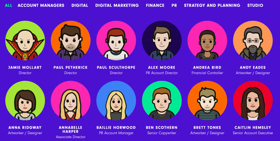 Rock Kitchen Harris, a full-service agency, decided to skip the photos altogether and showcase the cartoon versions of their employees instead.
Each employee at the English agency had a custom caricature drawn up, and everyone has a different personality.
While some employees opted for representations reminiscent of LinkedIn profile pictures, others got a little creative, dressing their cartoon selves up as Ewoks and other characters.
Employees can also be easily filtered by specialty.
Why this works: The choice to make renderings of each employee brings a lot of character and personality to this agency’s website. Plus, it gives employees the chance to have some extra fun as well.
7. FCINQ
 FCINQ, a creative studio, introduces us to their team with a collage of colorful bubbles.
Hovering over an employee’s circle produces a zoomed-in effect, and clicking expands their headshot with their name and social profiles. The splashy setup is a stylish alternative to the expected rows of team photos and names.
Why this works: FCINQ’s team section is a nice departure from the standard grid layout while staying intuitive and informative.
8. Zulu Alpha Kilo
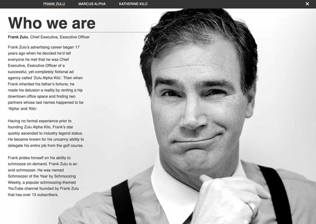
This Canadian agency presents its founding team with refreshing comedic flair. While many agency leaders choose to represent themselves with stoic business portraits, the three leaders of Zulu Alpha Kilo opted for playful photos and cheeky bios.
Here’s an excerpt from the bio of Marcus Alpha — the agency’s “Ultra Chief Creative Director Officer”:
Marcus has a reputation for pushing his creative teams further than any other creative director. He makes them work late nights, weekends, and through holidays in pursuit of that one truly breakthrough creative idea.
And when they’ve finally cracked it after weeks of grueling and thankless work, Marcus will triumphantly stand in front of the client and present it as an idea he had in the shower that morning instead.
Why this works: Zulu Alpha Kilo leverages humor with its portraits and text content to draw potential clients in search of a partner on the quirky side.
9. Stink Studios
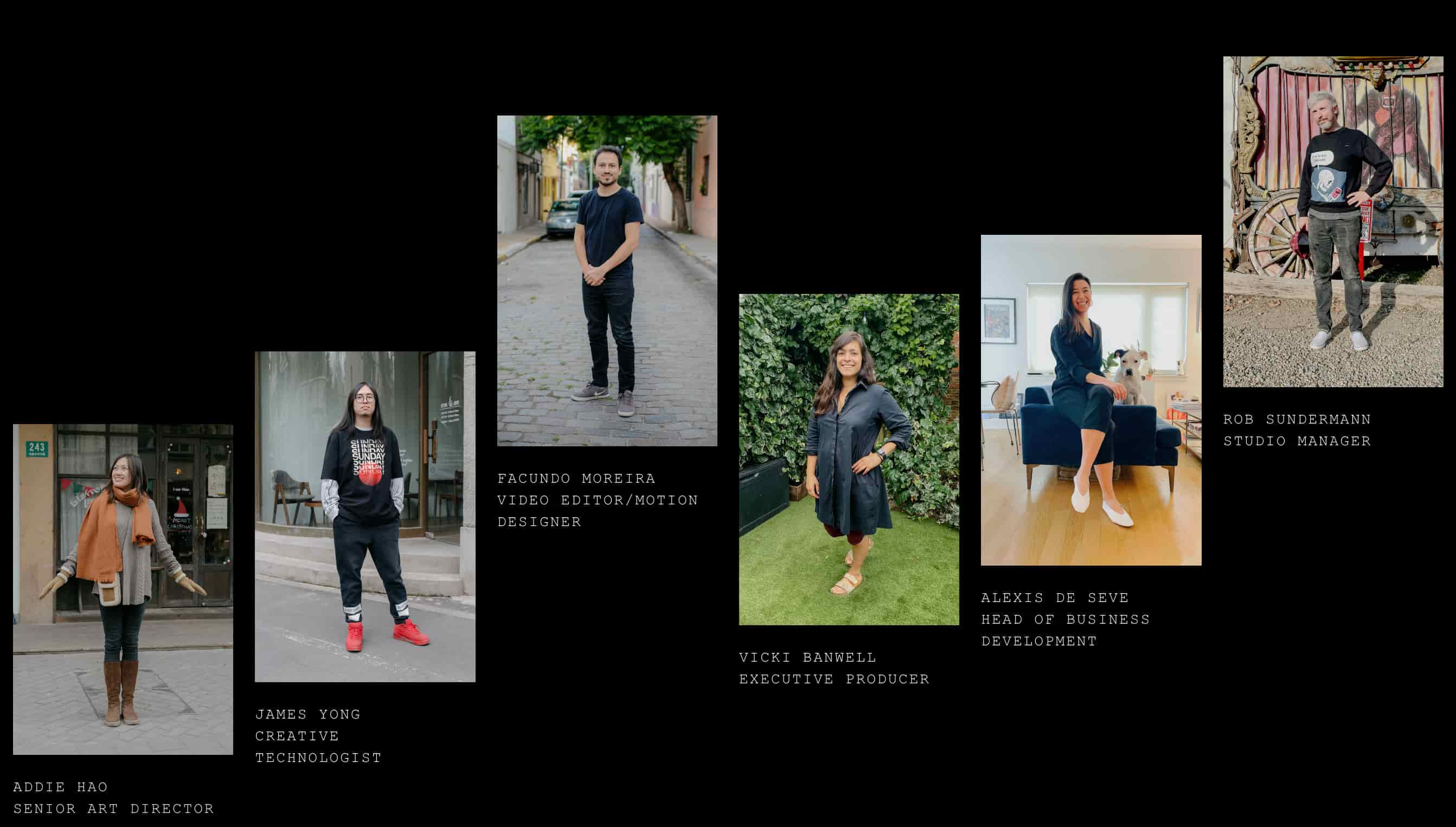 We love this expertly laid out slideshow of team members from Stink Studios.
This creative agency has offices in five major cities around the world — including New York, Paris, and Berlin — but having a personable “Meet the Team” section helps give their business an accessible edge.
They don’t call themselves “a global company with a local feel” for nothing.
Why this works: The broken grid layout of this website’s team page is inviting, clean, and a touch playful as well.
10. Canela Vegan Bakery & Café
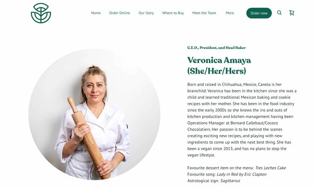
Canela knows that its people and story are just as important as thits delicious menu offeringsTheir meet the team page includes each person’s name, pronouns, and a short bio.
Team members’ photos often include a baked good or cup of coffee, keeping with the bakery’s theme. They also share their favorite desserts, tying back to the sweet treats the bakery offers.
What we love: Each bio also includes the employee’s favorite song and astrological sign. This creates a personal, lighthearted touch.
11. Drexler
 As one of the more artsy entries in this list, Drexler proves that you don’t need a whole page devoted to introducing your employees — just a section can do the trick.
This simple but polished team member marquee appears down the homepage and plays with scrolling to reveal each team member’s portrait. The “hands-on” portrait aesthetic is also unique, creating a homepage that only this group could think up.
Why this works: Drexler utilizes scrolling to present team photos in a scanning pattern, complete with peculiar but captivating portraits.
12. Matchstic
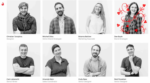 As a branding agency, Matchstic knows the importance of identity, creativity, and individuality. Not only does its “Who We Are” section provide that identity by highlighting the human element of the brand, but it also shows its creative side.
When you hover over each thumbnail, a goofy illustration is overlaid onto the photo.
In addition, the custom cursor, which only shows up on the About page, is a strong callback to the Matchstic brand, implying kinetic energy that starts with the lighting of a match.
Why this works: Matchstic applies a cartoon-style hover effect to its employee portraits, implying fun, imagination, and creativity behind the otherwise straightforward profiles. The custom cursor is an extra, delightful touch.
13. Atlassian
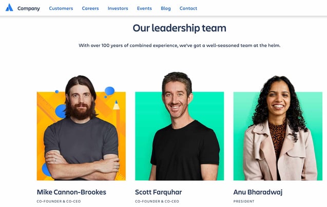 Atlassian, a company behind many software solutions used in businesses worldwide, highlights photos of their team on their “people” page, interacting at the office and hard at work.
Below, they showcase their leadership team with colorful headshots that break out of colorful background boxes, similar to Matchstic. When you hover over each image, vector graphics relating to the individual’s unique role appear.
In addition, a popup appears on click with social icons and a bio. What’s particularly interesting is the option to download their headshot, which has some extra utility for media professionals.
Why this works: Atlassian’s people page is professional and quirky, with useful features like bios, social media links, and an option to download headshots.
14. Kota
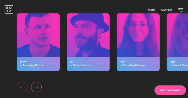 Heart Creative presents its team members on its “about us” page. Clicking on portraits reveals more information about each employee.
There’s also another double-vision style portrait showing a close-up and the employee’s profile picture overlapped.
Why this works: The creative, consistent color scheme lends a touch of fun to its “Meet the Team” section by displaying alternative portraits on mouseover.
15. LiveChat
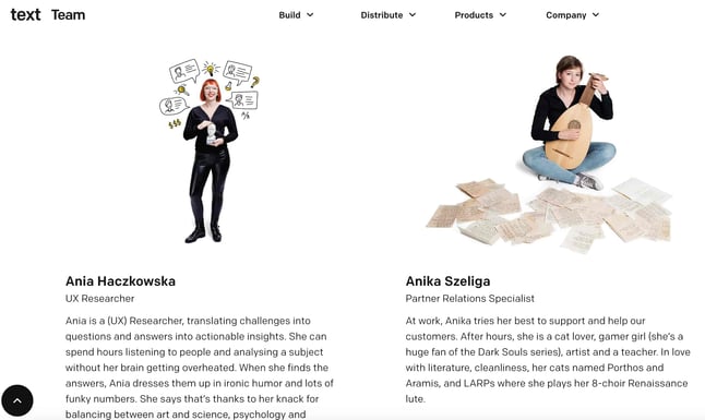 LiveChat, an AI customer service and chatbot solution, approached its team page completely differently.
Instead of just listing out each team member’s roles and experience, they created a photo for each team member that illustrates who they are in a conceptual, fun, and symbolic way. Given the size of the company, this was quite the endeavor.
LiveChat’s approach is extremely effective for showcasing the uniqueness of their team, and it compels the website visitor to take the time to look at each picture and read each bio.
This results in longer time on page, an important engagement metric.
Why this works: The LiveChat team page emphasizes each member’s personality and interests. Clearly, LiveChat values everyone and knows the real strength of any business is the people.
16. Etsy
.jpg?width=645&height=259&name=etsy%20(2).jpg) Many large companies forgo the traditional “Meet the Team” page because there are so many team members that it doesn’t make sense to display them all.
Many large companies forgo the traditional “Meet the Team” page because there are so many team members that it doesn’t make sense to display them all.
At Etsy, though, they acknowledge all the people that make the popular online marketplace possible with a tiled “people board” that scrolls for days.
Why this works: While impractical to provide bios of every team member, Etsy compromises with a collage of team portraits as a testament to the strength behind the company.
17. UWG
 Digital content specialists UWG have created a stunning team page that’s as much about personality as it is about personnel. Team members are shown in lively portraits against solid backgrounds.
Most images are squares, but the page occasionally breaks this pattern for some visual variety. You can click a portrait to open a modal for more information about a team member.
Why this works: This team page is simple, yet bold and effective. Each portrait is packed with personality, and together the images form a vibrant collage. It’s the kind of “Meet the Team” page that makes you actually want to meet the team.
18. The Correspondent
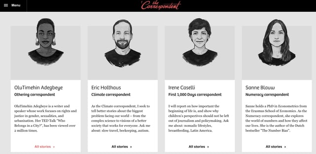 The Correspondent is an organization that offers news without fear-mongering or financial gain. In true journalistic style, the site features each team member in a beautifully rendered cartoon style, providing an artistic feel to the page.
Clicking on each thumbnail leads the website visitor to a place where they can subscribe to that particular writer and view a feed of their pieces. The individual’s mission is displayed across the top, and contact information is in the sidebar.
Why this works: Sketch renderings of every team member lend to the publication aesthetic of The Correspondent. Readers can easily find a particular writer’s stories as well by clicking a card.
19. Bluleadz
 What better way to convey the personality of your team than to display their favorite gifs on mouse hover? That’s what digital marketing agency Bluleadz does. You can almost imagine these folks in the scenarios their gifs represent.
Another useful feature of this “Meet the Crew” page is the ability to filter Bluleadz employees by function. Each button at the bottom corresponds to a team and brings up the individuals who “make the magic happen” in that business area.
Why this works: Yet another way to add personality to a team page, Blueleadz includes a favorite gif for each team member. It’s fun, entertaining, and potentially converting.
20. Media Junction
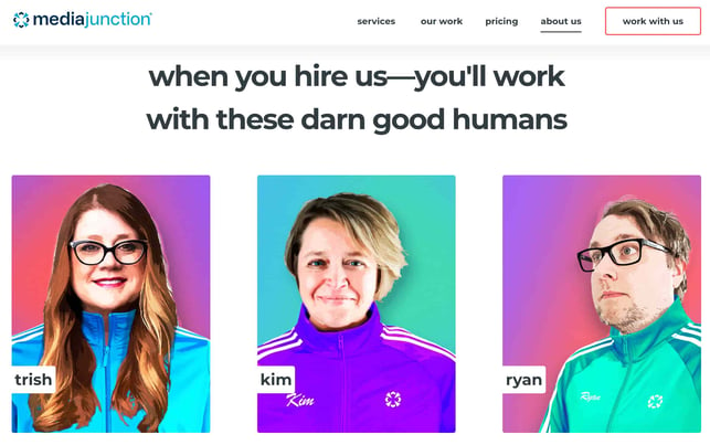 Bold blocky pops of color? Yes, please. HubSpot Elite Agency Partner Media Junction displays their team thumbnails on solid backgrounds with vector shadows.
Each photo is a little silly, and many of them bring their furry friends into the picture with them.
In addition, their leadership team’s thumbnails are clickable so that you can read more about them and even send them a message for more information.
Why this works: Media Junction is not afraid to show its playful side on the team page — images are colorful, inviting, and animated for a dash of style that keeps users on the page.
21. Humaan
 Humaan is all about mixing play and business with curiosity and experimentation. That’s why their “Meet the Team” page is crafted to showcase what they do best — design digital products for forward-thinking brands.
The Humaan “Meet the Team” group photo highlights their fun, collaborative side. But, when you scroll down the page, you’ll find personalized gifs of each team member and a short (but not boring!) bio.
Why this works: The vibrant group photo screams, “We are creative.” But not only does the group photo catch the eye, each photo (or gif) of the Humaan team showcases a bit of their personality to create a more, well, human experience.
22. Salted Stone
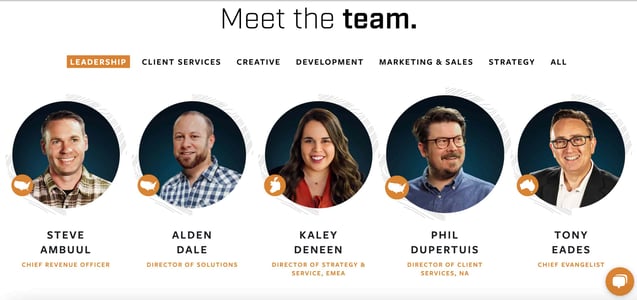 Salted Stone, an end-to-end digital solutions and consulting agency, is proud not to be bound to just one hemisphere — and they want you to know it.
The individual photos of each team member are professional photos with the same background and lighting. The darker background helps draw attention to the map on the side of each individual’s photo.
Why this works: Salted Stone’s “Meet the Team” page focuses on individual employees, while perfectly highlighting their location. Customers know they’ll be working with global-minded leaders.
23. Oak + Rumble
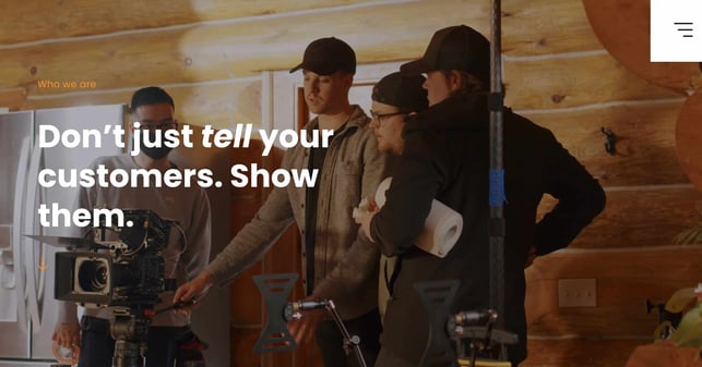
If you’re a company that produces video, wouldn’t having high-quality video content on your “Meet the Team” page make sense? Oak + Rumble thought so, and their intro video perfectly nails what they can offer clients.
Your bio page doesn’t have to be just headshots and short employee bios. Instead, be creative and take a page from Oak + Rumbles playbook. Add video to really make your story jump off the page.
Why this works: The Oak + Rumble intro video brings their work to life. Visitors to their team page know exactly what Oak + Rumble is good at doing, and they know what kind of quality work to expect if they work with them.
24. Fishfinger
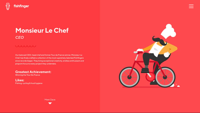 Fishfinger, a creative agency, decided to go against the grain with its “Meet the Team” page.
Instead of displaying employee photos, Fishfinger took the pain out of picture day and created personal animations for each employee based on their position, likes, and preferences.
Fishfinger also ditched the boring bios and created short, quirky bios for each team member.
Navigating to the next team member’s page is a snap with the “Meet Dave” link at the bottom of the page.
Why this works: Fishfinger’s “Meet the Team” page perfectly captures readers’ attention, showcasing the company’s and employees’ personalities.
“Meet the Team” Page Best Practices
So, what can we learn from these exceptional examples? Here are some tips and design best practices that you can take away and apply to your own team page.
Use high-quality images.
Most visitors will expect your team page to feature photos of your employees. Make sure these photos are high-quality and visually consistent (including dimensions). From there, you can add as much personality as you want. Or, as we saw in some examples above, you could try an illustrated alternative.
Write compelling employee descriptions.
At the very least, each member’s profile should include a photo, name, and job title. For more details, add a short bio of each employee that outlines their role, experience, accomplishments, and interests.
This is especially fitting for agencies that collaborate extensively and in person with clients — you’ll want to build trust, and bios are a great way to get there.
Include social links.
In addition to your employees’ names, titles, and bios, you might also link to their social media profiles. While unnecessary, this can help potential clients reach out to members through another preferred channel.
A LinkedIn profile link is likely enough, as you can be confident that employees will keep their posts professional on the site. However, link to other profiles (e.g., Twitter, Instagram) cautiously, as you can’t be sure their conduct on these sites is company-appropriate.
Showcase personality.
Yes, simply saying “personality” may seem like a cop-out answer. We’re being intentionally vague here because each company will have its own approach to adding extra character to its “Meet the Team” page. Depending on your brand, this might include fun portraits, humorous descriptions, or eye-catching effects.
As we’ve seen, the best team pages inject personality in a way that aligns with their branding. Some pages lean formal but sneak in some fun elements, some clearly aim for humor, and others play it more seriously. In all cases, the pages maintain a professional feel, even those that are funny.
You don’t need to go overboard here, but adding something extra can show your company is willing to go above and beyond for the best customer experience. It also helps your business stand out in users’ minds who might be wading through dozens of competing sites.
Show Off Your Team in Style
“Meet the Team” pages resonate because people like to buy from real people. The best practice is to determine what your brand stands for, then create “Meet the Team” and “About” pages that convey that in the strongest possible way.
Whether that’s going for an elaborate, eye-catching page or a simpler grid display, visitors will appreciate being able to put a face to your brand.
Editor’s note: This post was originally published in December 2016 and has been updated for comprehensiveness.
![]()


![→ Download Now: About Us Pages Guide [Free Lookbook]](https://no-cache.hubspot.com/cta/default/53/23c3d643-88f3-4af5-ac88-02f1fd4ea41d.png)
