29 Exit Intent Popup Examples and What Makes them Effective
The average time a person spends on a web page is 54 seconds. That’s not a lot of time, but you may be able to entice them to stay with an exit intent popup.
The longer they stay on your website, the better chances are that they’ll convert. If they miss the other calls to action on your site, an exit popup can capture some of your site visitors. Then they might keep reading, subscribe to your email newsletter, or even make a purchase.
The cost of attracting new leads is growing. In fact, more than 60% of marketers say that their customer acquisition cost has gone up in the last three years.
With the right timing and message, exit intent popups are a cost-effective lead generation tool. They can help you:
- Keep visitors on your site for longer periods
- Increase conversions
- Decrease cart abandonment rates
- Grow your email subscriber list
In other words, exit intent pop-ups know when one of your visitors is about to close their browser window. They serve a visitor a valuable offer or message that’s designed to keep them on the page and hopefully convert.
How do exit intent pop-ups work?
Imagine a visitor is on your ecommerce site browsing your product line. They then decide they want to exit the web page they’re on and they move their cursor off of your website page. But a pop-up appears with an offer like a coupon code or free trial that entices them to stay on the page. They click your CTA and convert instead of leaving your site.
What about exit intent pop-ups on mobile sites?
Over half of website traffic happens on mobile devices. However, there isn’t a reliable way to track exit intention on mobile. But if exit intent pop-ups work by tracking cursor movements, then how does this strategy work on mobile devices?
The triggers that popup tools use to gauge exit intent on mobile vary. If a user is viewing your site from a mobile device, a popup could trigger when they:
- Press the back button
- Scroll a percentage of a page
- Scroll up instead of down
- Switch between tabs in a browser
- Stay on a page for a set amount of time
- Leave a page idle
- Trigger a JavaScript element
In 2016 there was a lot of buzz around Google’s approach to interstitials like popups. The update said that intrusive interstitials would impact page experience scores on mobile.
With the February 2022 Google update, interstitials will also be part of the desktop experience evaluation. This means that creating a great user experience for your exit intent popup is essential.
It’s best practice to create separate exit intent popups for desktop and mobile devices. This way you can create the best experience for your audience no matter how they choose to browse.
Why would you use an exit intent popup?
Exit intent popups work by providing your website visitors with immediate and easy-to-understand value.
The right exit intent popup can help you keep visitors on your site for longer periods of time. When they’re used and shared on the right web pages at the right time, exit intent popups are also an effective strategy for increasing revenue.
An important note: Try to use exit intent popups only when people haven’t already taken action. A popup that triggers at the wrong time can feel irritating and impersonal to your audience.
Creating a Great Exit Intent Popup
Not everyone is a fan of popups. But a great exit intent popup can be like a jump scare in a horror movie. When they’re used thoughtfully, they can have a powerful impact.
If a site has too many popups or they’re poorly designed, that special offer can get annoying fast.
Let’s talk about what makes an exit intent popup great.
Copy
An exit intent popup should communicate a bold and simple message. So, craft a powerful headline and make your description short and easy to read.
Think about how your popup can solve a problem or offer a useful solution to your visitors.
CTA
Make your call-to-action clear and simple to understand. Motivational words and phrases are key. Your offer should also be unique and align with your brand.
Choose the Right Image
The right exit-intent image should relate to your offer. It should also connect with your target audience. The best images are attention-grabbing, but not so loud that they distract from your offer.
Design
Your popup should be clear, easy to scan, and look great on mobile devices. It should also match the design and vibe of your website.
You’ll also want to think about the user experience. Some users are fine with a popup that fills an entire window. But others might find this overwhelming and prefer a smaller popup to the side or on the bottom of the screen.
Testing
Running A/B tests can help you improve your popup placement and messaging. For example, using exit intent popups to segment your email list is a good idea, but it can take time to get it right.
You may need to do several tests to make sure your popups are targeting prospects and customers at the right moments in the buyer journey.
How to Make an Exit Intent Popup
The easiest way to add popups on your web pages is with an exit intent software tool.
Let’s take a look at the features and benefits you can get from one of these tools by looking at an example.
Exit Intent Popup Software: HubSpot Exit Intent Forms
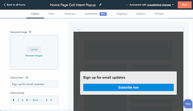
Price: Free forever, $45/mo (Starter), $800/mo (Professional), $3,200/mo (Enterprise)
HubSpot’s Popup Forms can display when site visitors appear to be leaving.
After showing your custom exit intent form, you can display a thank you message or send automated emails to your new contacts. You can also choose to target specific contacts based on data about their past visits and behavior with your popup forms.
Adding an exit intent form with HubSpot is simple and quick. This tool also allows you to customize your message, theme, and pop-up timing.
Other tools on the market to help with exit intent pop-ups include Optinmonster, Sleeknote, and Informizely.
Creating popups is like writing headlines. They both look simple but are hard to do well. In the next section, we’ll review some of the best exit intent pop-up examples.
Best Exit Intent Popup Examples for Driving Lead Generation
Over 77% of marketers in 2021 saw an increase in email engagement. But you can’t engage customers with email unless you have a robust subscriber list.
Here are some of the best exit intent pop-up examples for lead generation to inspire and guide your exit intent pop-up creation.
Email or Newsletter Subscription Exit Intent Popup Examples
1. Push Living
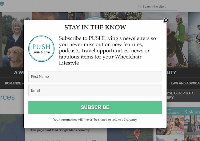
Why this example works: The text on this popup tells you who this newsletter is for and what you’ll get when you subscribe in a way that’s easy to understand. The subscribe button is big and bold, making the action they want you to take clear.
2. Omsom
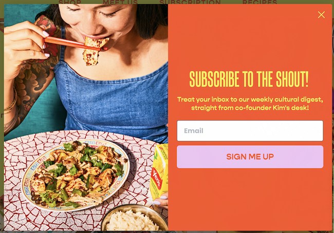
Why this popup works: This example is well-timed, on-brand, and eye-catching. It clearly states the value you can get out of their email marketing — great food, culture, and exclusives from their founder.
Resource Offer Exit Intent Popup Examples
3. ActiveCampaign
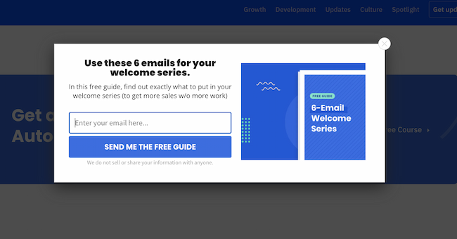
Why popups like this work: This example offers six free email templates.
ActiveCampaign is offering value with helpful information for its target audience. The company is also positioning itself as a thought leader in the industry.
4. Tim Ferriss

Why examples like this work: This popup includes a powerful headline and a simple download offer. The image highlights Tim Ferriss, a well-known influencer. It teases that he will share some of the questions that have made him successful.
Exit Popup Examples With a Course or Lesson
5. General Assembly
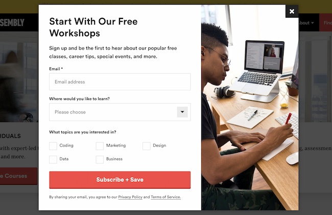
Why this popup works: General Assembly uses a smart headline to pull you into this popup form. There are only three things to fill out, and they’ve limited your choices so you can complete the form fast.
The checkboxes for the topics at the bottom of the popup also highlight what General Assembly offers in case you didn’t get this from scanning the website.
Exit Intent Popup Examples for Segmenting Your Email List
Personalization is the top way marketers improve their email results. There is a lot you can do to segment your current subscribers. But why wait to personalize when you can segment from day one?
These exit intent popup examples give you a chance to segment leads when they subscribe. This makes it easier for you to give them the email content they’ll love from the very beginning.
Exit Popup Examples of Yes/No Forms
6. Coursera
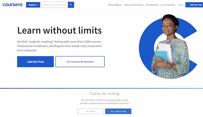
Why this exit popup works: This bottom-of-screen popup uses your exit to signal a quick request. Coursera wants your help to learn how you heard about it. The writing is direct, quickly covering how long the survey will take and what it will ask.
Exit Intent Popups to Collect Feedback
7. Everlane
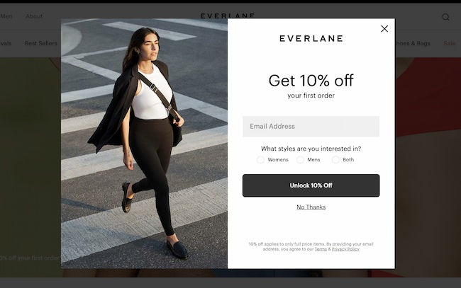
Why this example works: This form offers a discount to attract subscribers. The addition of a simple form also helps them send you emails with the products you’re most likely to shop for.
8. thredUp
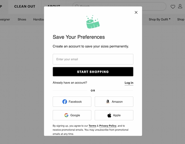
Why popups like this work: As you navigate this site there are many popups that aid in the buying process. Before you leave, they continue to personalize the website experience with a signup offer. The form is a simple way to save the information you’ve already shared.
Instead of intruding, this example feels like a natural part of the shopping process. It’s also a way to make it easier to shop with them in the future.
9. HEYMAEVE
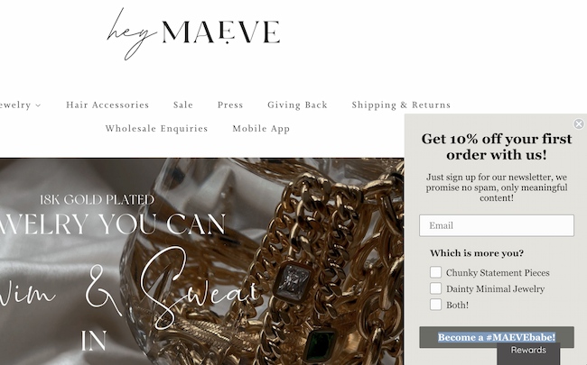
Why examples like this work: This form includes terms that fashion-savvy readers use. This helps HEYMAEVE give subscribers the looks they crave and also shows you the range of jewelry they offer.
These are the types of customer experiences that leave a good impression on leads, even if they don’t make a purchase. You’re offering them a personal experience. This may lead them to come back in the future or promote your business in their networks by word-of-mouth.
Customized Offer Exit Popup Examples
10. GQ
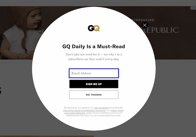
Why this popup works: GQ uses the path you follow through their website to serve a custom offer based on what you seem most interested in. For example, clicking on Recommended and scanning the trends pulled up this GQ Daily form.
The colors on the form highlight the choice they want you to choose.
11. Patagonia
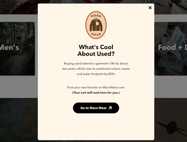
Why examples like this work: This exit example doesn’t segment users. But it improves the user experience by offering quick insights on sustainable clothing. Then they direct potential customers to a new and valuable resource.
The text also reassures you that you can keep shopping in their online store when you come back to the main site.
Contest Exit Popup Example
12. JewelScent
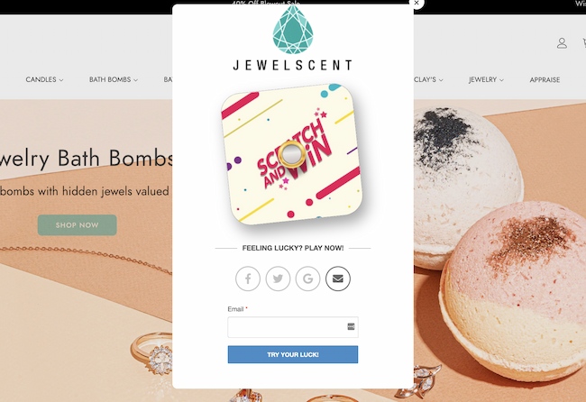
Why this example works: JewelScent offers a contest that feels bright and fun because of the colors in the example. The directions are simple and to the point. It gives new customers a short game they weren’t expecting.
13. West Elm
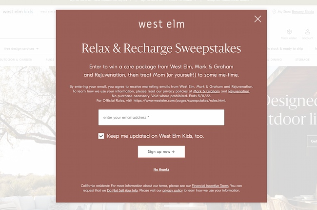
Why popups like this work: This contest offer from West Elm makes your rest and relaxation the focus. It’s also time-specific, offering a way to soothe tired moms just a few weeks before Mother’s Day.
Exit Intent Popup Offer to Chat
14. M.M.LaFleur
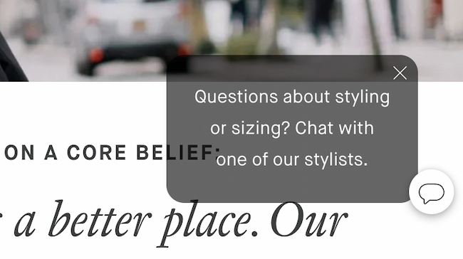
Why examples like this work: This chat example offers you hints about how their stylists can help you find the right size and style for you. With this popup, they are anticipating a common barrier to buying online and showing you how to solve it.
Exit Popup Examples for Closing Sales
You’re spending time and resources driving traffic to your site. But the average online shopping cart abandonment rate is 69.82%.
It can be tough to accept that most of your visitors get so close to making a purchase and then take off just before they cross the finish line.
These exit popups are prime examples of how to keep an attracted buyer on your site until they convert.
Cart Abandonment Exit Intent Popup Example
15. Rothy’s
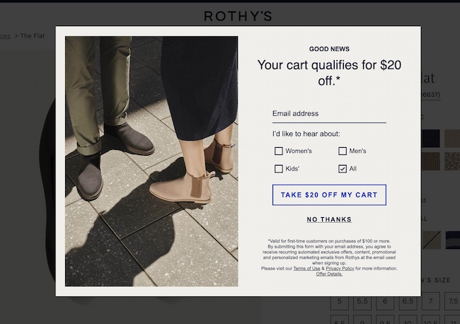
Why this popup works: This cart abandonment exit popup is effective because it shows on the page the moment someone who has an item in their cart moves their mouse away from the site.
Not only does it remind visitors that they are leaving items in their shopping cart, but it offers an immediate discount and gives shoppers a chance to subscribe to the content they most want to see.
This is powerful because it shows you that the company values your opinions and feedback.
Discount on Purchase Exit Intent Popup Example
16. Elaluz
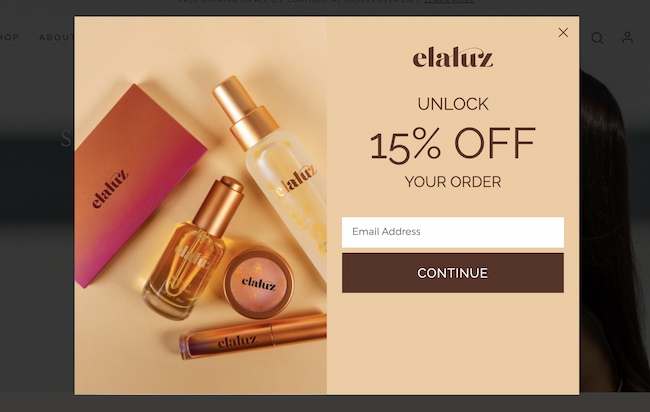
Why examples like this work: If you go to leave the Elaluz landing page an offer appears on the screen with a 15% off discount.
The coupon code influences purchase behavior. This example also requires an email address. This means that anyone who wants the code will share their email, whether they use the code that day or not.
17. Mochi Kids
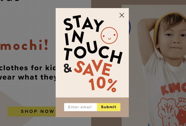
Why this exit popup works: This bold design uses fun typography, colors, and graphics to get your attention. With this example Mochi Kids isn’t just offering a discount, it’s showing you the kind of world their products can create for your kids.
18. The Sill
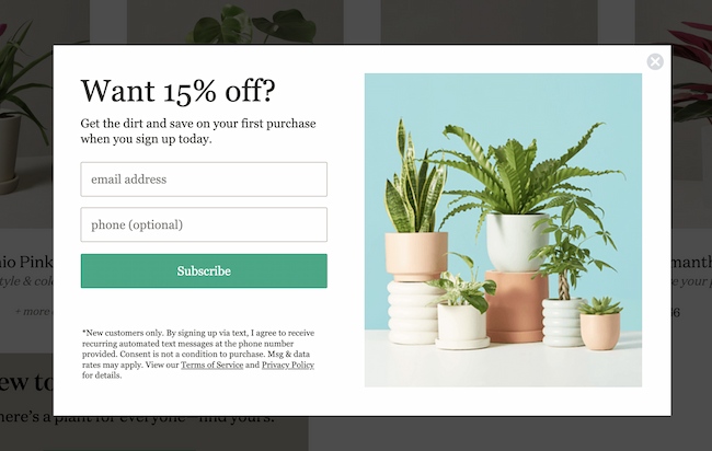
Why this popup example works: The image of healthy plants and the offer to “get the dirt” make sure that this example aligns with The Sill’s brand and products. It also offers an attractive discount.
19. CURLS
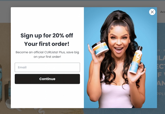
Why exit popups like this work: In addition to effective timing, this popup is located in an ideal spot — the center of the page, where a visitor on the page naturally has to move their cursor. The term “CURLista” in this example tells you that when you sign up you’ll be joining a community that cares about hair as much as you do.
20. Skullcandy
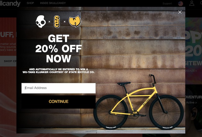
Why this popup works: It’s unique because it offers a surprise contest entry. Visitors know they’ll get 20% off if they subscribe, but they don’t know whether they’ll also win a special bicycle, which is exciting and enticing.
21. Nguyen Coffee Supply
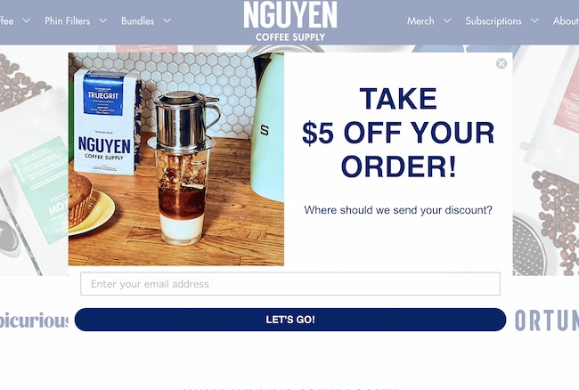
Why this popup works: This example doesn’t offer a discount in exchange for an email address. Instead, they make it clear that they want to offer you a discount before you leave their site. Then, they need your email address to give you the discount code.
This approach makes this example feel like it’s more about your needs than joining a mailing list.
Exclusive Offer Exit Intent Popup Example
22. Madewell
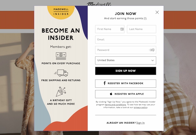
Why this example works: This example includes smart illustrations and eye-catching design. These additions make this form feel easy to read and fill out instead of overwhelming. The left column outlines the benefits of signing up, while also teasing the potential for more.
23. Mimochai
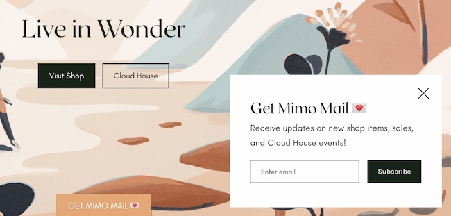
Why popups like this work: Design details like the heart on the envelope make this example feel like a welcome surprise. The design stands out on the page but doesn’t feel intrusive.
Product Demo Exit Intent Popup Examples
24. Zendesk
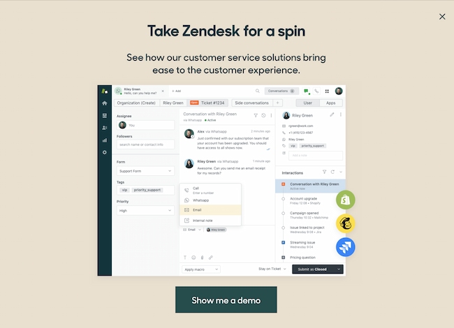
Why popups like this work: This example doesn’t waste any time. Instead, it covers everything their product offers in a quick snapshot to entice product demos. The headline tells you what you can do, then the supporting text tells you what problem their product solves.
The image shows the Zendesk dashboard. This makes it easy for a user to compare their dashboard to what they’re already using. All a prospect needs to do is click the button at the bottom to schedule a demo.
Popup Examples That Add Urgency
25. Flamingo
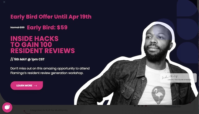
Why this popup works: This example does a great job of covering what you’ll need to know if you want to attend this valuable event. Besides making the deadline clear, the text and design show you exactly what you’ll save if you act quickly.
26. Codeacademy
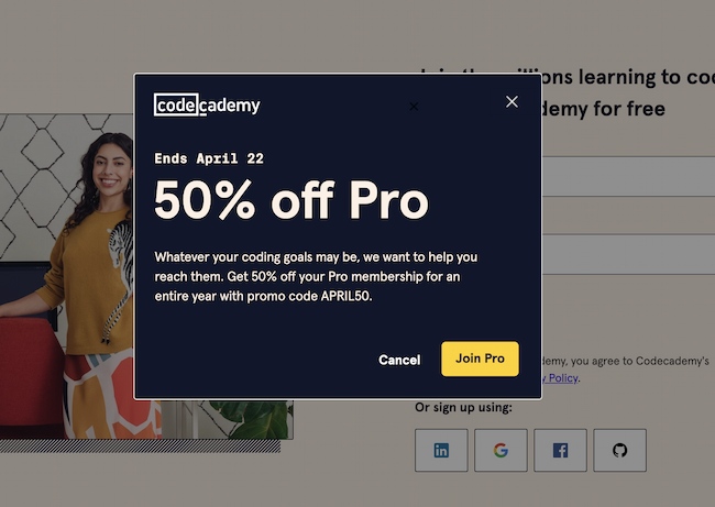
Why this popup example works: This example uses different text sizes to emphasize what’s most important for you to read. It starts with a deadline, then tells you what you’ll get if you act soon. Next, it offers instructions so you don’t have any blockers that could stop you from signing up after you click the bright yellow button.
Exit Intent Popups That Suggest Related or Popular Products
27. Blavity

Why this exit popup works: This example uses a striking image and bold type to attract attention. The message boosts their brand. Plus the contrasting pink on the button with bold text clearly states what you should do if you want mobile content from Blavity.
Popup Examples for Overcoming Objections
28. TOMS
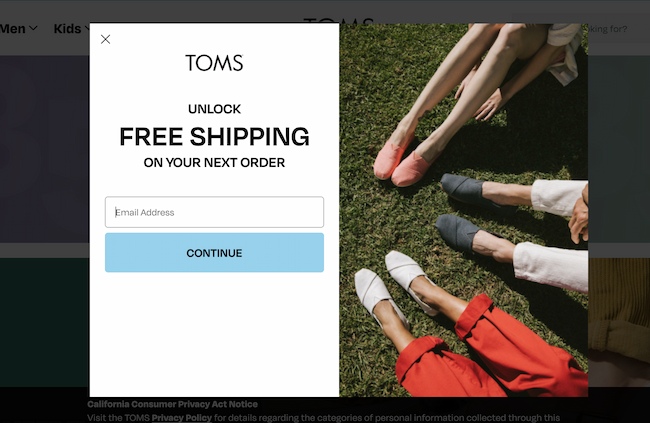
Why this example works: Besides tackling shipping costs, which are the top reason that shoppers abandon online shopping carts, the image Toms uses in this example highlights their top product. This helps entice curious shoppers to keep looking.
29. Quince
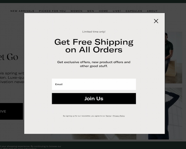
Why this popup works: This example makes a bold statement that you can’t ignore. Not just free shipping once, but free shipping on every order.
Free shipping is an important offer for online shoppers. But you don’t usually see anything about shipping until it’s time to check out. This makes it a smart thing to share in a popup.
Increase Conversions With Exit Intent Pop-Ups
Exit intent pop-ups are a simple yet powerful marketing and lead generation strategy. Once you put them into action, you’ll be able to keep more readers on your website and increase conversions and revenue.
Your next step? Learning how to analyze and improve your results.
Editor’s note: This post was originally published in November 2021 and has been updated for comprehensiveness.
![]()


