

Brand Colors — Everything You Need to Know
Brand colors shape how people perceive your business. Up to 80% of snap judgments about products are solely based on color alone. That’s right, 80%!
Think about McDonald’s for a moment. What pops into your mind? The yellow arches, right? McDonald’s has done a fantastic job of using its colors to establish a memorable brand identity that stays with you long after you’ve finished your burger and fries.
So why settle for a forgettable brand image that blends in with the crowd? Let’s sprinkle some color into our article and discover the powerful connection between colors and branding.
Inspiration From 10 Brands That Get it Right
![Free Download: How to Create a Style Guide [+ Free Templates]](https://no-cache.hubspot.com/cta/default/53/76520ae5-1a3b-4055-9e8e-95e150b90965.png)
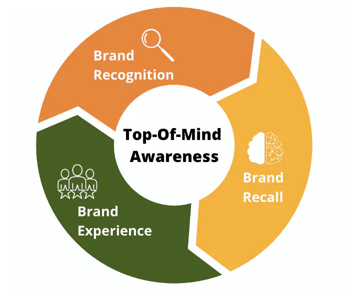
Why Brand Colors Matter
1. Colors establish brand identity and recognition.
Today’s market is overwhelmed. So, how can you find your top spot there? Using consistent brand colors is a great way to establish brand recognition and identity.
For example, let’s look at Coca-Cola. The company has been using its signature red and white colors since 1886.
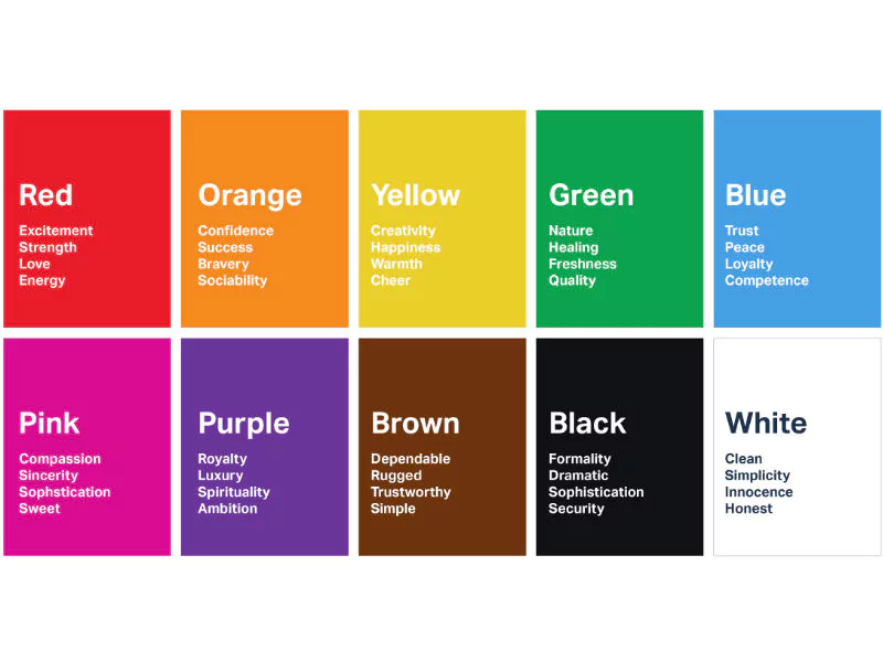
Red represents excitement, passion, and energy, while white represents purity and simplicity. These colors have become synonymous with the brand and are instantly recognizable by people worldwide.

2. Brand colors evoke emotions and associations.
Let’s admit it. We’re all guilty of making purchases based on emotions. And since the colors can evoke certain feelings, this raises the question: “What does this mean for your brand?”
Picking the right color palette can be a game-changer in customers’ attraction, as 34.5% of purchases are driven by color influence.
Different colors evoke different emotions and associations. For example, green can signify growth, health, and nature, while red can symbolize passion, excitement, and urgency.
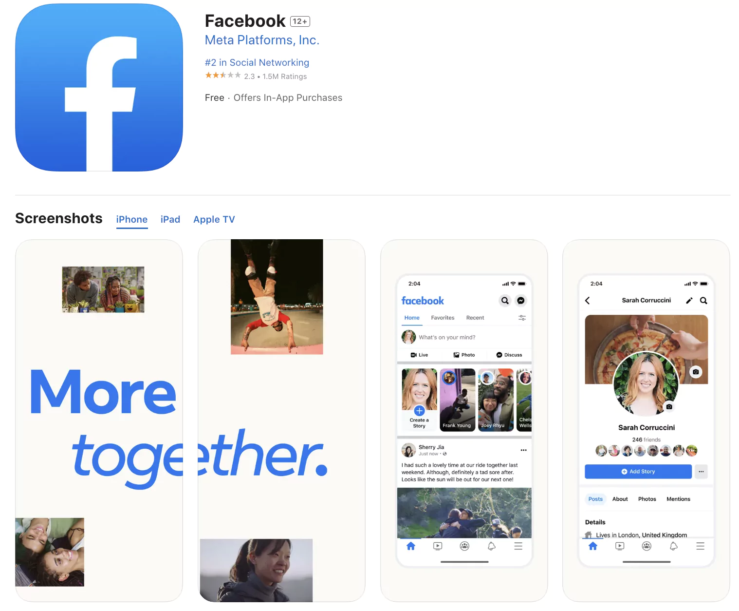
Facebook uses blue as its primary color in its branding. Blue is often a color of trust, security, and reliability, which aligns with Facebook’s mission to connect people and create a safe online community.
It also calms people, helping users feel more relaxed and comfortable while using the platform.
“Media giants are sneaky and use colors to create psychological impacts that grab our attention,” says Lindsay Braman, an illustrator, therapist, and visual translator.
Think of the fiery reds in fast-food logos that pump us up or the enigmatic blacks in luxury branding that intrigue us.
She also backs up her claims with an interesting study where college students who received test papers with red numbers performed worse due to its anxiety-inducing effect.
.webp)
3. Brand colors increase recall.
Using consistent brand colors can increase brand recall by up to 80%. When customers repeatedly see your brand colors in different contexts, their brains associate those colors with your brand.
So basically, brand recall can make or break your business.
And let’s not forget about brand equity. The financial value added to your products and services by having a recognized brand. Qualtrics says 59% of consumers prefer to buy from trusted brands.
4. Brand colors create a competitive edge.
Colors are your brand’s signature, your statement to the world. Creating a memorable brand increases your chances of outshining competitors and gaining loyal customers.
Canva’s experts suggest analyzing your competitors’ color choices and then using the following questions to differentiate yourself:
- What brand colors do your competitors use? How do they reflect their brand identities?
- What are the audience perceptions of each competitor’s visual design and branding choices?
- What color palette choices do competitors use with specific content types?
- What makes your brand unique from each competitor?
They also suggest interviewing brand managers for valuable insight into the color-choosing process.
The Brand Color Formula
A brand color formula is a set of predefined color codes representing a company’s visual identity. It translates into a cohesive look and feel that resonates with their target audience and strengthens brand recognition.
The following formulas outline how to select colors for one, two, three, and four color brands.
One-Color Brand
- Main color: This is the only color used in the brand.
Example: Nike’s brand color is black.

Two-Color Brand
- Main color: The primary color used in the brand.
- Accent color: The secondary color used to complement the main color.
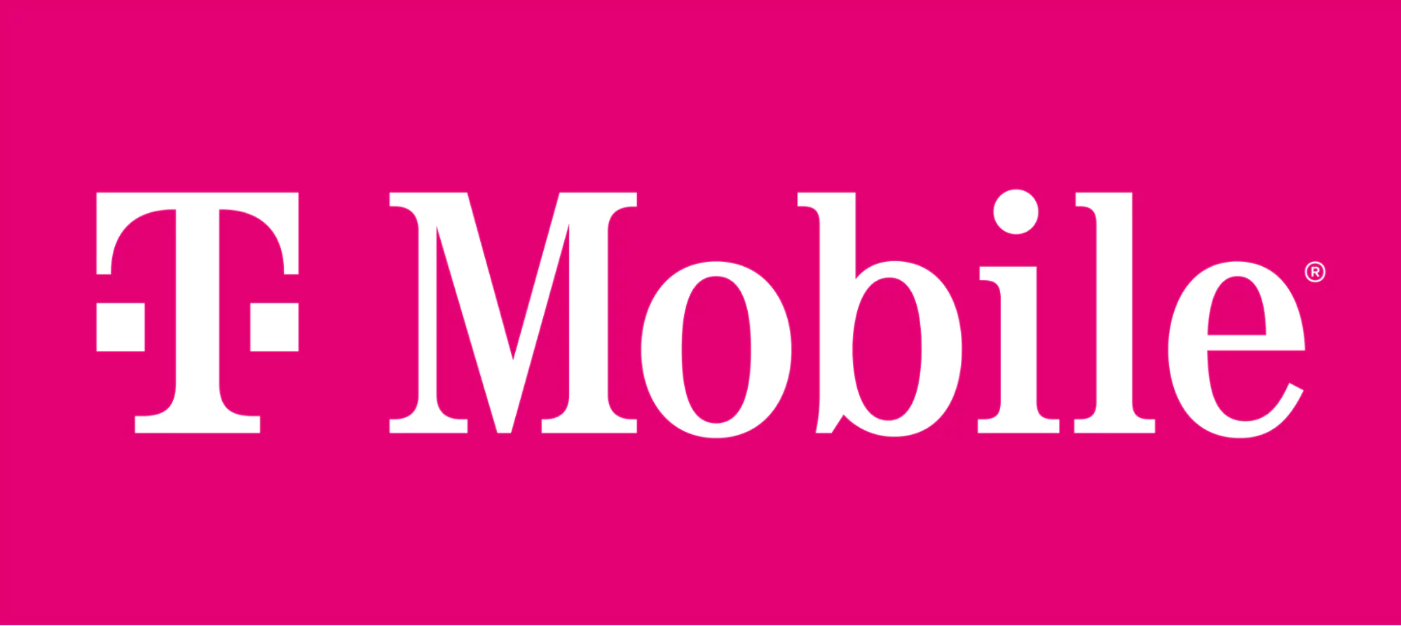
Example: T-Mobile’s main brand color is magenta and the accent color is white.
Three-Color Brand
- Main color: The primary color used in the brand.
- Secondary color: The second most important color used in the brand.
- Accent color: The third color used to complement the main and secondary colors.
Example: FedEx’s main brand colors are purple and orange, with white as an accent color.

Four-Color Brand
- Primary color: The main color used in the brand.
- Secondary color: The second most important color used in the brand.
- Accent color 1: A color used to complement the primary and secondary colors.
- Accent color 2: A second color used to complement the primary and secondary colors.
Example: Microsoft’s brand colors consist of a blue primary color and a green secondary color. Yellow is accent color 1 while red is accent color 2.

How to Choose Brand Colors
1. Define Your Brand Personality and Values
Before thinking about brand colors, let’s take a step back. First, consider the soul of your brand — its personality and values:
- What’s its purpose and goal?
- What emotions do you want to awaken in your customers?
- Is it bold and daring or gentle and nurturing?
- Is it all about luxury and exclusivity or affordability and accessibility?
- What values do you offer?
- What’s your message?
Once you’ve nailed down your brand’s personality traits, you’ll have a solid foundation for choosing your colors.
2. Research Color Psychology
Color psychology delves into how colors can impact our mood, behavior, and how we perceive everything around us.
Once you’ve cracked the code of color psychology, you’ll have the power to tap into the undeniable influence of hues and make savvy decisions.
Read books and studies on color psychology.
3. Pick Your Primary Color
Your primary color articulates your brand’s unique personality and values. Choose a hue that genuinely reflects your brand’s vibe and connects with your ideal audience to ensure a perfect match.
With color theory and psychology on your side, you’ll have all the tools to select a primary color and create a lasting impact.
 4. Choose Your Secondary Colors
Secondary colors support your brand identity, adding depth and dimension to your overall color scheme. Use them to highlight accents, backgrounds, and typography and create a harmonious color palette that tells your brand’s unique story.
To create a seamless combo, select two to three colors that perfectly harmonize with your primary color.
5. Test Your Colors Across Platforms
Once you’ve selected your brand colors, it’s time to put them to the test and ensure they work properly across all platforms.
Try them on your website, social media channels, business cards, packaging, and other marketing materials to guarantee maximum consistency and visibility.
You can A/B test the buttons’ colors, backdrops, etc., to identify which brings in the most conversions.
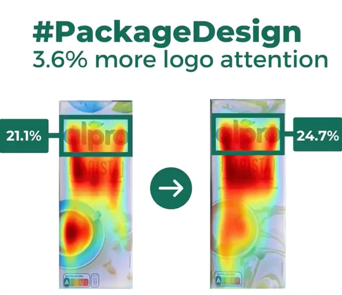
Small changes in color and more straightforward communication through images led to a sales boost for Alpro, a Belgium company that markets plant-based milk products.
Color Psychology Tips
Color Meanings and Associations
Colors have different meanings and associations. Red can signify passion and love. Conversely, it also symbolizes danger and warning.
Warm colors like red, orange, and yellow evoke emotions ranging from warmth to anger, explains Kendra Cherry, a Psychosocial Rehabilitation Specialist and author.
Conversely, cool colors like blue, purple, and green are often associated with calmness but can also evoke sadness or indifference.
Black and grey trigger high-quality and high-technology associations.
Pro tip: Choose your brand and product colors to stimulate a concrete action, feeling, or desire — hunger (= buying food), confidence, inspiration, trust, etc.
Color and Emotions
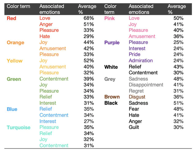
And did you know that people across 30 countries share similar associations between colors and feelings? A survey of over 4,500 participants from 30 countries found that people easily connect colors and emotions.
What we like: Most colors were linked to positive emotions, while brown, grey, and black were associated with negative emotions.
Fun fact: Participants whose languages and geographical locations were similar had more similar color-emotion associations.
We also highly recommend you watch the video on color psychology by expert Mike Ploger.
Understanding the emotional connection between colors and individuals is crucial in visual branding. “Your favorite color likely came from positive experiences with that single color when you were growing up,” says Mike Ploger.
This highlights the importance of considering color psychology in brand building.
Gender and Color Preferences
Color preference can also be influenced by gender. Women generally lean towards warmer colors, purple (23%) and blue (35%). Men prefer blue (57%), black (9%), and green (14%).
But wait, there’s more!
Have you ever noticed the ubiquitous association between pink and girls and blue and boys? This gender-color stereotype has been deeply ingrained in Western societies, but what about in Chinese culture?
Researchers from several Chinese universities set out to investigate this phenomenon using a modified Stroop paradigm and event-related potential (ERP) signals.
In the experiment, Chinese college students received occupation words stereotypically associated with masculinity or femininity (displayed in either pink or blue). They were then asked to quickly and accurately classify the gender of the occupation.
The study revealed that pink stimuli associated with masculinity resulted in longer response times. In contrast, blue stimuli linked to masculinity did not cause the same delays in response time.
So what’s the conclusion? Pink is a “gendered” color, but blue is not. What a thought-provoking discovery.
However, color preferences in marketing still have a powerful impact on consumer behavior.
While some may argue that colors are insignificant when it comes to gender, it’s hard to ignore that pinky shades have become synonymous with the feminine market.
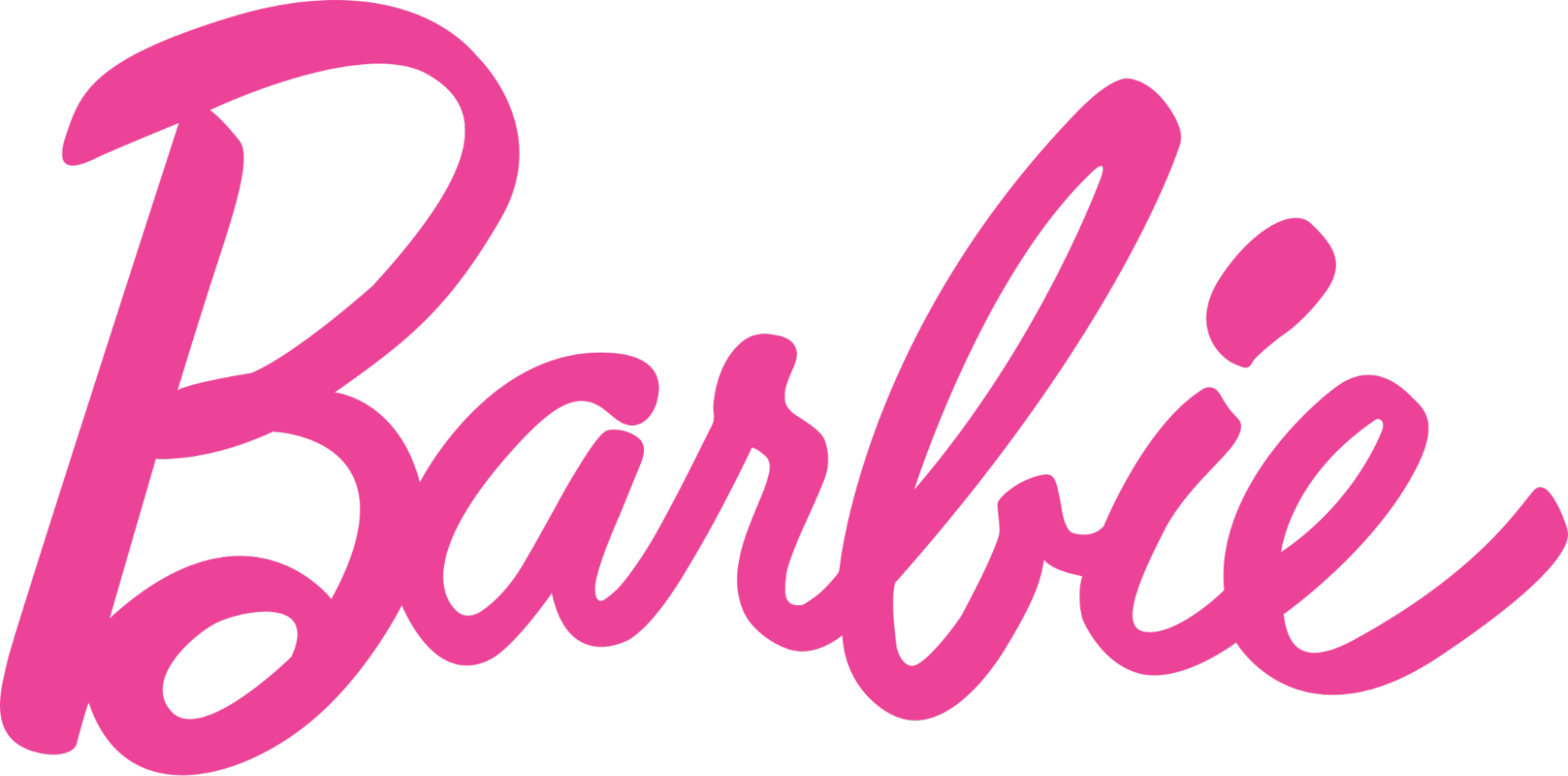
And we can see it everywhere, from Barbie’s iconic packaging to clothing brands that cater to women.
On the other hand, darker shades like black and navy blue have traditionally been a symbol of masculinity and are often the go-to choice for male products.
Just think of the rugged and athletic look synonymous with Jack & Jones’ marketing campaigns.

Color and Purchasing Decisions
Colors can affect purchasing decisions by evoking emotions and associations.
For example, red is often used in sales promotions because it creates a sense of urgency and can stimulate impulse buying. Sarah Levinger, Consumer Behavior Analyst, confirms that in one of her LinkedIn posts:
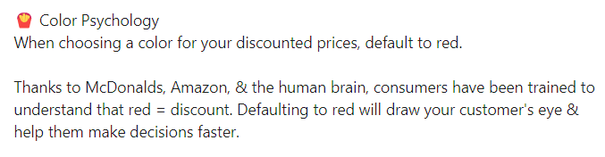
Yellow is often used to grab attention and create a sense of excitement. That makes it a popular color for clearance sales and promotions. Unexpectedly, people associate orange, brown, and yellow with inexpensive products.
Context and Color Impact
The impact of colors depends on the context in which they are used. For example, black can represent elegance and sophistication in fashion but can be perceived as ominous in other contexts.
Also, yellow can signify caution and slowness in transportation. Yellow lights, yellow yield signs, and yellow caution tape indicate slowing down in traffic.
In a different setting, yellow may evoke positive feelings such as cheerfulness and assurance.
The crux lies in the context of its usage.
Furthermore, in finance, green is all about profitability and money.
In the context of food, orange has a connection with freshness and nutrition (reminding us of oranges and carrots). However, in the context of safety, orange is used to signify danger and caution.
According to licensed psychologist Steffanie Stecker, colors can influence our mood, performance, and even how people perceive us. She emphasizes the subjective nature of color perception.
Simply put, what one person perceives as calming may not be the same for another person.
Brand Color Best Practices
1. Consider Cultural Differences
When choosing brand colors, remember to take into account cultural differences. Some colors can have different meanings and associations in different cultures.
For example, white symbolizes purity and innocence in Western cultures. But on the contrary, it has dark meanings, such as mourning and death in some Asian cultures.
In the 1950s, Pepsi decided to revamp the color in Southeast Asia. They swapped out the old and dull dark blue with a new, trendy, and icy blue shade that they believed would make their vending machines look fresh and inviting.
But nobody bothered to check the cultural significance of the color blue in that part of the world.
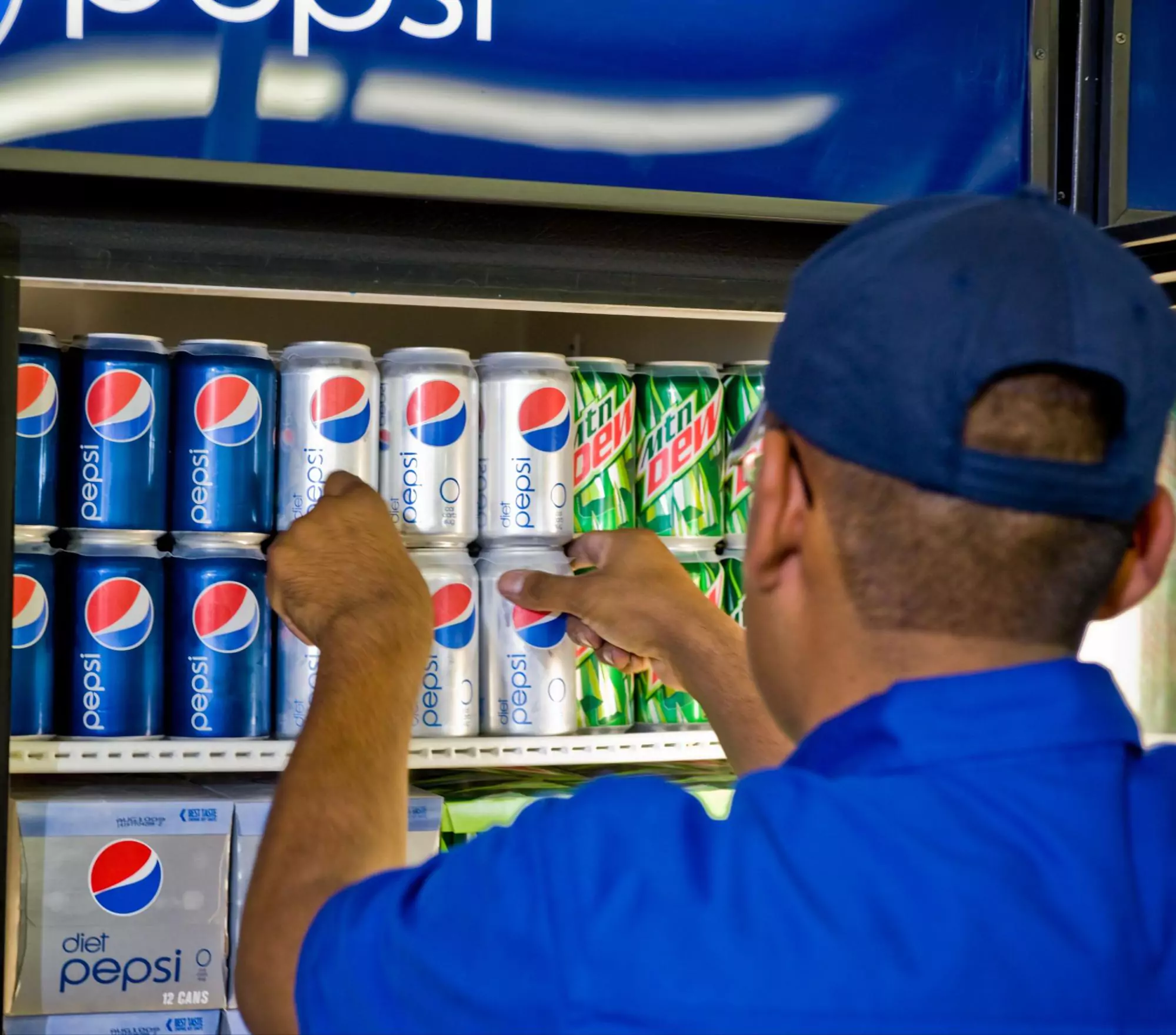
As it turns out, light blue means death and sorrow. So, needless to say, the new color scheme didn’t go down well with the locals. The result? A steep drop in Pepsi’s share price in the region.
Pro tip: When choosing colors for your brand, make sure you’re clued to their cultural connotations.
2. Use Colors to Differentiate Products
If your brand offers different products or services, you can use colors to differentiate them.
Google uses a clever strategy to help users easily differentiate between its products. The tech giant uses a distinct color scheme for each offering.
For instance, Google Drive has a tricolor look, while Google Docs has a fresh blue hue. Google Sheets is green, and Slides has a yellow appearance.
Pro tip: Choose a different color for each product or service to help customers easily identify and remember them.

3. Use Colors to Reinforce Your Brand’s Personality
Colors can also communicate important messages and enhance brand storytelling. If you carefully select the hues that align with your brand’s values and narrative, you can create a much better brand experience for your customers.
For instance, let’s consider Adidas — what sets it apart from others?
Its bold and dynamic colors reflect the company’s athletic and competitive spirit. The iconic three-stripe logo is often black and white, lending a touch of sophistication and timelessness to the brand’s overall look.
However, Adidas also incorporates vivid and lively colors into its product designs, such as neon yellows and electric blues. That exudes a sense of enthusiasm and excitement.

4. The Importance of Visual Contrast in Branding
Adding visual contrast to your branding is another key to unlocking the door of perfect design. You don’t have to make it look like a neon sign from Vegas, though.
Pro tip: Use the right color combo to create contrast. You can then emphasize key elements and convey your message more effectively.
No matter the brand, an element of visual contrast is key to every color palette. Having contrast
doesn’t necessarily mean that a brand looks bold or loud. A sense of complementary harmony, be it through hue or value, allows all brand visuals to be clear and legible.
“At Switch, one process we use to ensure that the brand colors we’re planning for a brand have
enough contrast is to desaturate our chosen brand palette. By removing all hues from our colors, we guarantee that the color values are distinct enough and, therefore, work well together.
This is a reverse-engineered process from traditional ‘underpainting’ — where artists would plan their painting in monochrome, only using light and shade to tell the story,” Andrea Meli, Head of Design, Switch
Now, let’s recall the iconic Apple logo with the perfect contrast between black and white. This design showcases how even a simple logo can use visual contrast to make a lasting impression.

5. Be Open to Change
Finally, don’t hesitate to change your brand colors if they aren’t connecting with your target audience or no longer match your brand’s personality and values. Stay open to making adjustments that can enhance your brand’s appeal.
And don’t consider that a bad thing. In fact, many mega-popular brands have done the same thing.
For instance, in 2014, Airbnb updated its brand colors and font. The company shifted from a blue and white color scheme to a more vibrant and diverse color palette.

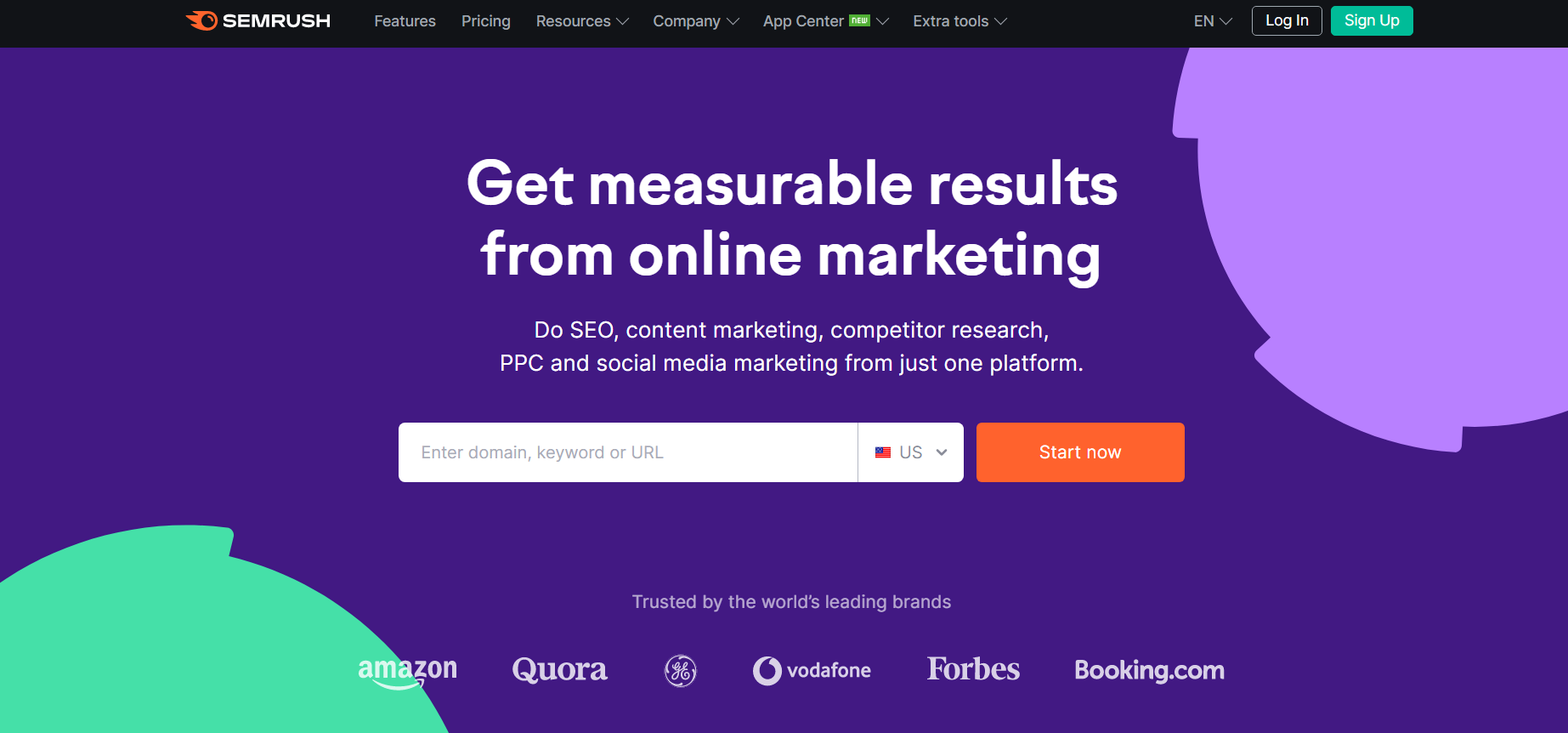
Likewise, Semrush, the leading SEO tool, rebranded in December 2020 to symbolize the creative spark that ignites the marketing engine and the company’s energetic, passionate, and innovative approach to work.
Semrush’s home page back in early 2020.

Semrush’s home page of 2023.
Inspiration From 10 Brands That Get It Right
Lastly, check out the list of 10 brands that expertly use colors to create a visually stunning and memorable identity.
- Instagram — Purple, pink, orange, and white
- LinkedIn — Blue and white
- Red Bull — Blue and red
- Spotify — Green and black
- Ferrari — Red and yellow
- Visa — Blue and gold
- Samsung — Blue and white
- Twitter — Blue and white
- Dropbox — Blue and white
- YouTube — Red and white
And if you’re looking for an answer to what are the best brand colors, sorry to burst your bubble, but they don’t exist. The trick is mixing and matching different colors to create a unique visual design that sets your brand apart.

![]()