How to Optimize Your 404 Error Page for SEO & Conversions
In an ideal world, you would never need a 404 error page. Links would never break, resources would stay in one place, and visitors would seamlessly navigate around your website by clicking on links. Despite best efforts, however, 404s still happen.
This error is the most common one that your site’s visitors will encounter. It basically means that the page the visitor was trying to reach cannot be found. This could be because the page has moved to a new URL or because it’s been removed from the website.
While you should take steps to correct these errors on your site when you find them, it is also important to create a 404 error page that helps visitors find what they’re actually looking for in the event that they encounter this error. Done right, 404 pages can even be used to increase SEO and boost conversions. Here’s how.
Customers don’t want to see 404 pages, and companies don’t want broken links since both cases result in reduced sales opportunities.
But it’s not all bad news. With the right approach, businesses can optimize their 404 pages to provide value. Here are 12 ways to create better 404 error pages.
1. Position your products.
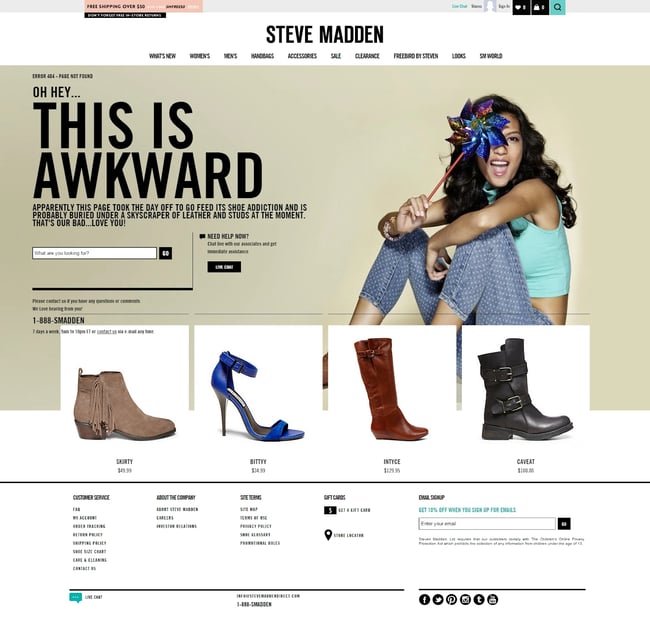
First up? Use your 404 page as an opportunity to effectively position your products. Show visitors a curated selection of some of your most popular offerings, along with links to each product. While potential customers may not be looking for these specific items, this approach provides a way to get visitors from your 404 page onto active site pages.
One thing that’s important to note: Always include images. While links to products are better than nothing, links with images are far more effective at getting customers to click through.
This image from fashion accessory company Steve Madden shows the product approach in action.

2. Serve up user reviews.
You can also improve your 404 pages by including user reviews of your products or services. Here’s why: When users land on 404 pages they’re naturally frustrated. They’re not sure what went wrong, but they do know that they didn’t find what they were looking for. As a result, they’re already annoyed, reducing their likelihood of buying anything you’re selling.
By adding a few well-chosen customer reviews, however, you can lessen the sting of the 404 page and get customers to the page they want to see (and back on the road to conversion.)
3. Capture new customers.
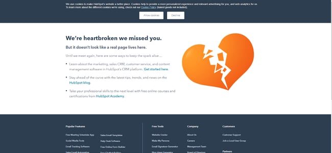
Starting your 404 page off with an apology is a solid tactic, but you can improve on 404 operations by generating new leads. Here’s how it works: Along with the “we’re sorry this doesn’t work message”, offer a way for customers to get in contact with you or offer a free demo of your product or service.
Create a simple one-line hook that asks users to submit their email addresses and you’re on the way to cultivating new connections, just like HubSpot in this example:

4. Make an impression.
If you can’t make them stay, at least make them laugh. From a joke at your own expense to a funny video that may (or may not) have anything to do with your brand, humor can both create a positive impact and help customers remember your brand.
Consider a visitor that lands on your 404 page, watches your funny video clip, and has a laugh. The next time they see ads for your brand on social media, chances are they’ll remember the positive impact of your funny 404 rather than the frustration of landing on the wrong page — and they might just come back and visit you again.
5. Point Them in the Right Direction
While you may not know exactly what customers were looking for when they landed on your 404 page, you can make educated guesses. By using data collected from your customer relationship management (CRM) and analytics tools, you can create a set of common customer search terms that can help inform your 404 design.
For example, if you’re an outerwear ecommerce brand and your most popular searches are for “winter coats”, “rain jackets” and “waterproof boots”, put links to all three of these categories on your 404 page to help point customers in the right direction.
6. Offer value.
If you can’t find what customers want, offer them something of value. One option? Exit-intent popups.
Although it’s true that as a general rule, people don’t like popups, this approach offers an exception: By creating popups that appear before users leave your 404 page and offer discounts or sales pricing with a code, you can convince users it’s worth making a trip back to your homepage to find what they were originally looking for — or to purchase something else.
7. Keep it simple.
When it comes to 404 pages, don’t overthink it. Sure, explain in basic terms what went wrong and offer a potential path to help solve the problem, but don’t write paragraphs of text explaining the problem and asking for customers’ goodwill.
Why? Because they won’t read it. Instead, streamline your apology and then add a list of common links (that actually work) to your site, such as your homepage, search page, and help pages.
8. Provide Interaction
What if you could make 404 pages more fun? Some brands have opted to create mini video games that give customers a few minutes of fun and then provide links to other site content. This is a great way to put a positive spin on an otherwise negative experience. By letting customers blast aliens, you can lessen the sting that comes with landing on a 404 page.
Kualo does this with its 404 page. By pressing the spacebar, visitors can shoot aliens in space as they move across the screen in the shape of the brand’s logo.

9. Leverage keywords.
404 pages can also help boost your search engine optimization. Here’s how: Instead of simply putting up a brief message and apology for your 404 page, add a few of your most popular keywords along with relevant links. This helps add value to an otherwise broken page by making it something that can help users find what they’re looking for.
Let’s say you’re a company that offers drop-off pet care. You could include keywords like “doggy daycare” or “pet service” on your 404 page along with links. In practice, this means adding a few lines of text after the 404 message such as “Looking for our doggy daycare page? Click here”, or “Need best-of-breed pet service? See what we have to offer.”
10. Put your app front and center.
Another option to help boost the impact of your 404 page is adding a link to download your mobile app. Sure, it’s a bold move — visitors might not want anything to do with your app after they land on your 404 page, but if you position it in the right way, it might just work.
For example, you could highlight how your mobile application won’t return 404 pages, or make it clear that it’s easier for customers to find what they want using the app. Even if you don’t generate a substantial amount of downloads, every app installation is another customer on the road to potential purchase.
11. Create Connection
If you can connect with customers, you can keep them coming back. One way to do this is by leaning into their frustration. Technology company Emailcenter did this by creating a “pick who to fire” page that let visitors decide who should get the blame for the 404 page they’re seeing. While it’s just a funny interactive joke, it helps create a connection between customer and company that can keep them coming back.

12. Get social.
Last but not least? Offer up links to all your social media sites on your 404 page. In effect, this opens the door for customers to voice their concerns, but also sets the stage for companies to kickstart a relationship.
If you’re able to quickly respond to visitor comments as they appear, you can get past the initial 404 disappointment and get customers back on-side by providing them links to specific product pages, forms to offer feedback, or even special discounts.
Making Marketing Focused 404 Pages
Looking to increase your marketing efforts? Solid options for 404 pages include:
Search Bar – One great feature is to have a search bar that is featured prominently on the page. Your visitor was clearly looking for something , and while they may not have found it on their last click, a quick search should send them in the right direction.
Navigation Menu – You also probably want to include a site navigation section, so that visitors can continue browsing your site immediately, without having to go back a page.
Fun – Some websites like to include quirky apologies in their 404 pages. These aren’t totally essential from a usability standpoint, but they can go a long way to calm a visitor who might otherwise be frustrated.
Bottom line? While it’s impossible to completely avoid the dreaded 404 page, it is possible to turn this not-found function into an asset.
By considering what customers may be looking for, leveraging relevant marketing data, and making sure your 404 page reflects your brand positioning, you can shift 404 pages from simple placeholders to SEO and marketing performers.
This post was originally published in February 2011 and has been updated for comprehensiveness.
![]()


