
The 20 Dominating Web Design Trends for 2022
Experimental navigation, scrolling effects, and kinetic typography are just a few of the web design trends dominating 2022.
Check out the full list with examples of the best website designs in 2022 to get inspired to tackle your web design projects this year.
One common theme among these trends is motion design. Gary Simon, an experienced UI/UX designer and frontend developer, believes motion design will be everywhere in 2022. To see several examples of websites using scroll-based animations, parallax effects, animated SVGs and more, check out his video:
1. Experimental Navigation
What we like: Experimental navigation can help engage and guide visitors to browse the site in a particular way.
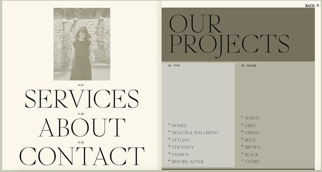
Experimental navigation refers to navigation patterns that subvert the traditional pattern (all caps navigation across the top of the screen with sans serif typography). These experimental patterns can help create interest and guide users to move around the site in a specific way.
Take Kim Kneipp’s portfolio site for example. If you click the Menu button in the right corner of the homepage, a menu slides in from the bottom of the screen that looks like the table of contents in a book. Each page is numbered to suggest an order of reading. On the right, the projects are also numbered and categorized by type and color.
2. Scrolling Effects
What we like: Scrolling effects can stimulate visitors and encourage them to keep scrolling.
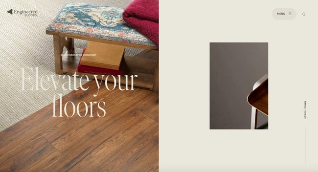
Scrolling effects — animations that are triggered by scroll action — can create more dynamic web experiences. These are increasingly used on interactive websites to intrigue readers to keep scrolling, signify a break in content, and create a three-dimensional experience.
Engineered Floors does just that using a combination of horizontal and vertical scrolling and other effects. For example, when the user lands on the homepage, they see an image of what appears to be a chair on the right. As the user scrolls, this image zooms out to reveal a living room, which is gradually covered in carpet. This 3D experience is delightful and informative.
3. Kinetic Typography
What we like: Kinetic typography can delight visitors and help them digest your content.
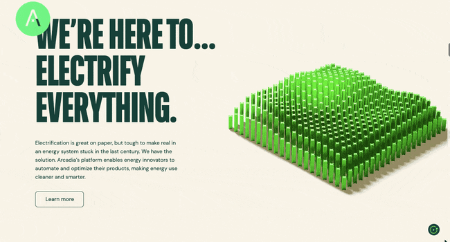
Kinetic typography — or moving text — is an animation technique that’s been around since the 60s when feature films began using animated opening titles. It can used for a similar purpose in website design to immediately grab the visitor’s attention once they land on the homepage.
It can also be used to highlight important sections, guide the visitor as they scroll, and gradually reveal information, like on Arcadia.
4. Drag Interaction
What we like: Drag interaction can provide users with a sense of control over their experience.
Drag interactions are designed to mimic an actual, physical action. They essentially allow website visitors to pick up and move objects on the screen. This type of gesture interaction is being implemented on more websites, and ecommerce and portfolio sites in particular.
Take Robin Mastromarino’s portfolio site as an example. In addition to clicking on the controls of the homepage slider, you can drag and drop the different slides to browse his featured projects. The page transitions and animations are based on the drag speed to provide users with a sense of control over these effects.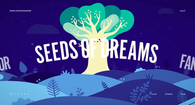
5. Retro Typography
What we like: Retro typography can inspire a sense of nostalgia and sentimentality in website visitors.
More and more companies are using big, bold typography with a retro feel to headline their homepages. This style works best for a short word, with the rest of the page kept minimal and clean.
This is part of a larger trend labeled “Neue Nouveau.” In its 2022 Type Trends Report, the foundry and technology company Monotype describes Neue Nouveau as a twist on the Art Nouveau movement, which was characterized by decorative designs, embellished stroke endings, and diagonal and triangular character shapes. We can see some of these same characteristics — like organic forms and flourishes — in typography today, according to the report.
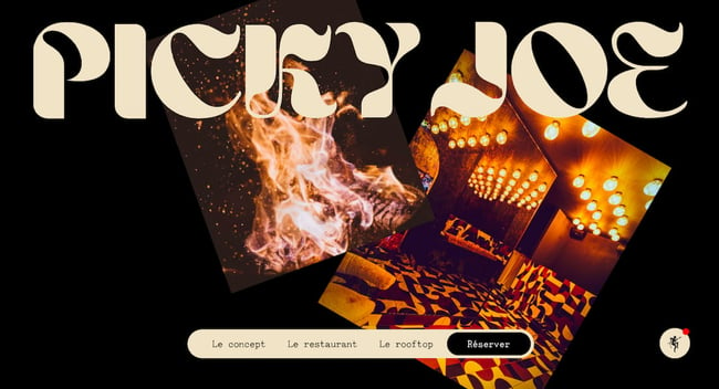
Here’s an example from French restaurant Picky Joe. The psychedelic-looking headline matches the retro interior of the restaurant as seen in the image on the right.
You can check out other restaurant website designs here.
6. Cinemagraphs
What we like: Cinemagraphs can help draw the visitor’s eye around the page, even in the most complex layouts.
Cinemagraphs — high-quality videos or GIFs that run on a smooth, continuous loop — have become a popular way to add movement and visual interest to otherwise static pages.
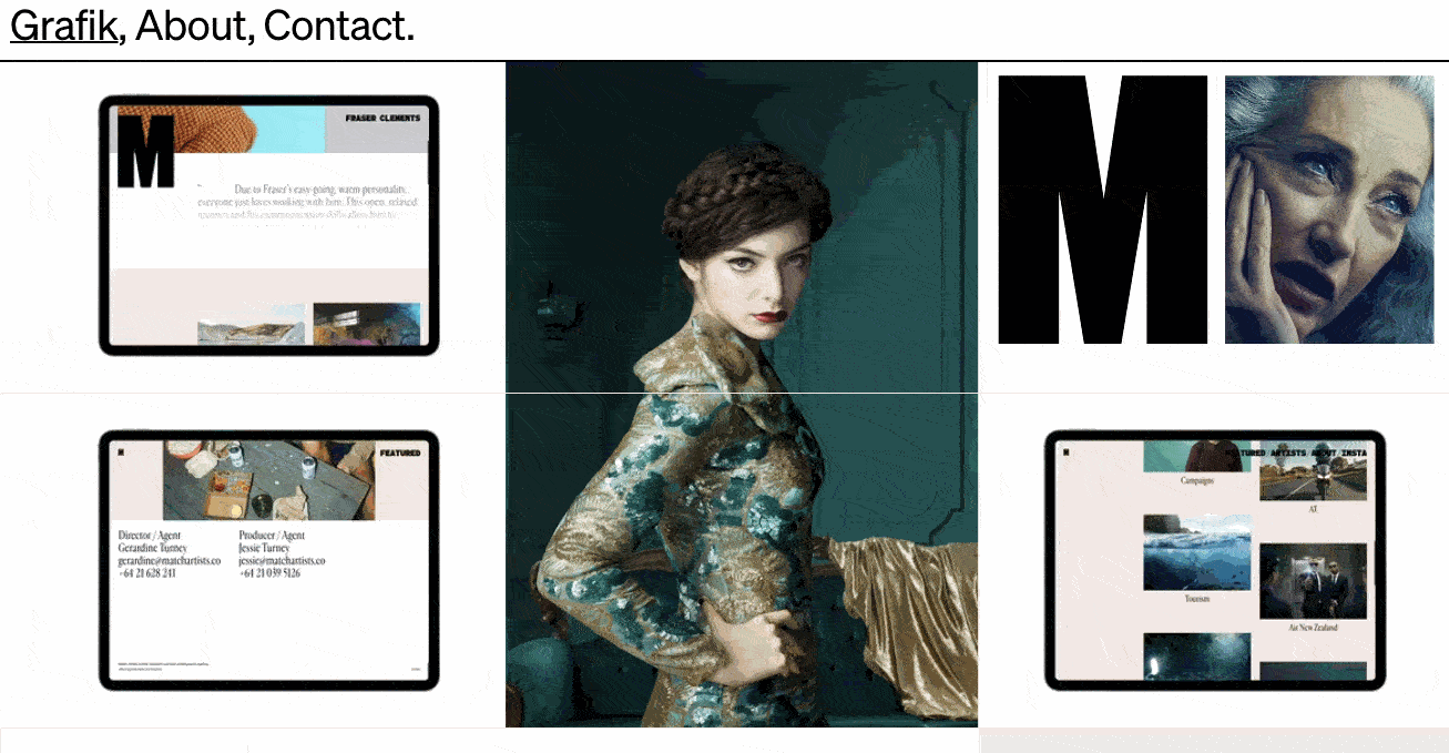
While full-screen loops were popular in the past, this year you’ll see smaller cinemagraphs incorporated into complex layouts to help draw the eye and keep readers scrolling, like in this example from the design and technology studio Grafik.
7. Brutalism
What we like: Brutalism prioritizes simplicity and functionality, which are pillars of the user experience.
To stand out in a sea of tidy, organized websites, some designers are opting for more eclectic, convention-defying structures. While it can seem jarring at first, many popular brands are now incorporating these aggressively alternative design elements into their sites, such as Bloomberg.
Brutalism emerged as a reaction to the increasing standardization of web design and is often characterized by stark, asymmetrical, nonconformist visuals, and a distinct lack of hierarchy and order. In other words, it’s hard to describe but you know it when you see it — like with the below example from Chrissie Abbott.
-1.jpeg?width=650&name=Update%20website%20design%20trends%20(heavy)-1.jpeg)
8. Monochromatic Gradients
What we like: Monochromatic gradients are visually interesting but not distracting.
Gradients have been all over the web for the past few years, and are still very common in 2022. This year, many website background are gradients that are both monochromatic and pastel.
Kendra Pembroke, a Visual Designer at Red Ventures, said “I see a lot of gradients, especially monochromatic ones, which give a sense of depth and visual interest without being too distracting.”
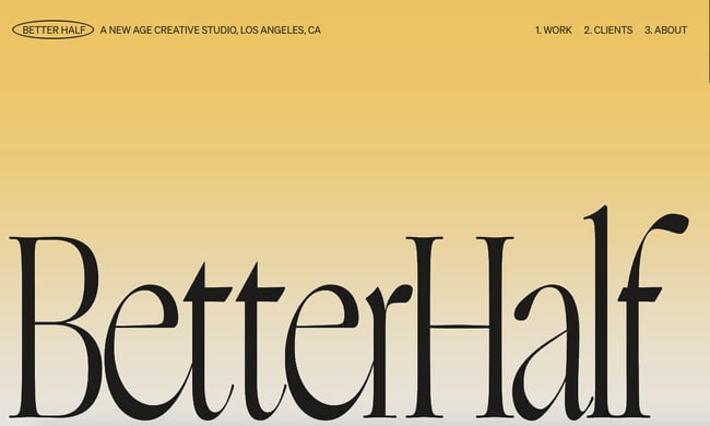
Creative Studio Better Half illustrates a perfect example of how to make this effect look fresh and modern. It combines bold typography and hover animations with a monochromatic, pastel yellow gradient background.
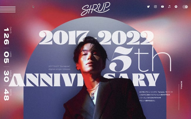
9. Layering
What we like: Layering can help add depth to a site and tell the brand’s story.
Layering images, colors, shapes, animations, and other elements add depth and texture to a site that doesn’t have a lot of text. Below is a stylish example from the singer-songwriter SIRUP.
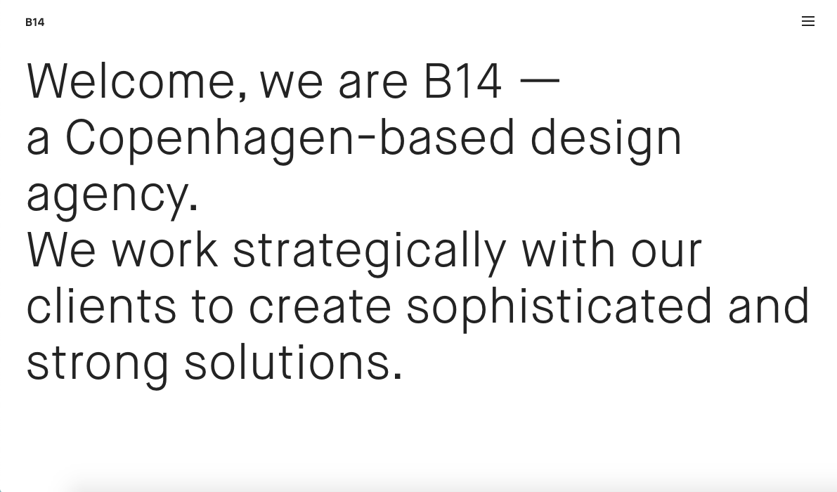
10. Text-Only
What we like: This minimalist approach ensures visitors only get the most essential information.
Some websites are cutting out images and prominent navigation sections altogether, relying on a few choice lines of straightforward text to inform visitors about their company.
Danish agency B14 uses the hero section of its homepage to simply describe its mission statement, for example. It’s a modern, uncluttered approach to presenting information that provides a stark contrast to its portfolio section, which uses cinemagraphs, hover animations, and an animated cursor effect.
11. Animated Illustrations
What we like: Animated illustrations help convey complex ideas and add some personality to a site.
More companies are turning to illustrators and graphic artists to create bespoke illustrations for their websites. “Illustration works well to convey more complex ideas that lifestyle photos aren’t always able to capture,” Pembroke explained.
In website designs this year, these illustrations are often animated to add interactivity.
For example, if you hover over one of the illustrations on the NewActon site (designed by Australian digital agency ED), the illustration and those in the surrounding area will wiggle. Then, only the illustration you’re hovering over will continue to move in a small circle. This design is also functional: each illustration represents one of the categories from the navigation menu on the right.
-2.png?width=650&name=Update%20website%20design%20trends%20(heavy)-2.png)
12. Ultra-minimalism
What we like: Ultra-minimalism can positively impact the user experience and website performance.
Taking classic minimalism to the extreme, some designers are defying conventions of what a website needs to look like, displaying just the absolute bare necessities. This trend, known as “ultra-minimalism,” can be great for the user experience and load times.
The site from designer Mathieu Boulet is centered around a few choice links to their social profiles and information.
-Oct-06-2021-08-53-34-47-PM.png?width=650&name=Update%20website%20design%20trends%20(heavy)-Oct-06-2021-08-53-34-47-PM.png)
13. Mixing Horizontal and Vertical Text
What we like: Mixing horizontal and vertical text defies convention and can therefore delight and intrigue some users.
Freeing text from its usual horizontal alignment and placing it vertically on a page adds some refreshing dimension. Take this example from action sports video producers Prime Park Sessions, which combines horizontal and vertical text alignments on a minimal page.
14. Geometric Shapes and Patterns
What we like: Geometric shapes and patterns can direct visitor’s attentions to certain products or CTAs.
Whimsical patterns and shapes are popping up more frequently on websites, adding some flair in a landscape otherwise ruled by flat and material design. Canadian design studio MSDS uses daring, patterned letters on their homepage.
-1.png?width=650&name=Update%20website%20design%20trends%20(heavy)-1.png)
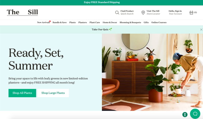
15. Thin Serif Fonts
What we like: This trend adds a level of sophistication to a brand.
Due to screen resolution limitations and an overall lack of online font support, designers avoided serif fonts for years to keep websites legible and clean. With recent improvements, serif fonts had a big moment in 2021.
While last year was all about big and bold serifs, 2022 is ushering in thinner, light serifs, according to Monotype’s 2022 Type Trends Report.
As seen on The Sill, a svelte serif headline adds a dose of sophistication and style.
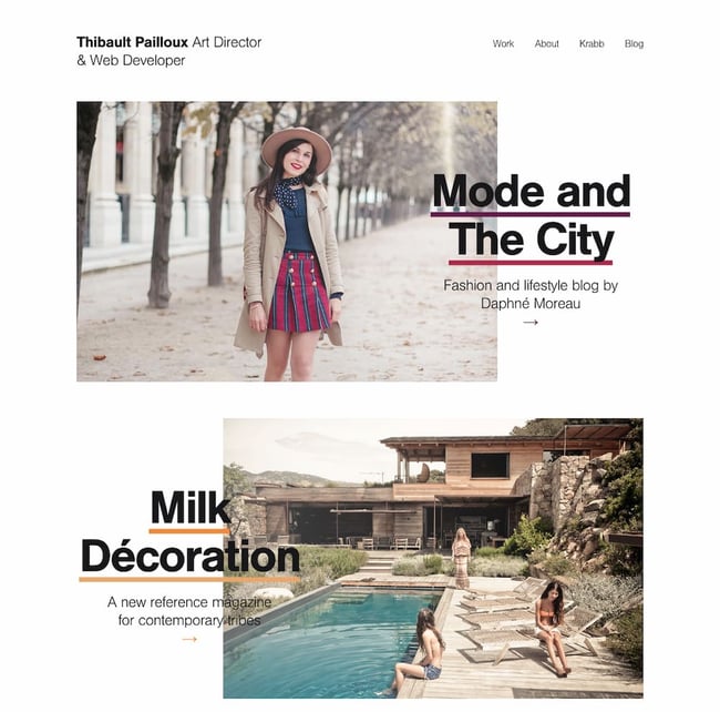
16. Overlapping Text and Images
What we like: Overlapping text and images maximizes space on the page.
Text that slightly overlaps accompanying images has become a popular effect for blogs and portfolios. Freelance art director and front-end developer Thibault Pailloux makes their overlapping text stand out with a colorful underline beneath each title.
17. Broken Grids
What we like: This convention-defying technique can make standard website pages or sections more interesting.
While grids remain one of the most common and efficient ways of displaying text and images on websites, broken grids continue to make their way into mainstream sites and offer a change-up from the norm. Check out the website for HealHaus, for example. Its homepage features images and text blocks that overlap.
-Oct-06-2021-08-53-34-65-PM.jpeg?width=650&name=Update%20website%20design%20trends%20(heavy)-Oct-06-2021-08-53-34-65-PM.jpeg)
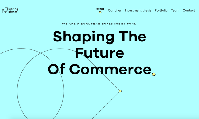
18. Organic Shapes
What we like: Organic shapes add personality without distracting from the content.
Gone are the days of strict grid layouts and sharp edges — now it’s all about curved lines and soft, organic shapes.
“Organic shapes can help add some playfulness without affecting the way the information is displayed,” Pembroke said.
In the example below from Spring Invest, the organic shapes in the hero section are not only decorative but functional. The yellow dots act like a cursor, drawing the tear drops that form the company’s logo. These shapes not only add a moment of delight — they also help reinforce the brand’s identity and value proposition to “shape the future of commerce.”
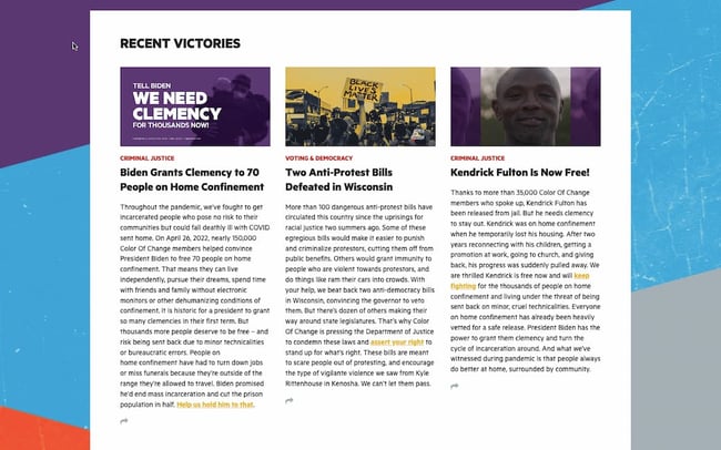
19. Web Textures
What we like: Web textures draw attention to a particular section on a website.
Web textures are background images that visually resemble a three-dimensional surface. When done well, textures can immerse viewers in a website by engaging tactile senses, as demonstrated by Color Of Change — the background evokes a duct-tape-like texture.
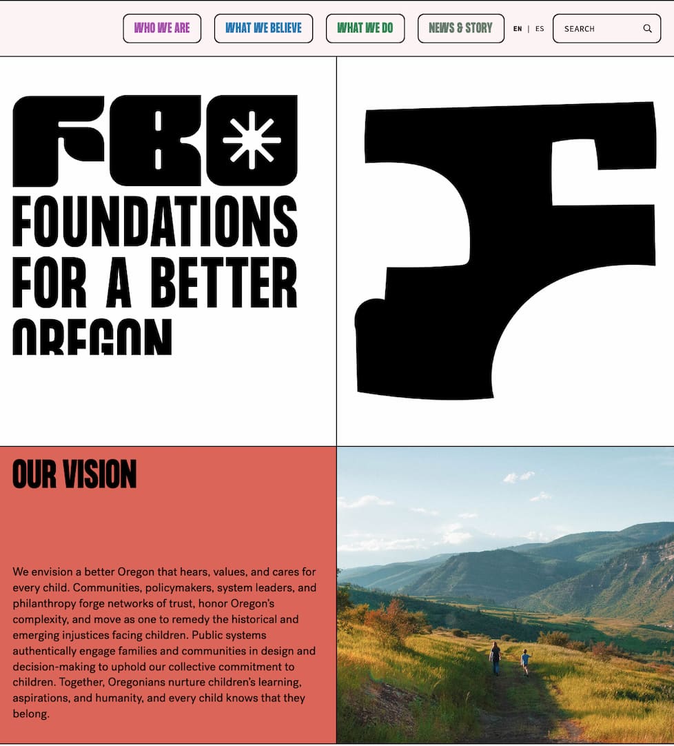
20. Grid Lines
What we like: This trend emphasizes the grid as an organizing principle.
Grid lines have started cropping up more and more in recent months, and for good reason. Grid lines structure content in a way that makes it easy to read and understand — but it also adds a modern aesthetic. On the Foundations for a Better Oregon website, grid lines are used to create a clear layout that looks futuristic.
Design Trends You Can Use on Your Website
Of course, you don’t need to incorporate all of these trends to build one of the best website designs in 2022 — we doubt that’s even possible anyways. However, even adding a couple as prominent components or subtler details can improve your site’s UX significantly, leading to higher engagement, more CTA clicks, and a better outcome for your online business.
Editor’s note: This post was originally published in January 2018 and has been updated for comprehensiveness.
![]()